Getting Started.
It is time now to take a detailed walkthrough of the features and controls that are available to build a customized form as per individual requirements
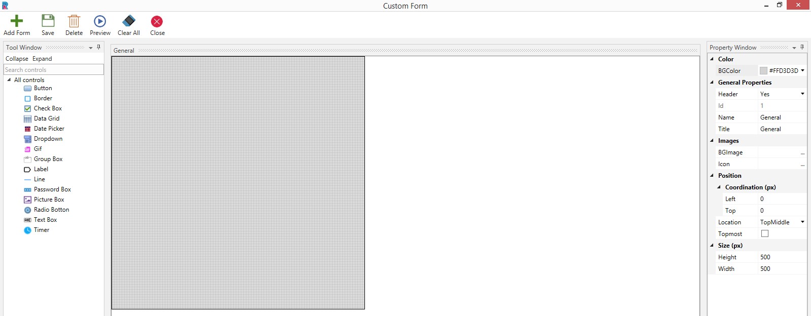
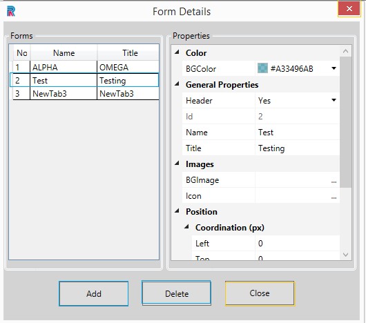
Click on the Form Builder menu on the top right to access the General Form.
Figure 1
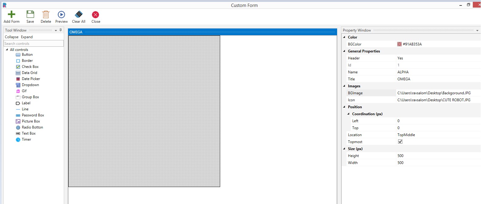
Main Window
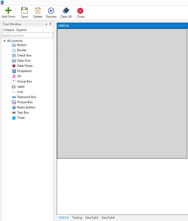
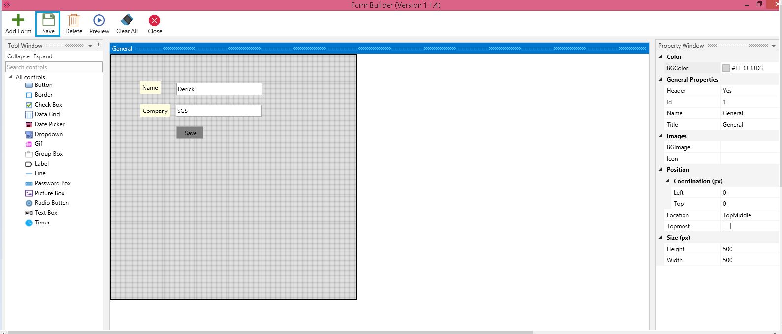
The main tab comprises the Tool Window on the left, Property Window on the right and an empty form with a default design form named General.
Property Window
Several options are provided in the Property Window. Background Color of forms are chosen from the choices provided in the Color field. Each form should have unique names and titles. Duplicate names for forms are disallowed just as duplicate names in controls are disallowed. Name and Title help easy identification and is not mandatory. File Path is used to load pictures or icons.
Using the choices in the Position field, the form and controls can be placed to the right, left, top or bottom, etc.
The black outline that is seen is the margin, which is the default window size and the design form will be of the same width and height if the size option is not required. One can resize the form to fit individual requirements, using the Height and Width options provided under the Size field. Ensure all controls are created within the boundary of the form to avoid errors.
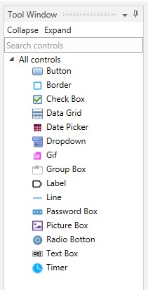
Tool Window
The form can be created using the controls provided in the Tool Window.
The controls are found under the Tool Window and can be hidden or made viewable by using the Collapse or Expand options. Currently, there are fifteen controls to begin with. Search Controls allows the user to filter search and select the required control, promptly.
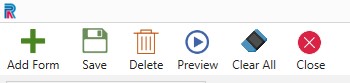
Menu
Menu comprises options such as Add Form, Save, Delete, Preview, and Close, which can be used to perform these actions. Clear All options will clear all the controls in the form.
Figure 2
What are the fields in the Property Window to design the default form?
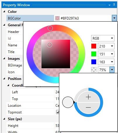
Background Color
Select the background color from the innumerable choices that are provided. Reduce or increase shade of the color as per selected percentage.
Figure 3
General Properties
Select yes if you want to give a header for the form.
Provide a name for the form. Name will be used to define values in the given form or controls during runtime. Since it is unique users can identify forms in the backend. It will be visible after saving in the Designer wizard. Provide a title. Title will be displayed during design time as well as runtime. While previewing, title will be displayed.
Images
Background Image is used to provide a background. Similarly, icon can be provided for the form.
Position
Position where your created form will be displayed during runtime by using the options available here.
Increment selection can be done in Left and Top fields to define the coordination of your form position. Or you can you select any position from the list provided in the Location drop-down.
Note: If left top coordination px is chosen, the location choices will not be enabled. So, select either one.
When Topmost check box is checked, the form will be visible on top of all opened applications in the system.
Size
Select the Height and Width as per requirements.
Figure 4
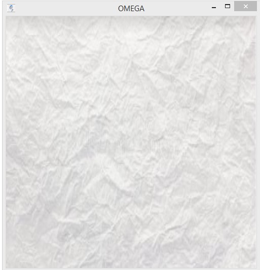
Let us preview. The form is created with the given background and icon, in the selected position and size.
Figure 5
What are the menu options?
Figure 6
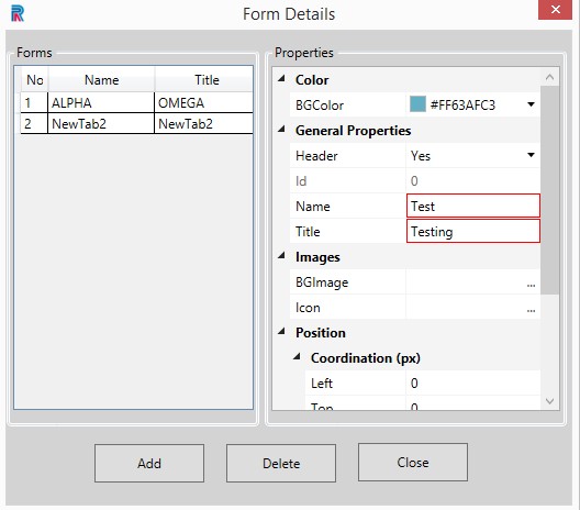
Add Form - To facilitate creating multiple forms, simultaneously. Click on the Add Form menu, fill the Form Name, Title and Add. The title will be displayed at the bottom, open the form and proceed.
Figure 7
The form will be created and displayed.
Figure 8
- Save - After creating form or form with controls or while making changes, save option is used
- Delete - if controls are chosen they will be deleted, no controls are chosen, and multiple forms are opened it will delete the selected form. If only one form is opened it will not allow you to delete it without alerting
- Preview - You can Take a sneak peek of the created form
- Clear All - Will clear all controls in the form
- Close - Will close the form or form with controls.
Figure 9
What are the controls that are available to design the form?
The user can use the following controls to design the form.
Figure 10
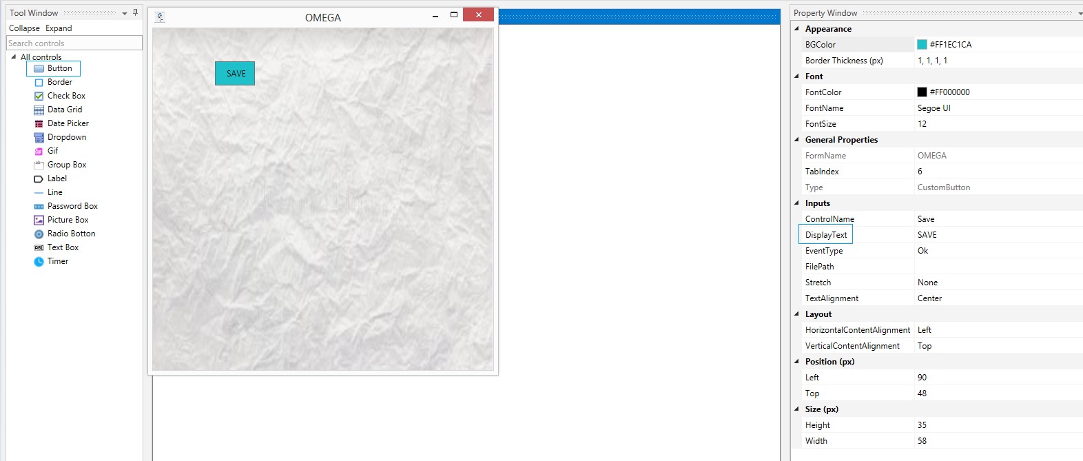
What follows is an example of creating a form using the Button control.
Click on the Form Builder to enable the General Form. Select a background, give it a name and place an icon in the form. Drag and drop a Button control on the form.
Appearance
Select the Background Color (BG Color) and Border Thickness (px.)
Font
Select the Font Color, Font Name and Font Size from the respective dropdowns.
General Properties
Provide a Form Name.
Tab index is a feature that helps the user move from one control to another, by clicking the tab in the keyboard. Provide the number as per requirements.
Type of the control is auto populated as Custom Button, since the selected control is button.
Inputs
Provide a Control Name.
Type the value in the Display Text. This will be displayed inside the button. The same can be called during runtime and the same action will be performed.
Select the type from the Event Type field.
Event Types are as follows:
- Ok
- Cancel
- Clear
Select Stretch options, such as:
- Fill
- Uniform
- Uniform to Fill
Select Text Alignment as Left, Centre or Right as you want your text in the Button to be placed.
Layout
Select Horizontal or Vertical content alignment as per requirement. This will be explained in detail in the Text Box control section.
Position(px)
Left: Increasing the count will move the control to the right side. Decreasing the count will move it to the Left side.
Top: Increasing the count will bring the control down and decreasing the count will move the control up.
Note: Numbers in Position can be selected from the dropdowns or typed.
Size(px)
Increase or decrease height and width as per requirements.
After filing all details, preview. The button is created in the form as per specifications. Save your work after creating the control.
Figure 11
Choosing the Form
Click on the Form Builder menu on the top right to access the General Form.
Figure 12
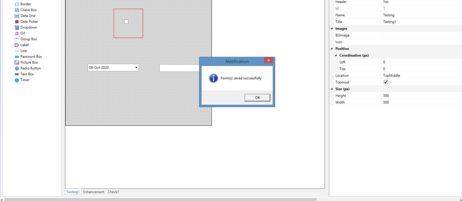
After creating customized forms with the use of the provided controls , save the form.
Figure 13
Proceed to drag and drop a Runtime activity form the FormBuilder Automation package under the Toolbox section. The created forms will be displayed in the dropdown to proceed further.
Figure 14
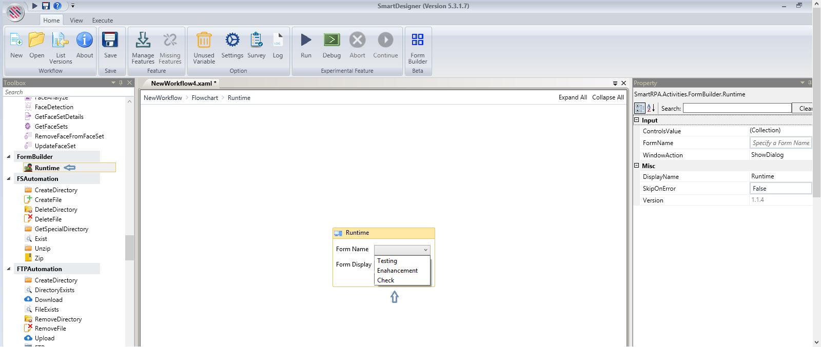
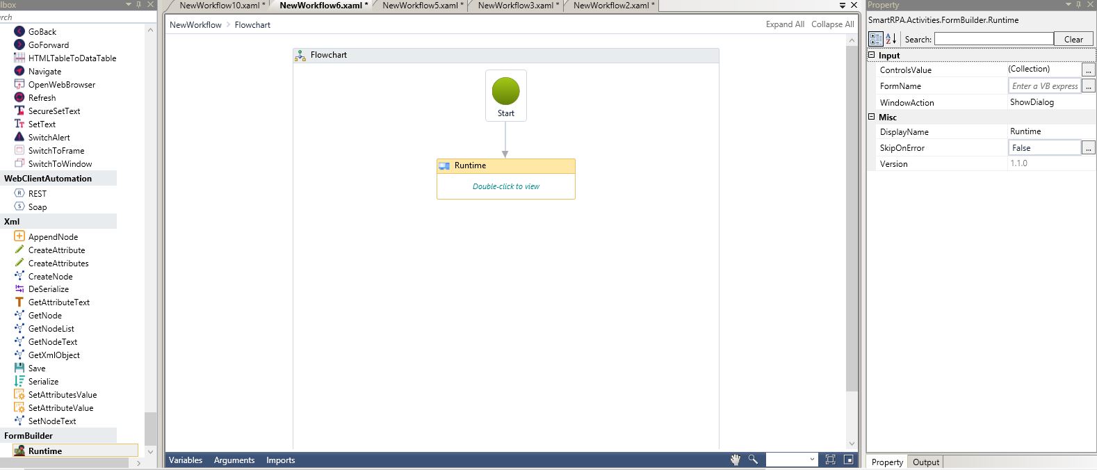
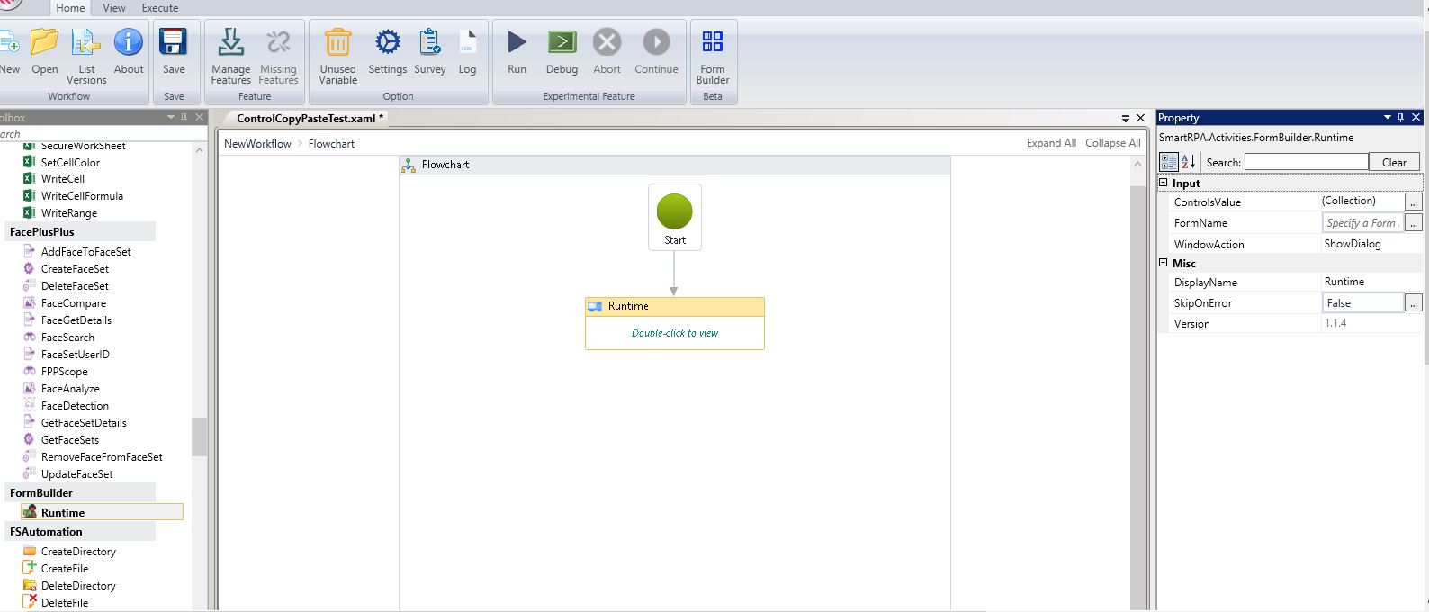
After saving, forms will be displayed in the Form Builder's Runtime Wizard. Drag and drop a Runtime activity and set it as the start node. Double-click to view.
Figure 15
The saved forms will be displayed.
Figure 16
Choose the one as per requirement and execute.
Figure 17
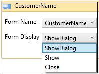
There are options in the Form Display, such as Show, which will open and show multiple forms at a time .Itwill allow users go to the next step without closing the current form during runtime. Show Dialogue will display the form and will not allow users to proceed without closing the current form. Close option will close the form.
Figure 18
Form Builder now supports declaring all field types (Boolean, String, Date Time, Integer etc.,) to variables without dictionary making for easy transfer of data within a workflow. Additionally, variable declaration is now possible within the form field property definition.
Figure 19
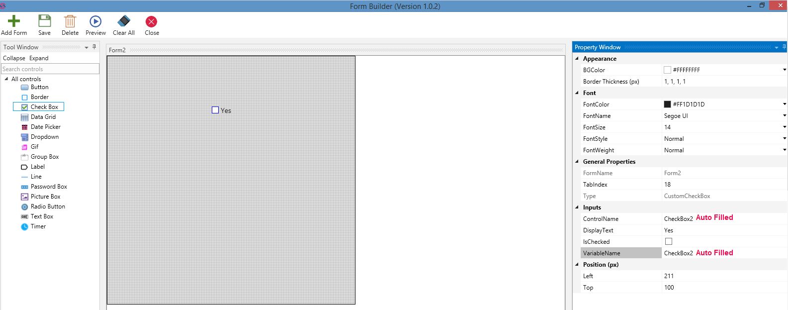
Thus, there is an option in the latest release of Form Builder 1.1.0 to create variables while creating the forms. An option is provided in the Controls’ Property Window under the Inputs field. Thus Variables can be created for controls that are used to get and set values. Controls, such as Check Box, Data Grid, Date Picker, Dropdown, Radio Button and Text box have fields to declare variables. In the following example a variable has been declared for the Text Box Control.
Figure 20
Save the Form.
Figure 21
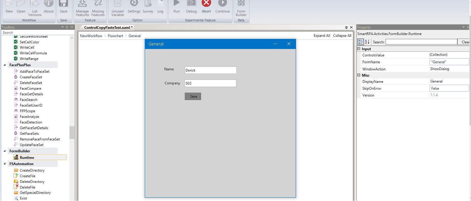
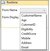
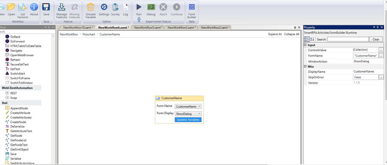
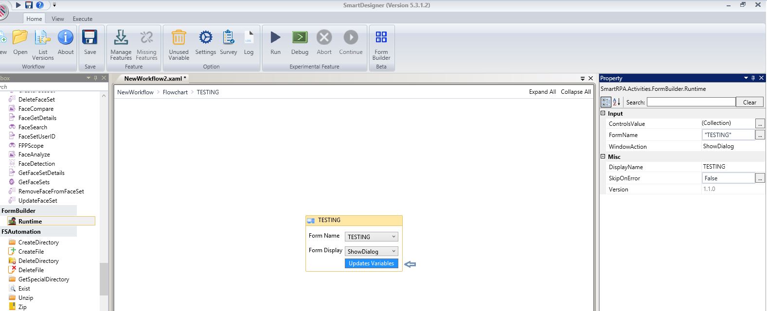
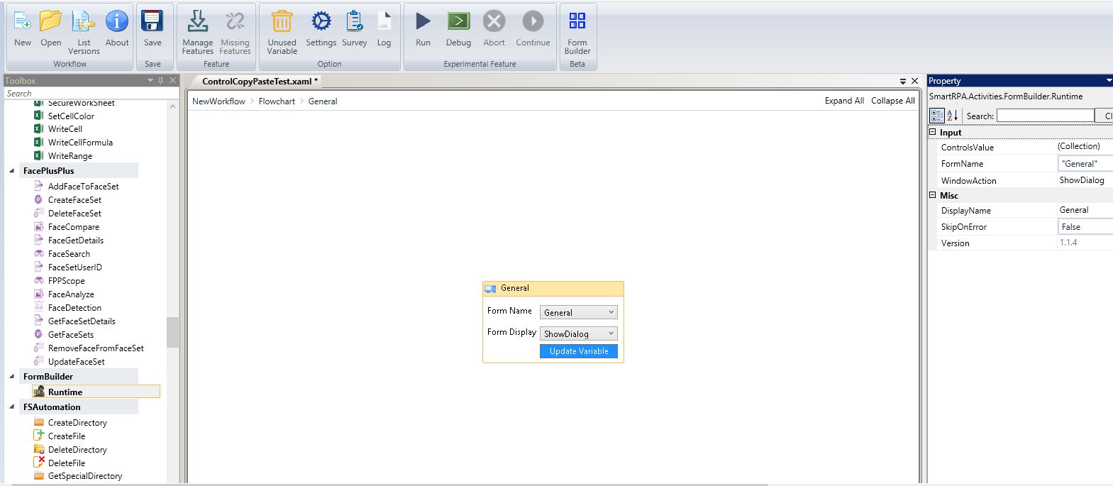
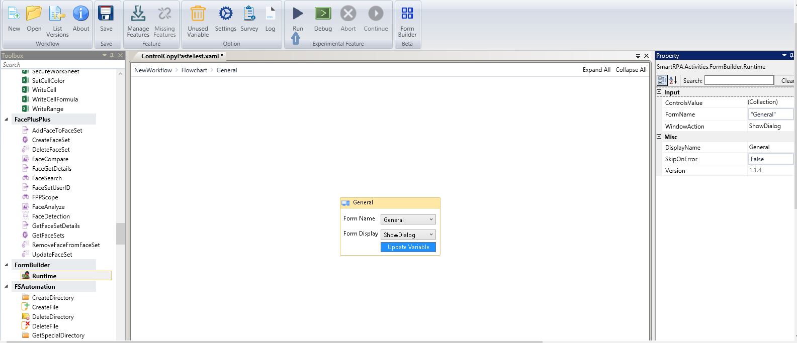
Drag and drop a Runtime activity from the Form Builder Package. Select the Form from the Form Name Dropdown.
Figure 22
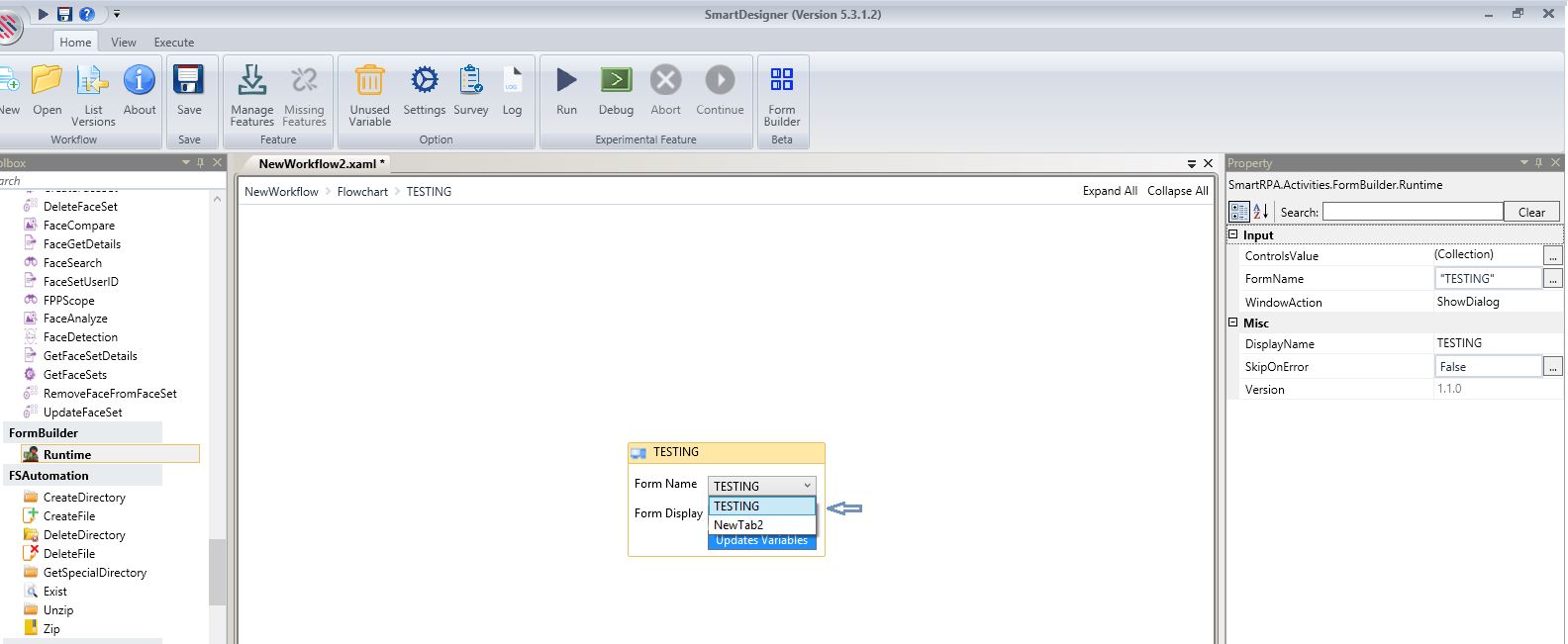
Figure 23
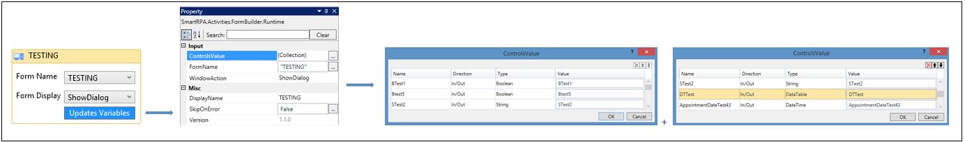
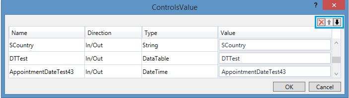
Click on Update Variables and all the created variables will be mapped against the respective controls.
They will be displayed in the Controls Value Window as well. Click on the ellipsis beside the Control Value field to enable the window.
Figure 24
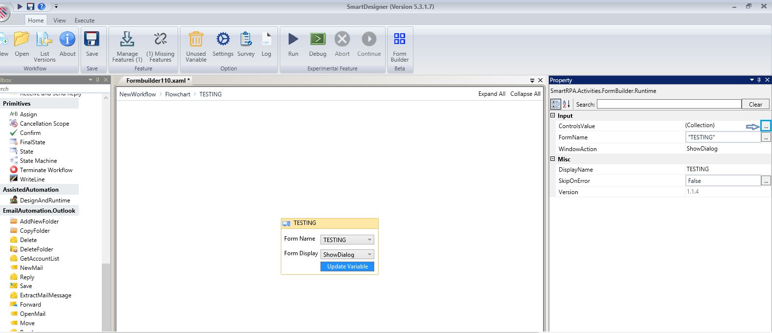
Figure 25
Additional Details
Click on Ok to close the window.
X Mark is used to delete a row and upward arrow is used to move up a row, while the downward arrow is used to move down a row.
Figure 26
Executing the Form
Figure 27
Create a form and save.
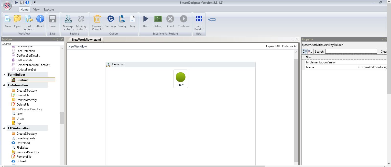
Drag and Drop a Runtime activity on the flowchart from the FormBuilder package listed under the toolbox. Double-click on it to enable the General window.
Figure 28
Choose the form that you want to execute from the dropdown.
Figure 29
Execute.
Figure 30
The form will be displayed.
Figure 31