The first control in the Tool Window is Button.
Button
Drag and drop a Button control on the custom form.
Appearance
Select the Background Color (BG Color) and Border Thickness (px.)
Font
Select the Font Color, Font Name and Font Size of the text from the respective dropdowns.
General Properties
Provide a Form Name.
The Tab Index property of a control determines where it is positioned in the tab order. By default, the first control is defined as a Tab Index value of 0, the second has a Tab Index of 1, and so on.
Type of the control is auto populated as Custom Button, since the selected control is button.
Inputs
Provide a Control Name.
Type the value in the Display Text. This will be displayed inside the button. The same can be called during runtime.
Select the type from the Event Type field. The same action will be performed during runtime .A detailed explanation is given at the end of this section.
Event Types are as follows:
- Ok
- Cancel
- Clear
Use File Path(ellipsis) to browse and add an icon.
Select Stretch options, which are as follows:
- Fill
- Uniform
- Uniform to Fill
Select Text Alignment as Left, Centre or Right as you want your text in the Button to be placed.
Layout
Select Horizontal or Vertical content alignment as per requirement. This will be explained in detail in the Text Box control section. Please refer Text Box control's section.
Position(px)
Left: Increasing the count will move the control to the right side. Decreasing the count will move it to the Left side.
Top: Increasing the count will bring the control down and decreasing the count will move the control up.
Note: Numbers in Position can be selected from the dropdowns or typed.
Size(px)
Increase or decrease height and width as per requirements.
After filing all details, preview. The button is created as per specifications. Save your work after creating the control or choose to save it after all controls have been created.
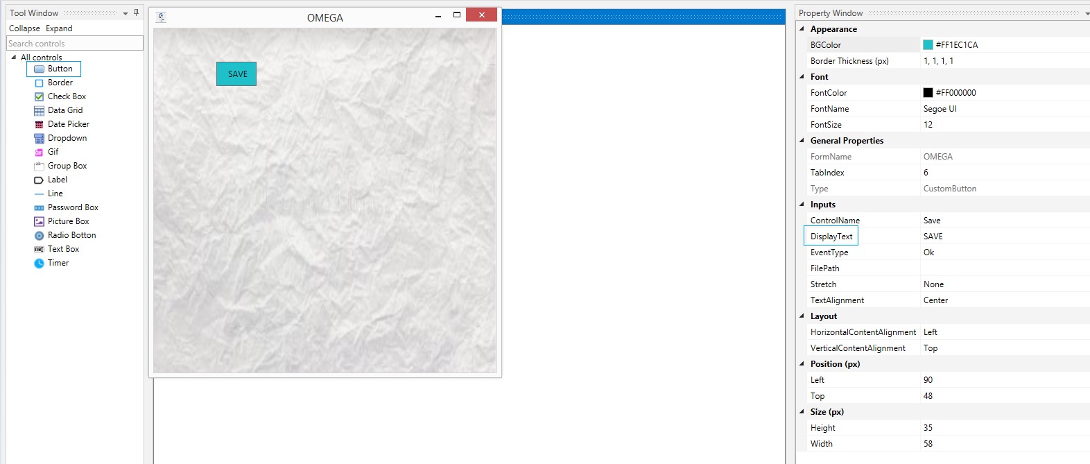
Figure 1
How to place an image in the button?
File Path
Specify the file's location path in the FilePath field, so the image gets displayed, inside the button.
One can increase or decrease the height and width of the button using the options provided under the Size header. Likewise, increase or decrease font size by selecting the options under Font header.
Stretch in Button
The images can be positioned or aligned using the options provided in the field, named Stretch. The options are explained below.
Fill

Figure 2
Uniform

Figure 3
Uniform To Fill

Figure 4
None

Figure 5
Text Alignment in Button
Text alignment options are used to align the text to the Left, Right, and Center.
Left
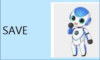
Figure 6
Right
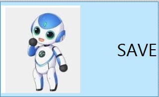
Figure 7
Center
Figure 8
Button can be used to depict only images as well. If no value is given in the Display Text box and only image is chosen, button will be displayed as an image.
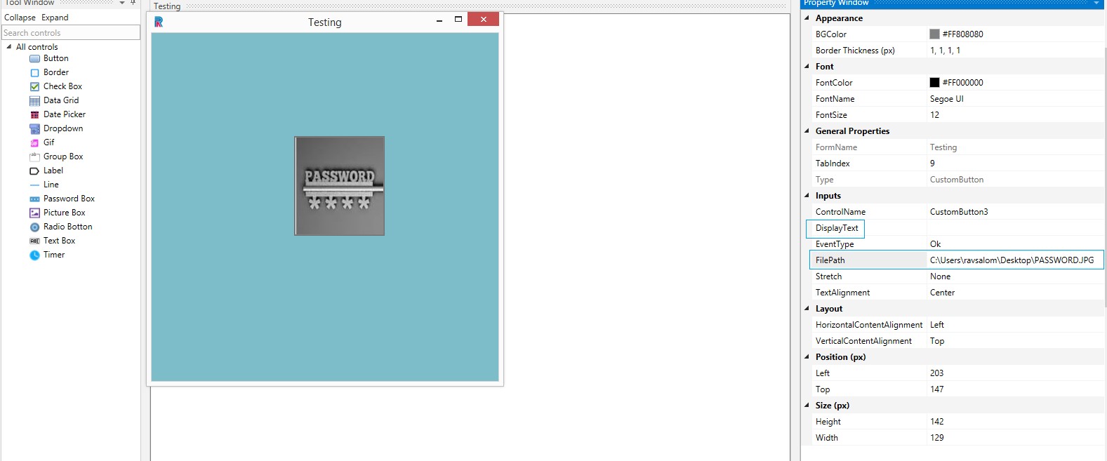
Figure 9
Event Type
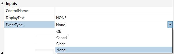
Figure 10
Actions
Let us assume you have created a form with the given action sequence as displayed in the following image:
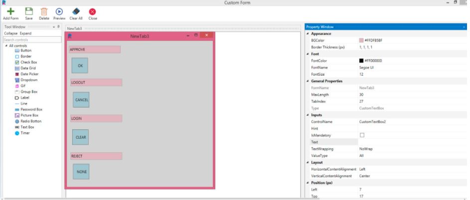
Figure 11
Upon clicking Ok, the values will be saved in the preview form and subsequently in runtime to do the corresponding action.
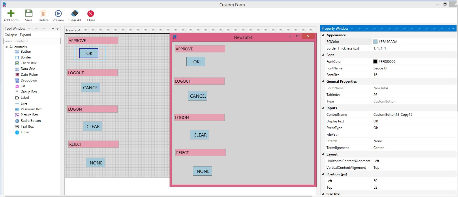
Figure 12
Clear will clear all the input values in the control in the preview and runtime.
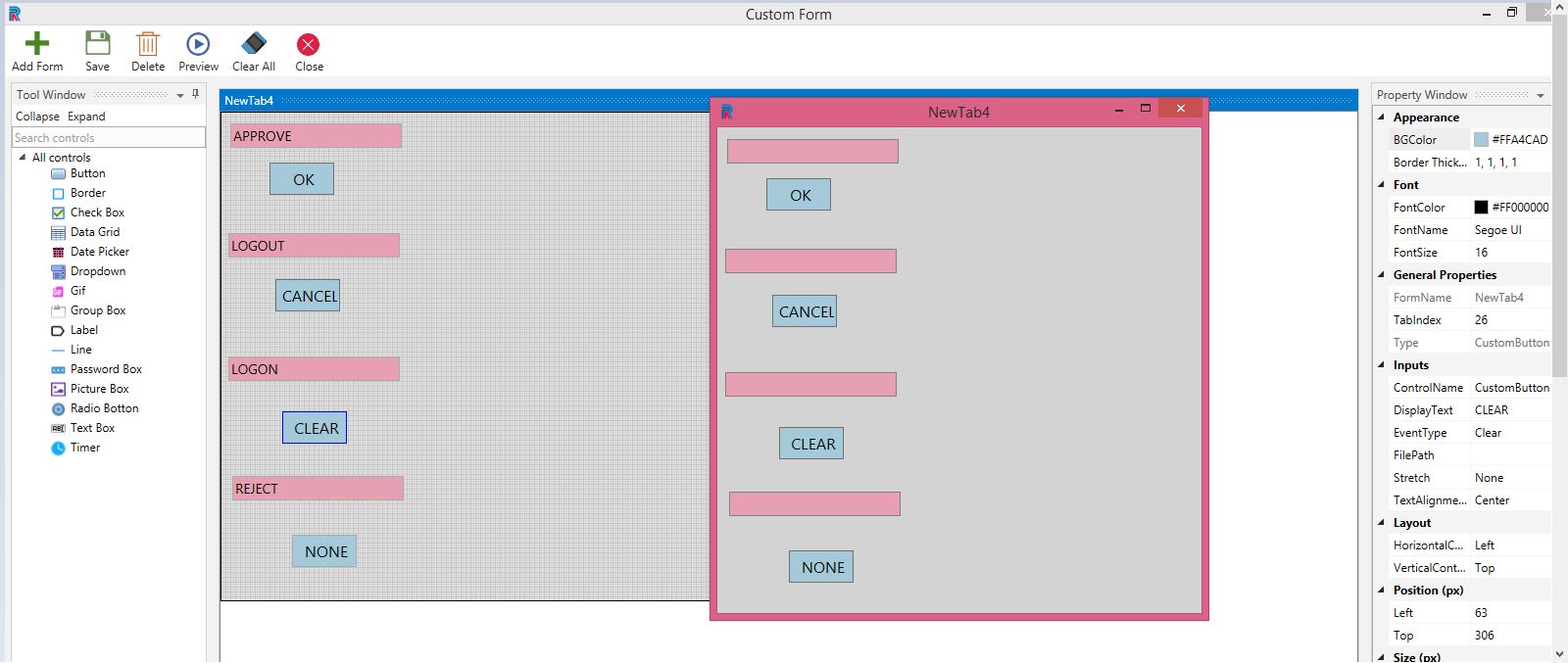
Figure 13
Cancel will clear all the values in the control and close the preview window as well.
None will not do any action. This option is made available when button has only images without any action sequence.
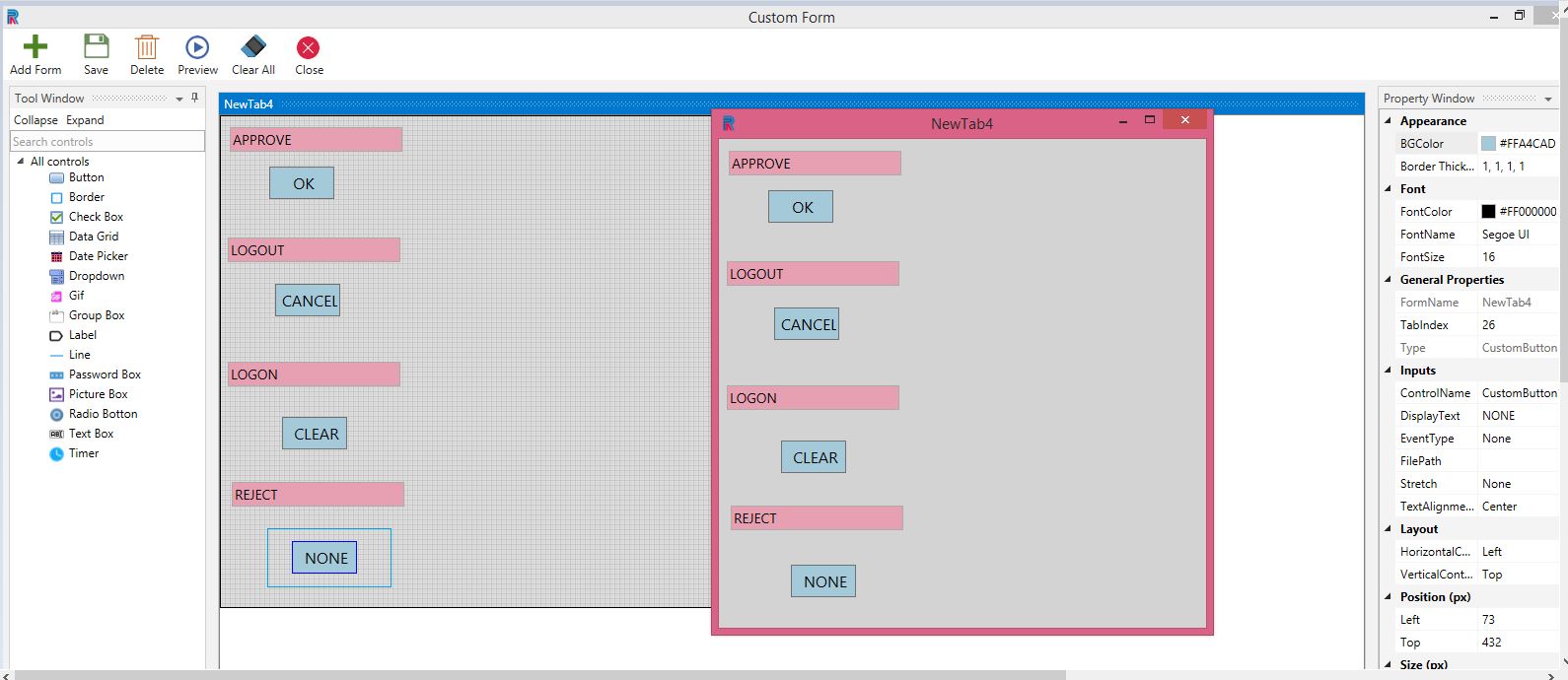
Figure 14
Note: Click on the event types in the preview window for the aforementioned actions to be implemented.