Label
This control is provided to give a header or label.
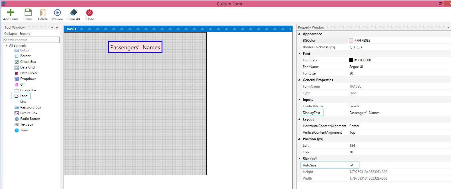
Drag and Drop a Label control on the custom form. Proceed to fill in the requirements in the respective fields.
From the Appearance options select the Background Color and Border Thickness.
Select the Font Color, Font Name and Font Size from the respective dropdowns.
The Form Name remains the default name. One can provide a new name. Here, it is given as Travel.
Tab Index is a feature that helps the user move from one control to another, by clicking the tab in your keyboard.
Type of the control is auto populated as Label, since the selected control is label.
Type the Control Name.
Type the value in the Display Text.
Select the Layout Of The Horizontal And Vertical Content Alignment.
Position your control as follows:
Left: Increasing the count will move the control to the right side. Decreasing the count will move it to the Left side.
Top: Increasing the count will bring the control down and decreasing the count will move the control up.
Note: Numbers in Position can be selected from the dropdowns or typed.
You have a default Size that is predefined for the label control. If you want to fix your own height and breadth for the label, you can do so by unchecking the Auto Size check box.
Save.