Data Grid
An entire data table can be bound and made to be displayed using the data grid control. Additionally, date picker and drop down can be added here as well. You can use the collapse and expand options against each tab.
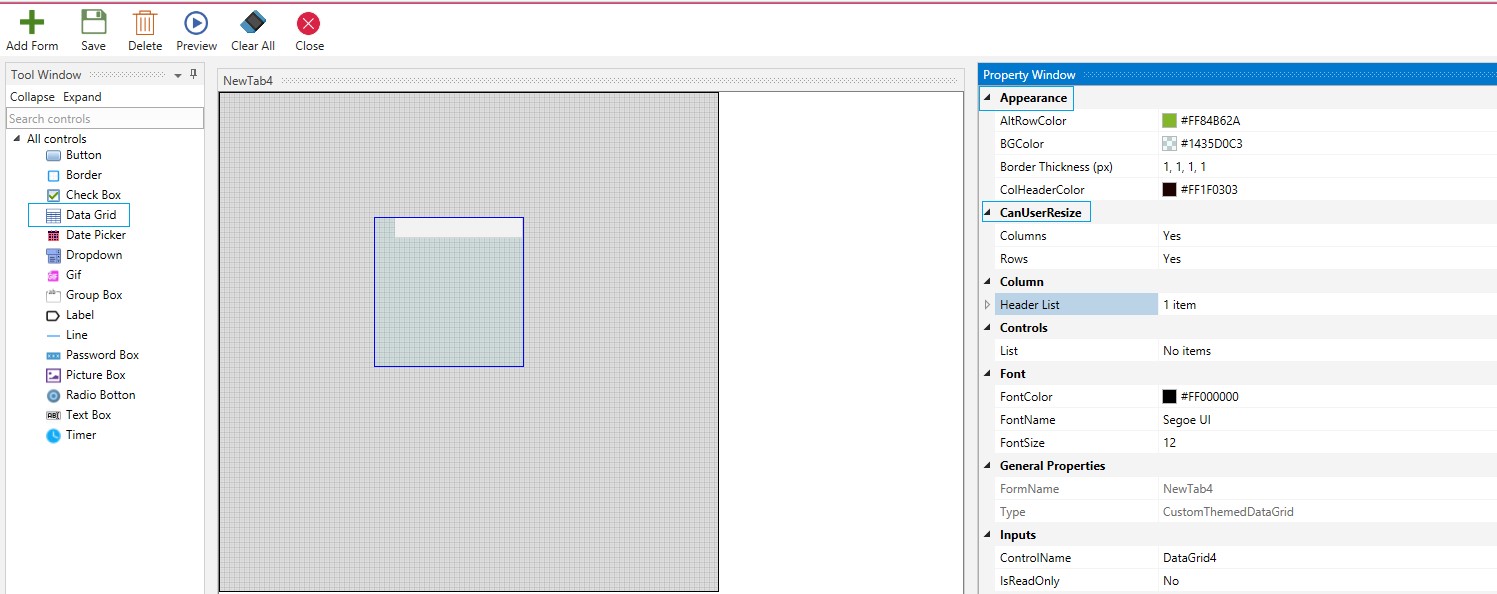
Drag and Drop a Data Grid control on the custom form. Since the data grid will contain rows and columns, many options are provided to customize for optimal output.
Appearance
Select the Alternate Row Color, Background Color, Increase your Border Thickness as required, and provide a Column Header Color. If you want to Resize The Columns And Rows select Yes.
Figure 1
Column
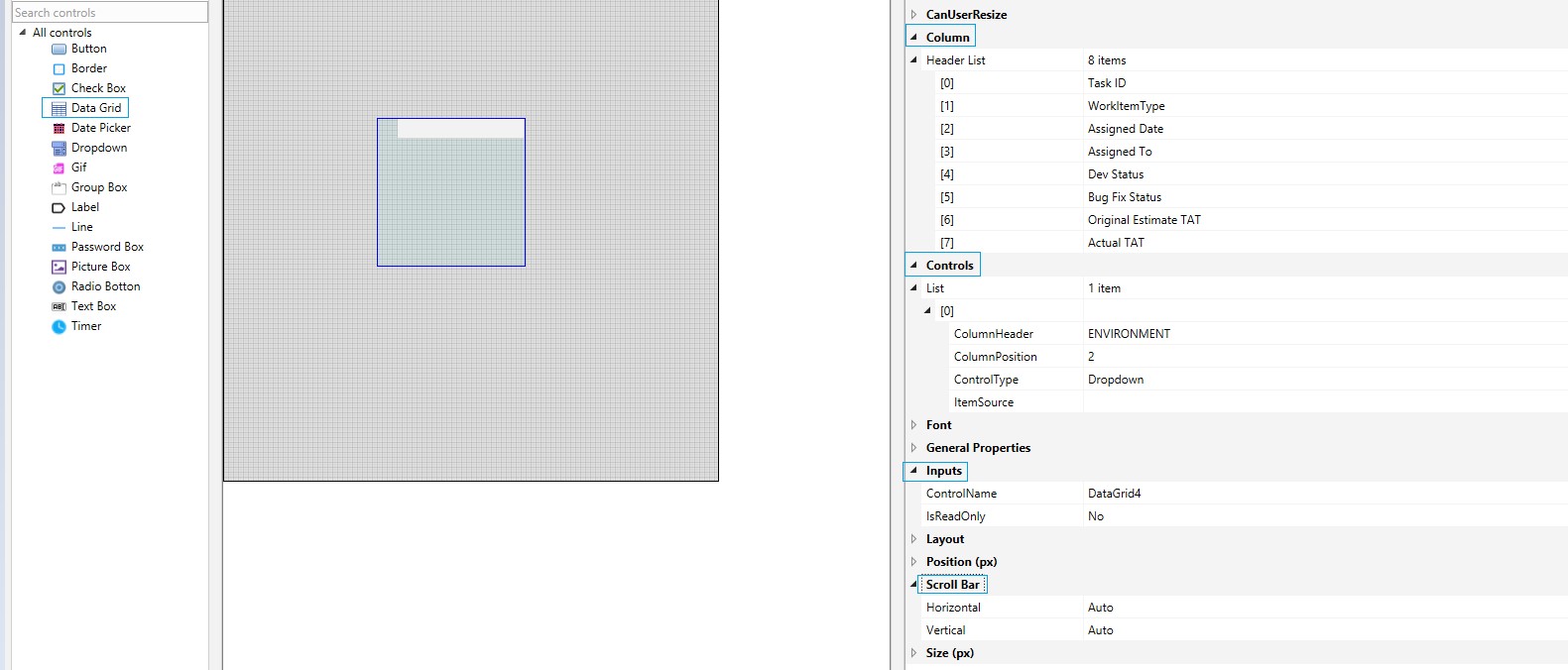
You can select the names of all columns' Headers in the Data Grid and it will be populated as designed, using the Column option. Click the Plus symbol and add items. Proceed to fill the headers' names adjacent to each created item.
Controls
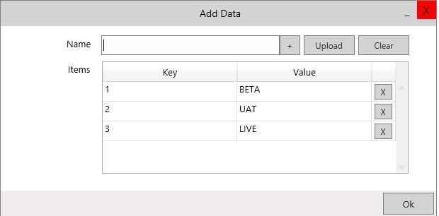
There is a choice to include date picker and dropdown in the grid. This is available under the Controls option. Expand the control tab to view List. Provide the column header and where you want it to be positioned. Select the control type (Dropdown or date picker). In the following example dropdown is selected. Click on the points of ellipsis, at the end of the Item Source field. It will open the Add Data window. Proceed to fill the names. Click on the ok button. These items will be added to be displayed in the dropdown of the grid.
Figure 2
Font
Select the Font, its Size And Color.
General Properties
They are read only and will reveal the name of the control and Form Name.
Inputs
Select Yes if you want it to be displayed as Read only or if you want to edit, then select No.
Layout
Choose Left /Right Content Alignment For Horizontal And Vertical Positioning.
Position
Choose the Position of the grid as left, right, top, and bottom.
Scroll Bar
This gives you an option to provide Horizontal and Vertical Scroll Bars for the DATA Grid. Select the one that best suits your requirement.
Figure 3
Size
Select the Height and Width.
After all fields are filled, Save.
Figure 4


