Let us take a quick walk- through of all menus in SmartDesigner.
How to access the menus in SmartDesigner?
SmartManager--> Choose A Tenant -->Products--> SmartDesigner -->Download SmartDesigner-->Complete Installation Process-->Log into SmartDesigner
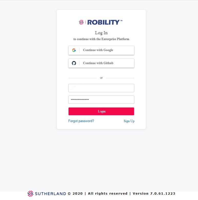
First, Login to SmartManager.
You can use the Github and Google options if they are enabled.
Figure 1
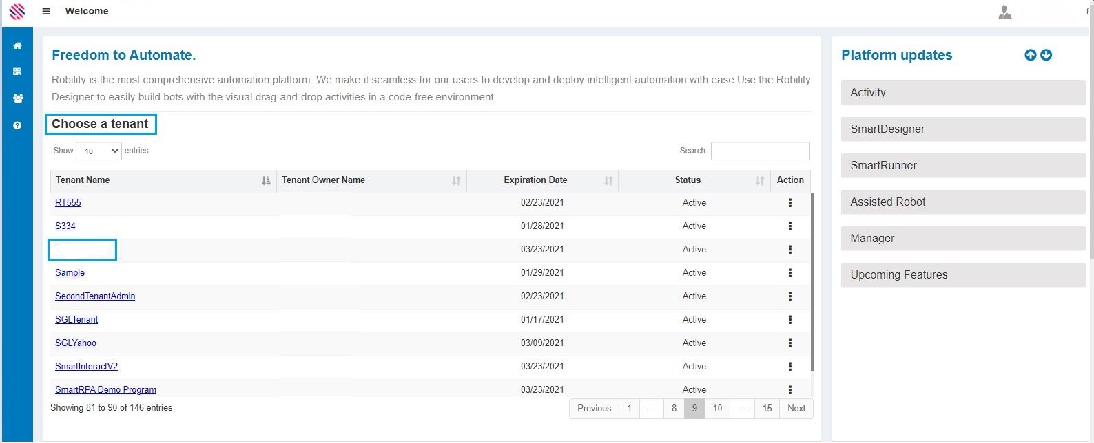
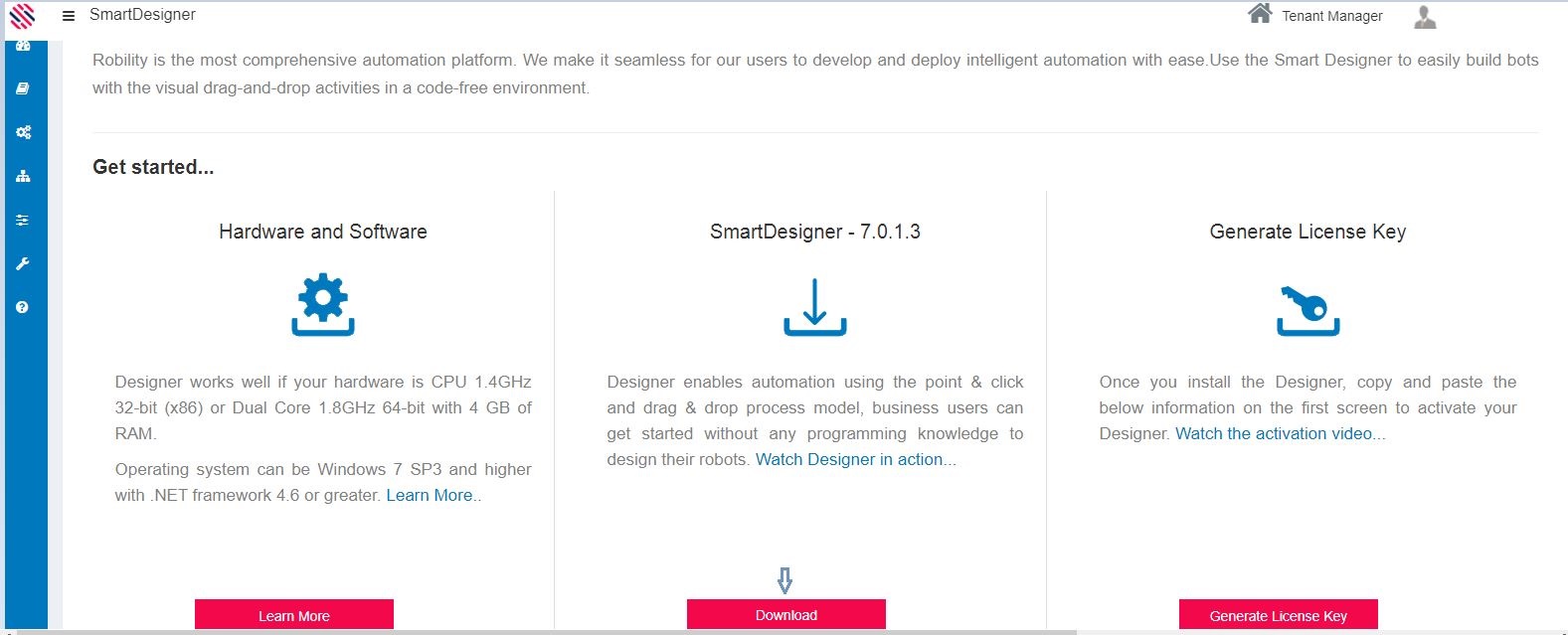
Choose the Tenant name by clicking on it. Select SmartDesigner sub-menu from Products menu.
Figure 2
Select the SmartDesigner sub-menu from Products menu. Download the latest version of the SmartDesigner and complete the installation process.
Figure 3
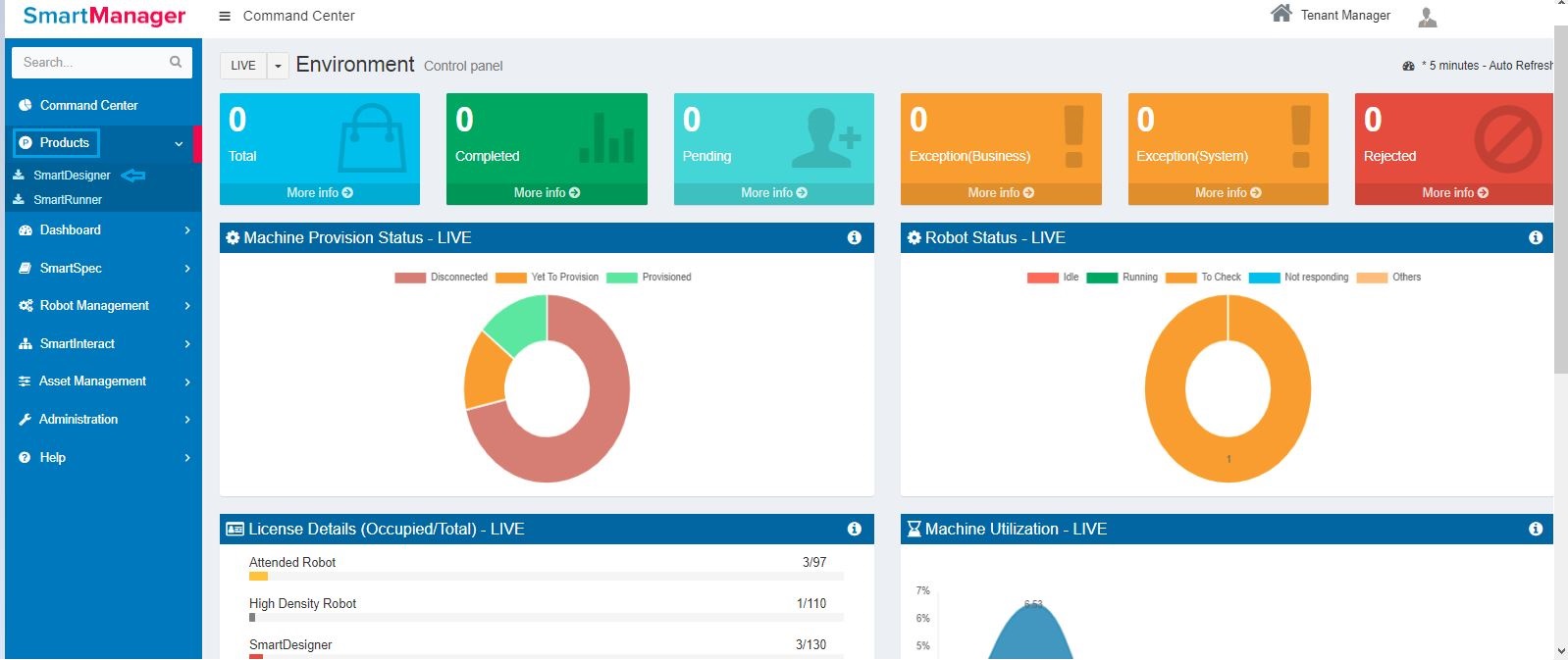
Download the latest version of the SmartDesigner and complete the installation process.
Figure 4
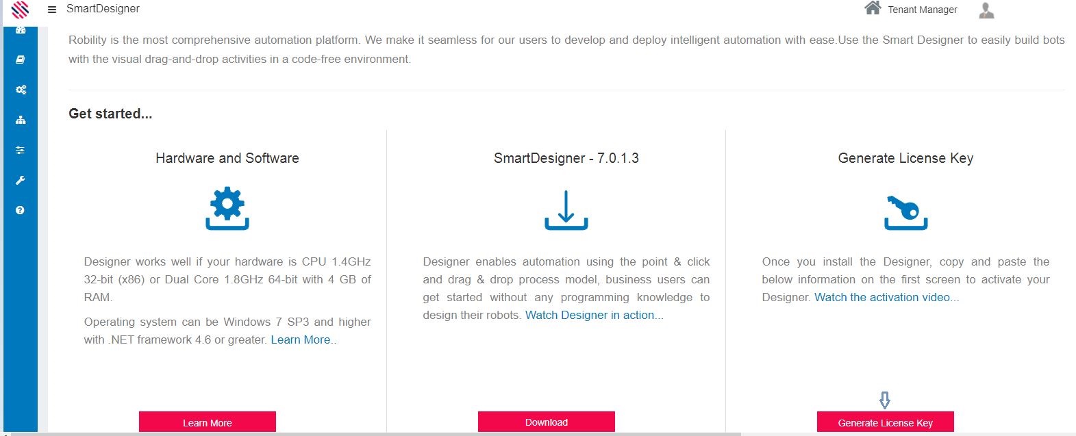
Click on the Generate License Key text box.
Figure 5
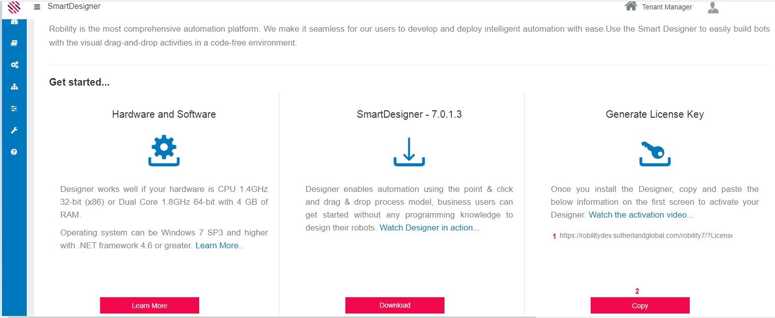
(1) License Key will be Generated--> (2) Click on the Copy option.
Figure 6
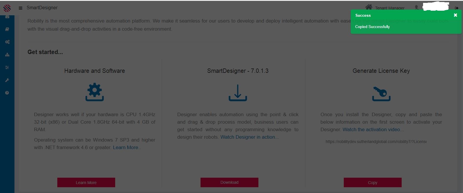
License key will be copied.
Figure 7
(1) Paste the License Key in the appropriate tab.(2) Activate.
Figure 8
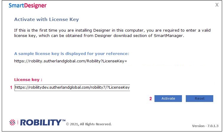
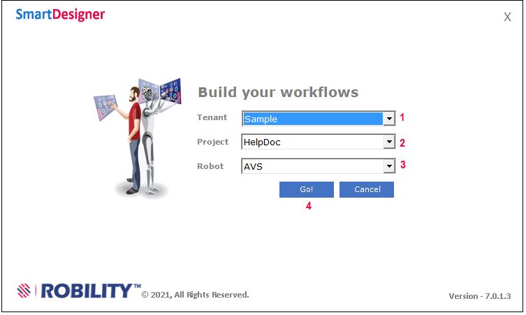
Figure 9
(2) Select the Project.
(3)Select the Robot.
(4)Click on the Go button.
Figure 10
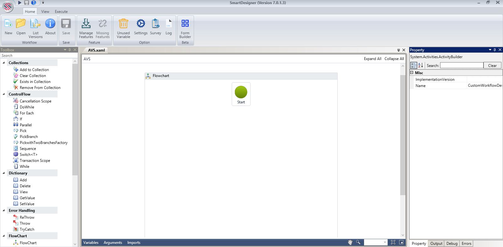
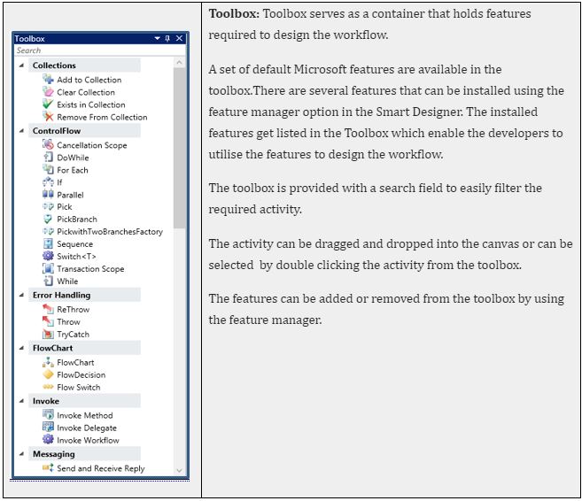
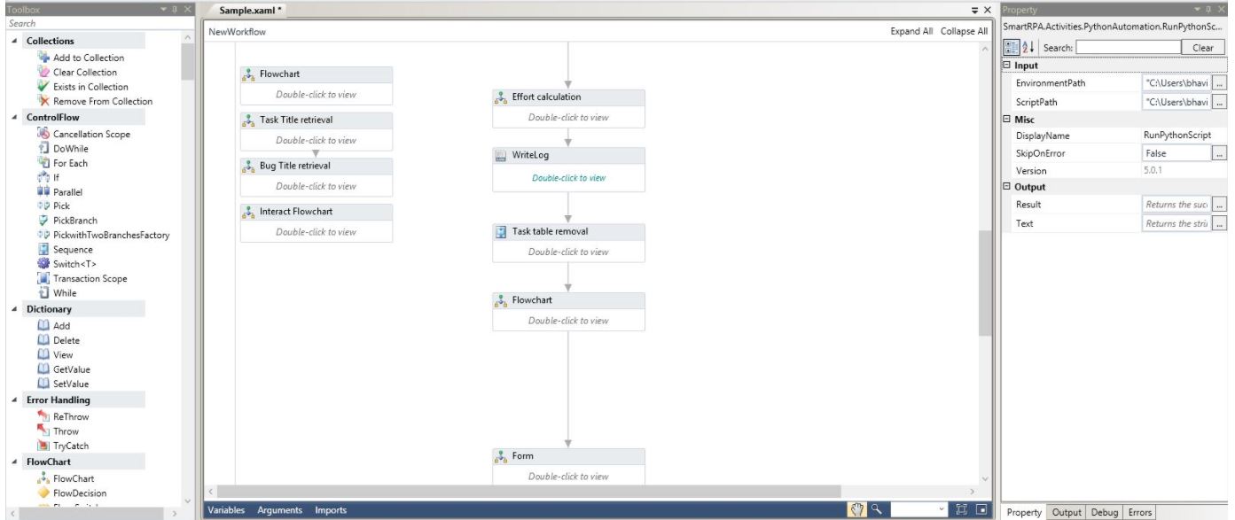
The landing page comprises a Toolbox on the left. The middle area (canvas) is initially a blank screen where the user can drag and drop activities from the toolbox and build workflows. The Property Window on the right is where the parameters relating to each activity are configured.
Figure 11
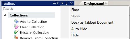
Window Dock
The drop-down has options such as dock, float, hide and auto hide the window.
The dock option is used to place the window adjacent to the workflow canvas.
Float option helps in dragging or placing the window anywhere in the screen.
Hide option helps hide or remove the window from the screen.
Figure 12
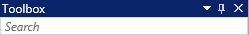
Pin & Unpin:
Use the Pin option to pin or unpin the toolbox pane, quick navigation tab, as well as activity property, output, debug and errors tabs.
Figure 13
Figure 13.1

Run, Save & User Manual
The dark blue arrow shaped button is the Run option that facilitates running or executing workflows. Save button is just next to it to save your workflows.
Help Button with the question icon - Directs you to a user manual with comprehensive explanation for activities that help build workflows.
Figure 14
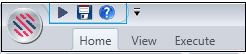

Figure 15
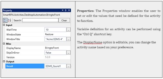
Property
Figure 16
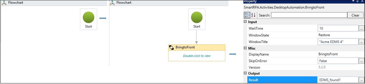
Figure 16.1
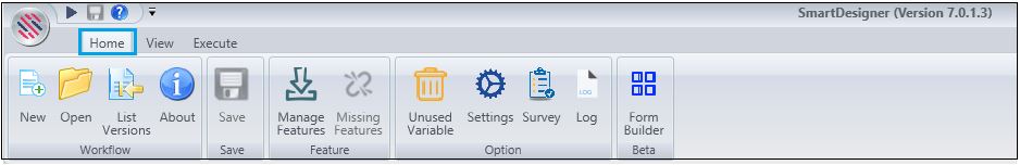
The Home tab comprises sub-menus such as Add a new workflow(New), Open a workflow(Open)Display the previous version of the workflows (List Versions),Provide you with details of the workflow(About)Save workflows. Download and manage the features as per requirements(Manage Features).
You also have an option to view Missing Features and to Remove Unused Variable. Settings menu gives you instant information about your connection. You can take the Survey to provide your invaluable feedback about Designer.
Access the log information seamlessly by using the Log menu. Download The Form Builder to use the Form Builder that is available as a menu.
Figure 17
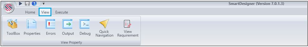
The view tab helps you enable the Toolbox tab, Properties, Errors, Output, Debug and Quick Navigation windows. It also allows users view the requirement document using the View Requirement sub-menu.
Figure 18
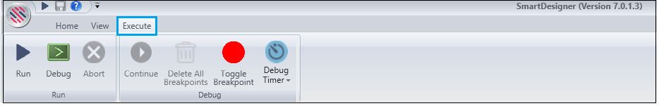
Execute menu has menus to execute or Run the workflow. Debug menu displays the debugged information of each activity that is executed. Terminate the executing workflow using the Abort menu.
Continue menu resumes the execution after a Breakpoint. Delete All Breakpoints menu will delete all breakpoints in the workflow. Toggle Breakpoint enables or disables breakpoint for debugging. Debug Timer is available.
Note: Breakpoints allow you to intentionally pause a workflow when it reaches a specific location or process step. The workflow automatically pauses whenever a breakpoint is reached if the workflow debugger is attached.
Figure 19
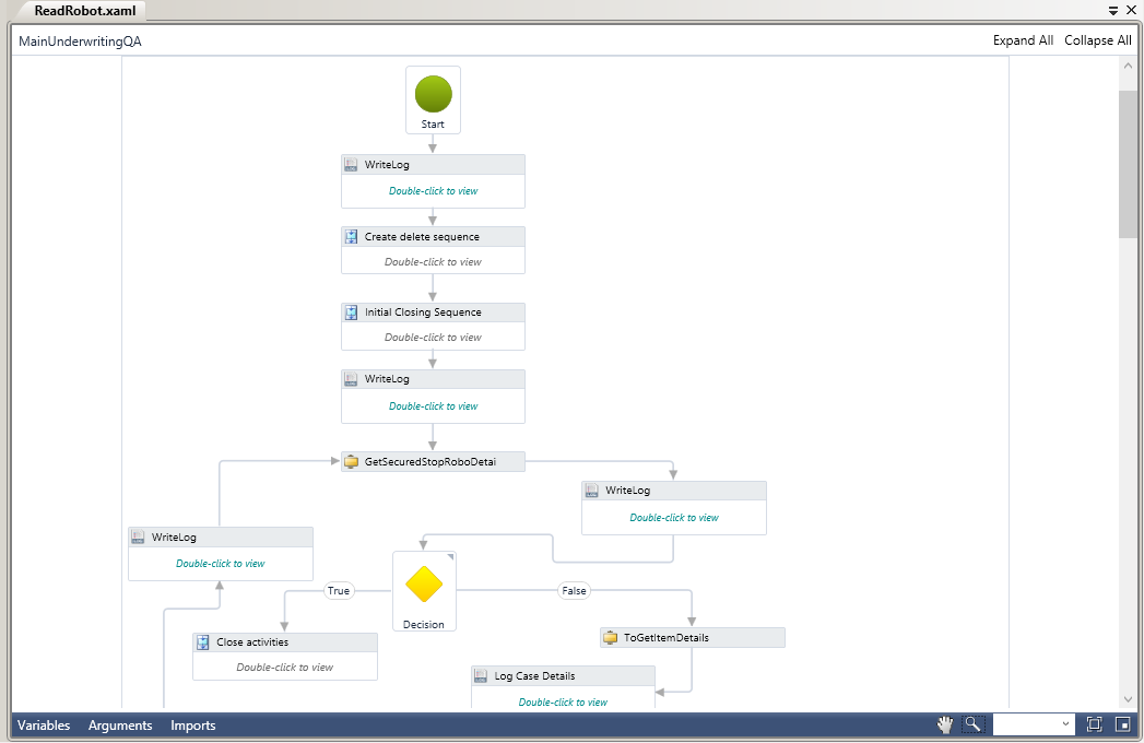
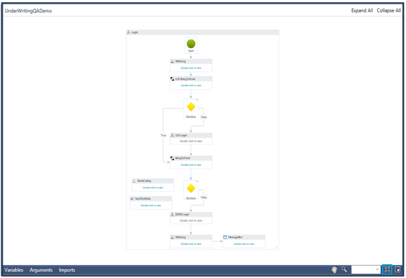
Designer Pane is the place where one can visually arrange activities in a desired sequence. It enables you to make changes and provides quick access to variables, arguments and imports. This is where users assemble the sequence of activities. One can also re-arrange the sequence of activities.
Figure 20
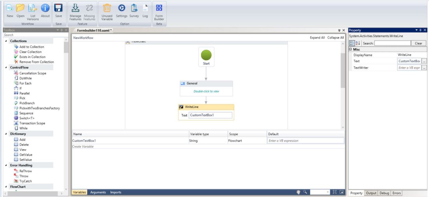
The variables are used to store values of different data types. It supports datatypes like text, number, object, array, data table, etc.
You can also create the variable by using the "Ctrl Q" shortcut key. The datatypes of the variable are auto detected.
Make sure the designer pane contains at least one activity to create a variable. The variable that is created will be seen in the variable pane of the designer.
Figure 21
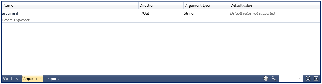
Arguments are used to pass functions from main to the child workflow and vice versa. It can be defined with specific directions.
Directions:
In This is defined to indicate that the argument is given as an input to a sub-workflow and the argument can only be used within the given project.
Out This is defined to indicate that the argument is used to store data that is received from a sub-workflow and the argument can be used to pass data, outside of a given project.
In/Out This is defined to indicate that the argument is used to supply input to a sub-workflow, as well as receive data from a sub -workflow and the arguments can be used both within and outside of a given project.
Figure 22
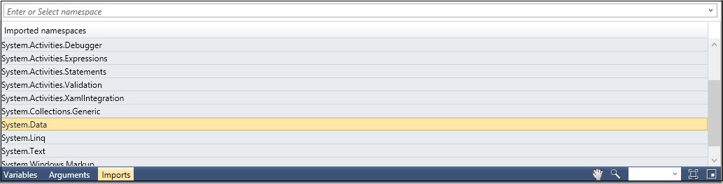
Imported Namespace is used to import the class of elements that are available in the namespace. All imported namespaces are displayed in the Import Panel.
For instance, if you have imported the System. Data namespace, you can use the DataTable, Data View, Data Column, Data Row and other classes that are available in the namespace.
Figure 23
Additional Options
The additional options comprise the following:
Figure 24
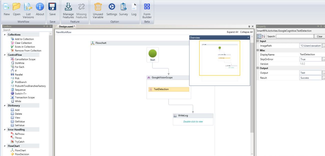
Overview
Figure 25
The Overview option facilitates an overview of the flowchart.
Figure 25.1
Fit to Image
Figure 26
Fit to Image option fits the entire workflow within a frame and displays as a single image, for easy reference.
Figure 26.1
Zoom
Figure 27
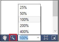
One can reset zoom to get a wide/narrow view of the workflow.
Figure 27.1
Toggle
Figure 28
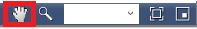
One can move the canvas to the right or left, up and down and navigate to any part, using this option.
Figure 28.1
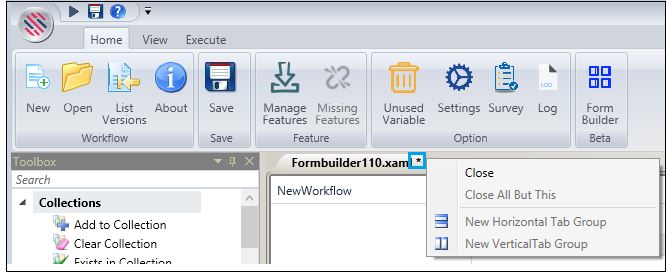
A workflow can be closed, and other subsequent options can be availed when you have more than one workflow opened. Right click on the star icon next to the selected workflow to enable the options.
Figure 29
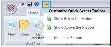
Click on the highlighted button to enable options to customize the Quick Access Toolbar.
Figure 30