This section explains how to create widgets for the indexed report. The widget configuration enables one to build custom widgets to report the count of transactions in respective queues and environments.
Some of the key features of Widgets are as follows:
- Display data in a pivot table and perform operations on the grid or visualize data using pivot charts
- Use the drag & drop interface in the Field List to compose reports and add calculated measures
- Filter the dataset, sort the records, or drill through non-aggregated data
- Use the Toolbar to access features
To access the module use the left-hand menu bar.
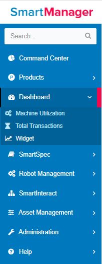
Figure 1
Dashboard-->Widget
To create a new widget click on the Add button.
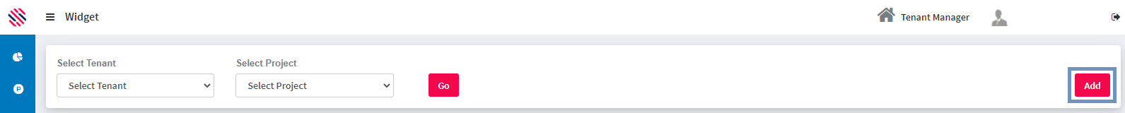
Figure 2
Select the Report Name, Environment, Tenant, Project, Report Duration, Chart Type. and Refresh Time. Provide a Name for the Widget. Start your Grid actions using the options such as Export, Format options and Fields. Use the Full Screen option to adjust screen settings as preferred. Save.
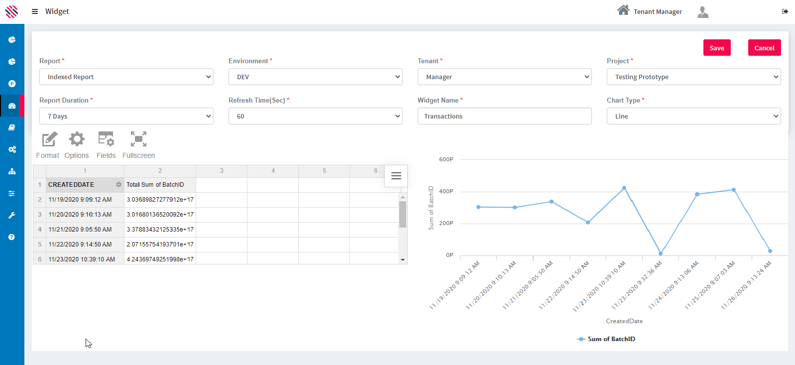
Figure 3
One can set the refresh seconds duration from the options in the dropdown.
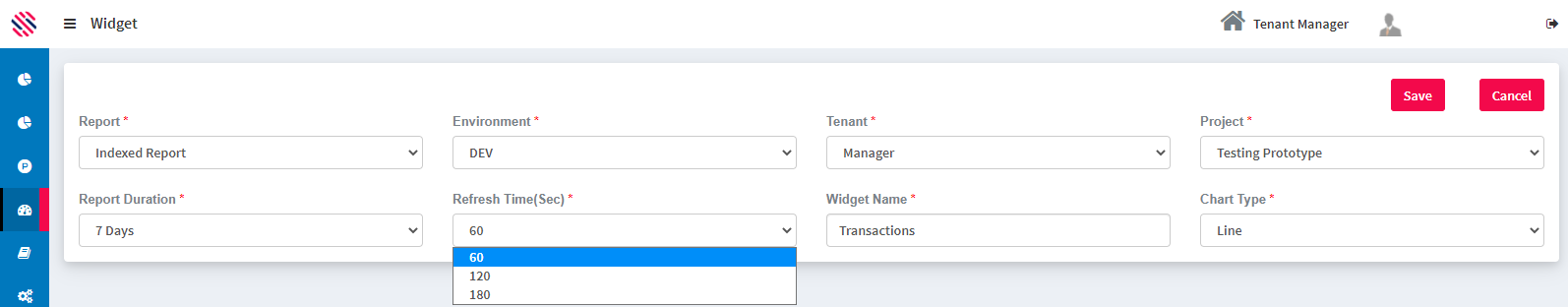
Figure 4
There are two options in the Report Duration dropdown and they are as follows:
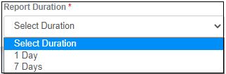
Figure 5
Grid controls offers provision to perform operations directly on the grid.
- Display as many hierarchies for rows, columns, and report filters as you need on the grid
- Drag hierarchies between columns, rows, and report filters
- When there is more than one hierarchy in a row or column, expand or collapse the inner values by clicking the icon on the left of the cell
- Drill up & down multi-level hierarchies by clicking the icon on the right of the cell
- Filter values by clicking on the hierarchy name
- Show or hide totals and grand totals on the grid
- Sort values by using the controls on the right of each hierarchy member name or the total cells
- Double click to drill through a cell to non-aggregated data
- Resize columns and rows by dragging the header boundaries; double-click on column or row headers to set them to the default size
- Select cells on the grid, copy the content and paste it directly into a spreadsheet; for example, Excel
- Use the Toolbar to switch between the compact, classic, and flat view.
Field List
The Field List can be used to define which data is shown on the grid or charts. This tool can be accessed by clicking the diagonal arrow in the upper right corner of the component or from the Toolbar.
On the left side of the Field List, you can find all the hierarchies from the original data source. When the list of hierarchies contains more than 50 elements, a search bar appears to help you find items. If the data source contains hierarchies with more than one level, the Expand All option is added to the top of the left part of the Field List.
Drag & drop hierarchies from the left part of the Field List to Rows, Columns, Values, or Report Filters boxes. The hierarchies can be dragged between these boxes. Each box can have as many hierarchies as you wish. The order of the hierarchies inside the box can also be changed by dragging and dropping. It is also possible to include any level of a hierarchy, as well as all its sub-levels, in the rows or columns.
Values are typically placed in columns but can also be dragged to rows. Each value requires an aggregation function applied to it. Depending on the data source type, numeric hierarchies support between seven and 13 different aggregation functions. String hierarchies can also be selected for values, but the only available aggregation functions are count and distinct. By default, numeric hierarchies are aggregated using sum and string hierarchies use count. You can change the aggregation function by pressing the sigma icon and choosing a new one. Choose Add calculated value at the top of the Field List to add a calculated value.
Calculated Measures
Widget provides an interface for adding and editing calculated values. Click on Add calculated value inside the Field List and a pop-up window for adding the new value will appear. If necessary, enter the value’s name, then compose the formula by clicking on operators and dragging the existing values into the formula box. Select the Calculate individual values’ checkbox to calculate the formula using raw values. Click APPLY and the new value will be added to the Field List. It will be already selected in the values box and ready to be displayed in the component.
All calculated values are gathered in one folder - Calculated Values in the All Fields section. Edit the calculated value by pressing the sigma icon next to the value name. The pop-up window for editing the value will appear. Change the formula, update the name if necessary, and click APPLY to save changes. Remove the calculated value by clicking the recycle bin icon at the top of the editing pop-up.
Filtering Controls
Each hierarchy on the grid has a gear icon on the right. It provides access to the Filter with options for the selected hierarchy. The Filter can be accessed through the hierarchies context menus as well.
Under the hierarchy name, there are alphabetical and reverse alphabetical controls, that define the order of hierarchy members. For OLAP data sources, alphabetical ordering is the order that was defined inside the cube, and reverse alphabetical ordering is just the reversed order of the one that was defined inside the cube. For all other data sources, these controls apply actual alphabetical and reverse alphabetical orders accordingly. Deselect both controls and members will be displayed in an unsorted order.
The next feature in the window is TOP 10. It performs filtering by values where only N top (or bottom) elements are displayed on the grid. Clicking on TOP 10 will open a sub-menu with additional options: the first field for entering the number of the top or bottom values to show, top or bottom value selection, and a drop-down with available measures.
The Select All checkbox helps to select or deselect all members at once. Members can also be selected or deselected manually. A search bar helps to find members by their names when there are a lot of members in the hierarchy. After the manipulations press APPLY to see the changes on the grid.
Sorting Controls
A specific row or column on the grid can be sorted using sorting arrows. Find these arrows on the right of each hierarchy member name or total cells. Click for the first time to sort descending, for the second time to sort ascending. Also, these options are accessible through the context menu of each hierarchy member or total cell. Remove sorting via the context menu.
Drill-through
Each number on the grid or element on charts represents one or more records from data. Click twice to drill through the cell or graphic element to the non-aggregated data. A pop-up will be opened with the list of records from which the value is composed. At the top of this window, there are the details of the value: column name, row name, and the value itself.
The Field List is available for this pop-up as well. Use it for adding or removing fields from the drill-through view without changing the slice for the grid. Another way to open the drill-through view is through the context menu of the element.
Reports based on CSV and JSON data offer editing feature. Change the raw data entries by clicking on them and entering new values.
Pivot charts
Pivot charts provide the same analysis functionality as the grid:
- In the upper left corner choose active measure from the drop-down list. If Multiple values option is selected, the drop-down list allows choosing of more than one measure
- Filter values for hierarchies selected inside the Filter window
- Click twice on the graphic elements to drill through and see the raw data
- Use the Toolbar to easily switch between different chart types
- If there are multiple hierarchies in the rows, expand or collapse the inner values by clicking the plus sign left to the hierarchy name on the x-axis. For multiple hierarchies in the columns use the plus sign on the legend
- Drill up & down the hierarchy from the rows by clicking the plus sign left to the hierarchy name on the x-axis. To drill down the hierarchy from the columns click the plus sign on the legend.
Toolbar
- Use Export tab to print current content or export it to HTML, CSV, Excel, Image, and PDF. When Drill-Through pop-up is opened, Export tab gets the raw data.
- Format tab provides two options: Format cells for number formatting and Conditional formatting.
- The Fields tab opens the Field List.
- Click Full screen and switch to the Full screen mode. Exit this mode by clicking Esc.
Conditional formatting pop-up can be opened by clicking Format in the Toolbar and choosing Conditional formatting. In the pop-up click plus icon to add a new condition. You can apply the condition either to All values or to the specific measure from the drop-down list. Select condition type and value, font family and size. Click the A-letter icon to replace the default font and background colors. Choose the new colors from the color picker or enter the hex codes. Click Apply to add these colors to the condition. Check out the result inside the box on the right. To see the result on the grid click APPLY. Remove the condition by clicking the recycle bin icon on the right of the condition.