Group Box
Group Box facilitates grouping of data to be invoked during runtime. Thus, large amount of data is available for the user to make their task easier and enhance performance, resulting in overall process efficiency.
Drag and drop a Group Box control on the custom form.
As always, select the Appearance options.
Select the Font Color, Name and Size.
Values pertaining to Form Name and Type are auto populated.
Provide a Control Name for the control.
Provide the Display Text, to be displayed as defined.
Position the group box and define the size of the same.
Save.
Note: Group Box can accommodate multiple controls inside it. However, one Group Box cannot be placed in another Group Box. Like in all controls, Preview is possible before saving.
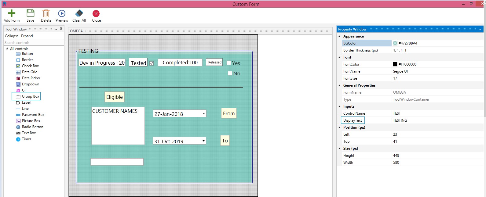
Figure 1
The following illustration displays how a simple login form can be created using the Labels, Text Box and Picture Box controls. All of this can be grouped using the Group Box control.
Create a form. Drag and drop a Group Box control. Place a Picture Box and insert a picture. Use a Label to give a header. Drop two more picture boxes and labels and provide the name and password values. Create Ok, Clear and Reset buttons.
Display text = Login Form
Event type = OK
Display Text = Cancel.
Event type = Cancel
Display Text = Clear
Event type = Clear
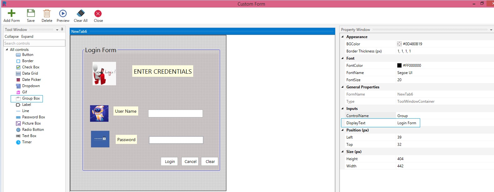
Figure 2
A preview of the above form is displayed in the following image.
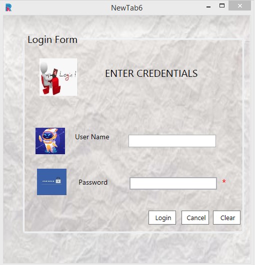
Figure 3
Note: Picture box can be used to insert icons, images, logos, etc. Password box will be displayed as mandatory, by default.