DesignAndRuntime Activity
Overview
The DesignAndRuntime activity is ideally suited for front office activities, such as personnel who are in sales, customer- care enquiries or tech support. Such personnel are required to save or access details even as the robot is running. In order to do this, one can use the activity to design forms to collect/verify data from the customers. Thus, this activity will be grouped under a feature named ÔÇ£Assisted Automation.ÔÇØ
It facilitates the user to create customizable forms that will help consolidate and enter values during execution of the robot and with the values, decide the sequence of workflows that has to be executed. So, even before storing data, if user can create the forms as per requirement, it would be easy for them to collect or pass information seamlessly. This is extremely helpful in validations, or quickly collecting missed out details, etc. Additionally, the user will be able to group multiple forms in a workflow using simple drag and drop activities.
The forms can be created swiftly and creatively, based on individual needs. It cannot get simpler than this, because there is no necessity to create variables or get into complex steps. Due to the many font styles and sizes, various background and font colors, provision for icons and headers, resizing and positioning, the forms can be customized as creatively as possible.
Description of the activity
It is good practice to appropriately name all controls, as they are being created in order to pull the values for use, while the robot is running. Thus, for easy identification and quick retrieval, names are used. There are several options provided for each control, which facilitates creating design forms that can be called and used during the execution of robots. Thus, DesignAndRuntime activity can be described as one that designs and creates forms that can be invoked during runtime of the workflow in order to collect/validate information from users and use it for further actions.
Benefits
Valuable information can be created securely, not using an open source, thereby safeguarding confidential customer data or other details. This is possible because information is not stored in desktops or note pads, but as a form and can be called for use in a most secure manner.
Highly customizable, so, it encompasses a wide variety of workflows and is suitable for a number of processes.
Easy to create, hence does not require technocrats or specialists-even a beginner can design and call the forms, so it is invaluable for nontechnical agents because it does not need setting variables or complex steps.
Any number of forms can be created simultaneously saving a lot of time and energy. And such forms can be invoked for use, numerous times by using the ok and clear options.
How to start?
Drag and drop the DesignAndRuntime activity from the AssistedAutomation package that is available in the Toolbox. Double click to open the wizard.
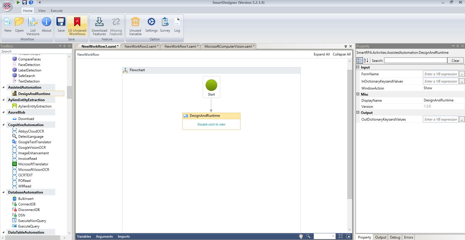
Figure 1
Design and Runtime wizard.
The Design Wizard will be displayed.
There are options in the Form display, such as show, which will show the form during runtime, show dialogue will display the form as a notification at specific times at the specified juncture in the workflow. Close option will close the form.
Double click on the Design box to open the custom form.
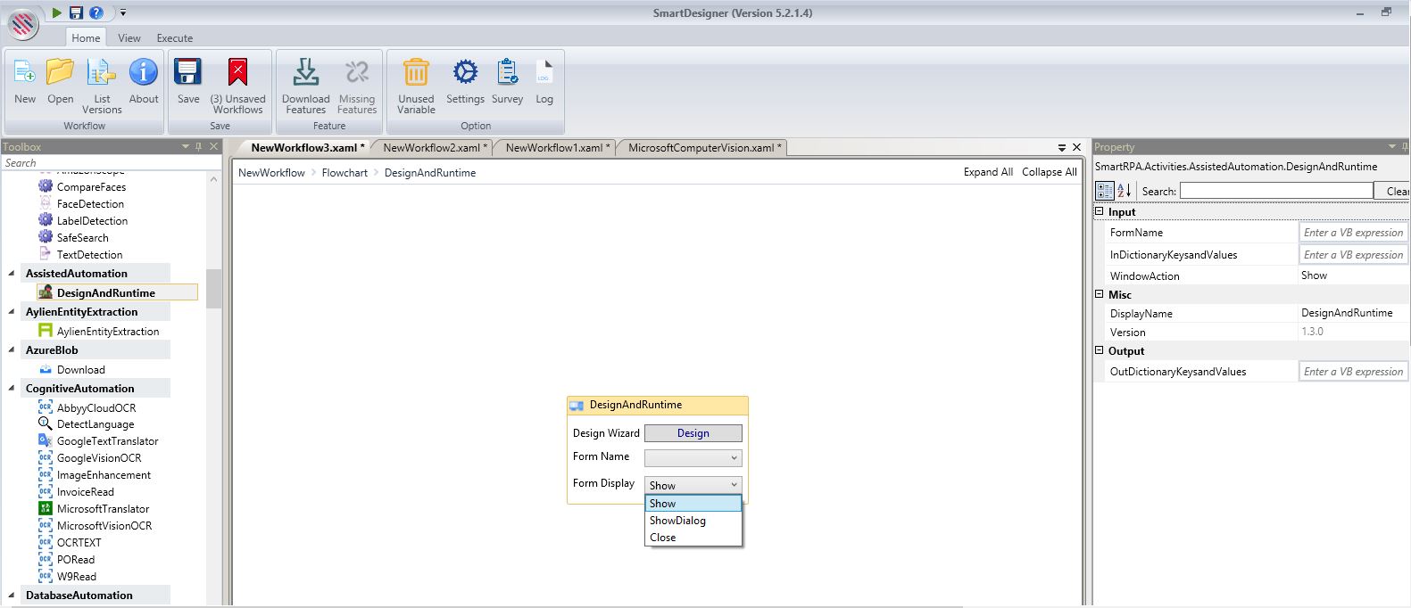
Figure 2
What are the menu options?
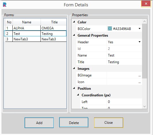
Add Form- at the extreme top left is to facilitate creating multiple forms, simultaneously. Click on the Add Form option.
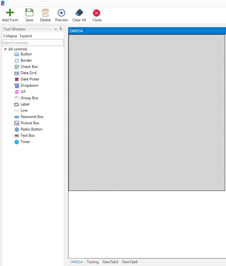
Figure 3
Upon clicking the add form option in the menu, the Form Details tab will be enabled. Fill the Form Name, Title and Add.
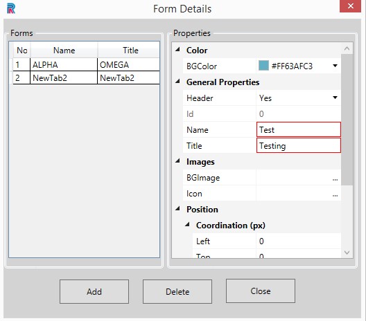
Figure 4
The form will be created and displayed. in this manner you can create as many forms as required at one go.
The title will be displayed at the bottom. You can change the name and title by clicking on it and modifying.Click on the required form to open it and proceed.
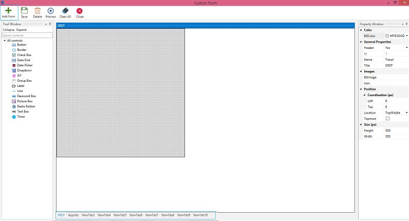
Figure 5
- Save- After creating form or form with controls or while making changes, save option is used
- Delete- if controls are chosen they will be deleted, no controls are chosen, and multiple forms are opened it will delete the selected form. If only one form is opened it will not allow you to delete it without alerting
- Preview- You can Take a sneak peek of the created form
- Clear All -Will clear all controls in the form
- Close- Will close the form or form with controls.
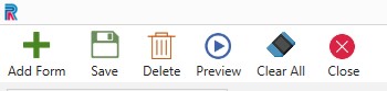
Figure 6
ÔÇïThe Custom Form.
Main Window
The main window comprises the Tool Window on the left, Property Window on the right and an empty form with a default design form named General.
Property Window
The form and controls can be created using the field provided in the Property Window. Background color of forms are chosen from the choices provided in the Color field. Each form should have unique names and titles. Duplicate names for forms is disallowed just as duplicate names in controls are disallowed. Name and Title help easy identification and is not mandatory. File Path is used to load pictures or icons.
Using the choices in the Position field, the form and controls can be placed to the right, left, top or bottom, etc.
The black square that is seen is the margin, which is the default window size and the design form will be of the same width and height if the size option is not required. One can resize the form to fit individual requirements, using the Height and Width options provided under the Size field. Ensure all controls are created within the boundary of the form to avoid errors.
Tool Window
The controls are found under the Tool Window and can be hidden or made viewable by using the Collapse or Expand options. Currently, there are fifteen controls to begin with. Search Control allows the user to filter search and select the required control, promptly.
Menu
Menu comprises options such as Add Form, Save, Delete, Preview, and Close can be used to perform these actions. Clear all options will clear all the controls in the form.
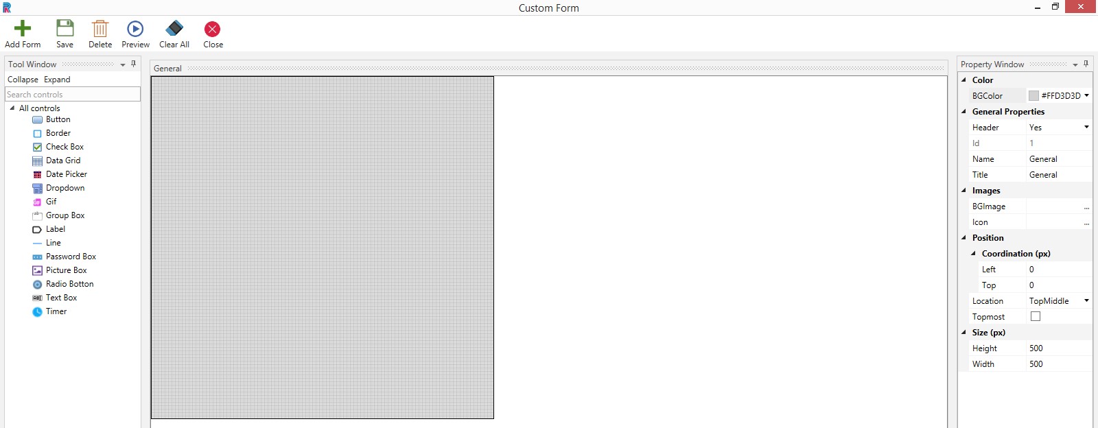
Figure 7
What are the fields in the Property Window to design the custom form?
Background Color.
Select the background color from the innumerable choices that are provided. Reduce or increase shade of the color as per selected percentage.
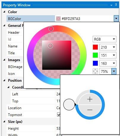
Figure 8
General Properties
Select yes if you want to give a header for the form.
Provide a name for the form. Name will be used to define values in the given form or controls during runtime. Since it is unique users can identify forms in the backend. It will be visible after saving in the Designer wizard. Provide a title. Title will be displayed during design time as well as runtime. While previewing title will be displayed.
Images
Background image is used to provide a background. Similarly, icon can be provided for the form.
Position
Position where your created form will be displayed during runtime by using the options available here.
Increment selection can be done in Left and Top fields to define the coordination of your form position. Or you can you select any position from the list provided in the Location drop-down.
Note; If left top coordination px is chosen, the location choices will not be enabled. So, select either one.
When Topmost check box is checked, the form will be visible on top of all opened applications in the system. That is, it will appear before all currently opened apps, such as word, outlook, etc.
Size
Select the Height and Width as per requirements.
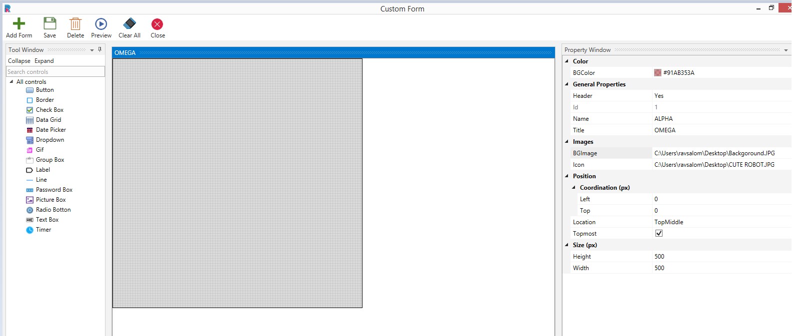
Figure 9
LetÔÇÖs preview. The form is created with the given background and icon, in the selected position and size.
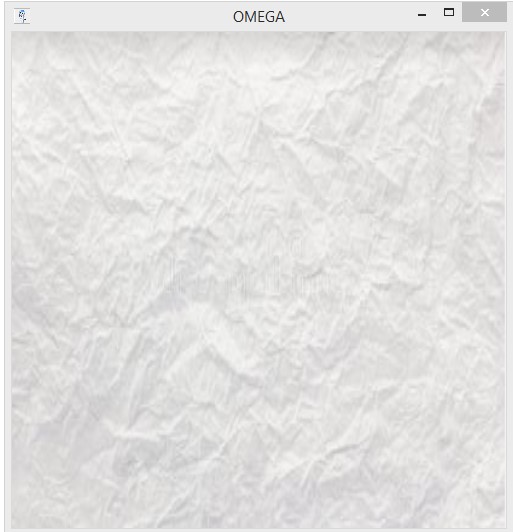
Figure 10
What are the controls that are available to design the form?
The user can use the following controls to design the form.
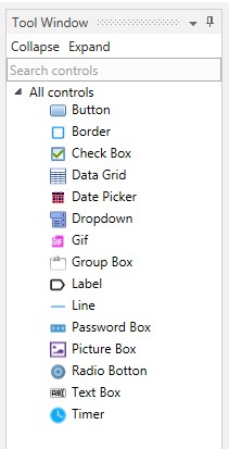
Figure 11
Functionality of Controls
Each control has various functionalities to help design a form as creatively as possible.
How to Save?
Always provide a unique name to the controls for easy identification. Please provide a Title and Name for the forms. Form Title will be displayed while creating the controls under the bottom of the grid. Form Name will be displayed in the Designer wizard after creating the controls and during runtime. Ensure that the form name does not have any special characters and spacing. After all forms are completed with the required controls, click on the save option in the menu. If any modifications have been made at any point of time, an alert message will prompt you to save the form before closing.
Display in the Design Wizard
After creating controls and saving, It will be listed in the dropdown. One can select the required form and execute or proceed with further modifications as per requirements.
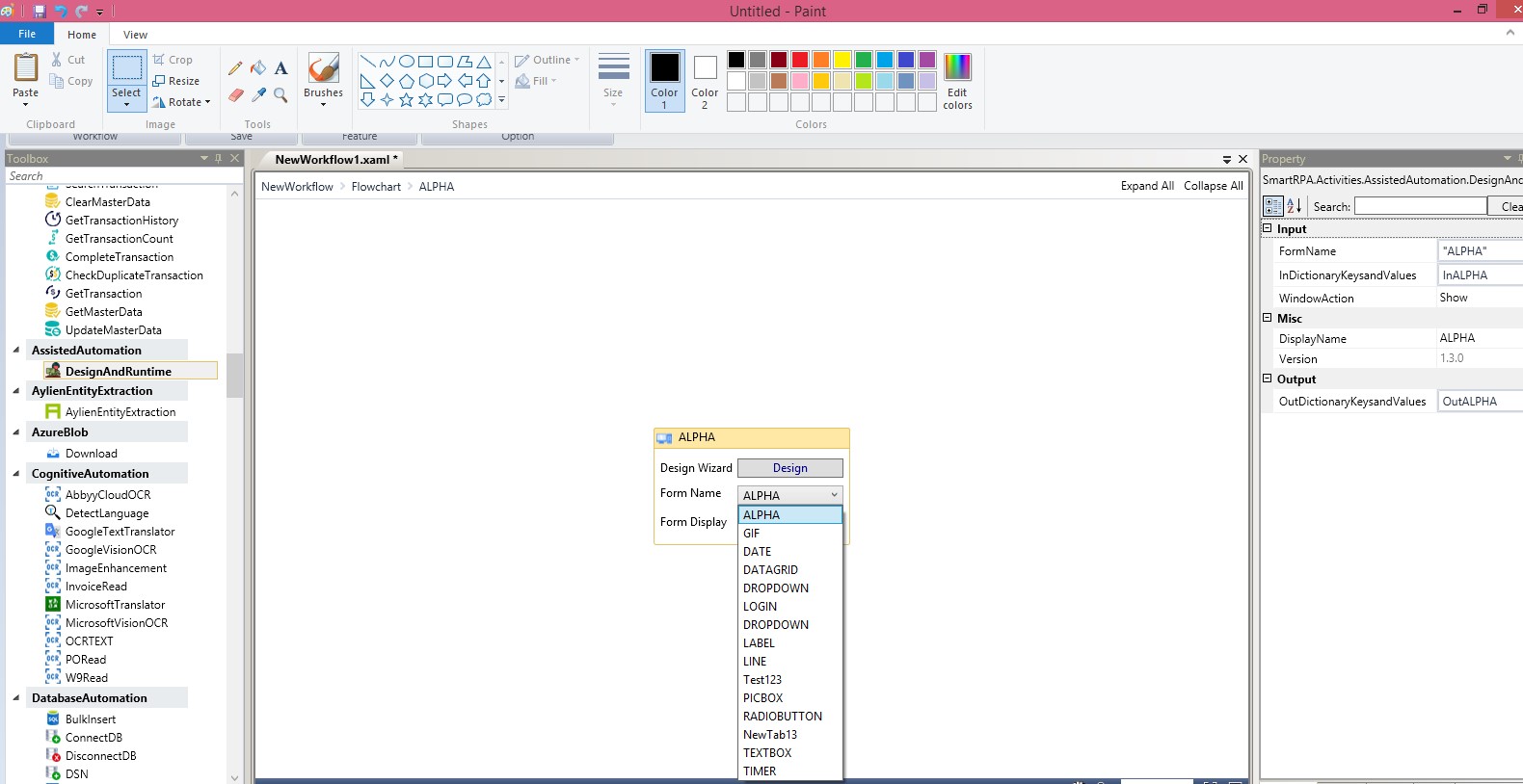
Figure 12
Points to be noted
- Controls can be manually navigated on the form to be positioned anywhere, without using the Position option
- It is possible to manually type in values in fields instead of selecting
- Once the custom formÔÇÖs height and width have been defined, and you start adding controls, it cannot be changed. You have to open another new form if your controls do not fit in it
- Always ensure that the controls are within the default boundaries of the form
- Copy and paste controls by using CTRL+ C and CTRL+ V options to create the same sized controls, instead of selecting from the toolbox every time. This will save a lot of time.
Other Options
- Float- Enables the main window to be dragged to any place on the screen and one can also maximize the floating window
- Dock- will dock the window to its original frame
- Auto hide- Hides the Tool Window
- Collapse and Expand options are provided
- Search options are provided to filter and retrieve a specific control.

Figure 13
A Sample Form
After creating a form, proceed to use the picture box to provide a logo. Drag and drop a label to provide the header. Once again use labels to create identification of the patient, as First Name, Last Name, etc. Drag and drop text boxes, check boxes, radio buttons, date picker, etc., to design the form as per requirements. Group box is used to contain specific details as displayed in the following image. Buttons are used to submit and clear forms. Buttons can be presented as only images or only text or both image and text.
Forms are thus created, using the controls available in the toolbox.
You can build many such customizable forms with other controls, such as the data grid, password, Timer, etc., according to individual needs.
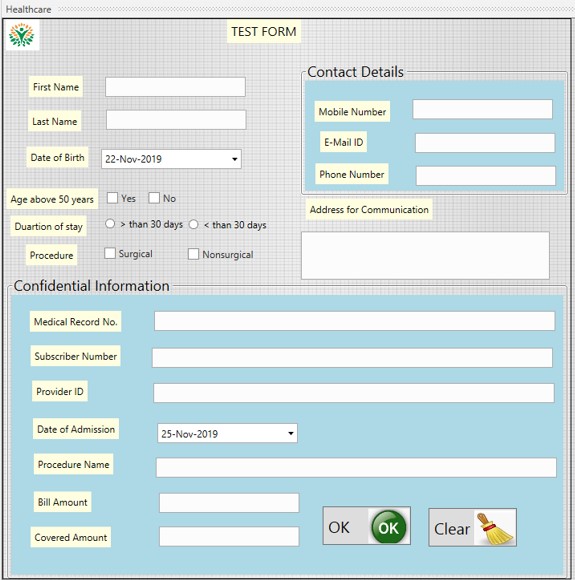
Figure 14
One can preview the form before saving.

Figure 15