Overview
The Assisted automation grouping is ideally suited for front office activities, such as agents who are in sales ,customer care or tech support. Such personnel are required to save details even as the robot is running. In order to do this, one can use the activity to design forms and pass data from the customer to the robot.
DesignAndRuntime is an activity that facilitates the user to create customizable forms that will help enter values during execution of the robot and with the values, decide the sequence of workflows that has to be executed.(through flow decision, if else, switch activities present in the Designer)
Additionally, the user will be able to group multiple forms in a workflow and call another form (field group) using simple drag and drop activities. The forms can be created swiftly and creatively, based on individual needs.
It cannot get simpler than this ,because there is no necessity to create variables or get into complex steps. Due to the many font styles and sizes, various background and font colors, provision for icons and headers ,resizing and positioning, the forms can be customized as creatively as possible.
Description of the activity
It is not mandatory to name a control aka "Fields". However, it is good practice to appropriately name all controls, as they are being created in order to pull the values for use, while the robot is running. Thus, for easy identification and quick retrieval, names are used. There are several options provided for each control ,which facilitates creating design forms that can be called and used during the execution of robots .Thus, DesignAndRuntime activity can be described as one that designs and creates forms that can be invoked during runtime of the workflow in order to collect information from users and communicate the same to robots.
Benefits
Valuable information can be created securely, not using an open source, thereby safe guarding confidential customer data or other details. This is possible because information is not stored in desktops or note pads ,but as a form and can be called for use in a most secure manner.
Highly customizable, so, it encompasses a wide variety of workflows and is suitable for a number of processes.
Easy to create ,hence does not require technocrats or specialists-even a beginner can design and call the forms, so it is invaluable for nontechnical agents because it does not need setting variables or complex steps.
Any number of forms can be created simultaneously saving a lot of time and energy. And such forms can be invoked for use, numerous times by using the Ok and clear options.
What are the field types that are available to design the form?
The user can use the following field types to design the form.
- Label
- Text Box
- Check Box
- Radio Button
- Date Picker
- Group Box
- Label
- Password Box
- Picture Box
What are the elements that need to be defined in controls that are used to design the form?
The user will have provision to define the following elements:
- Size of the form
- Position of the form
- Background color
- Define if the control is mandatory ÔÇô (by checking Yes or No)
- Name and title of the controls
- Provide headings and icons or pictures for the form
- Maximum length of characters to be entered in the Text Box control
- Enable multiple lines in the Text Box by checking MultiLine option
What other options will be used to design the form?
Option to delete the fields that have been added is provided.
Appropriate controls to design the form are provided.
The form will have default buttons such as :
- Preview
- Save
- Close
- Add form- to facilitate creating multiple forms, simultaneously.
How to start?
Using the aforementioned features ,let us take a detailed walk-through of the process of designing a form, using the Assisted Automation package.
Drag and drop the DesignAndRuntime activity from the Assisted Automation grouping, that is available in the Toolbox. Double click on the box.
Figure 1
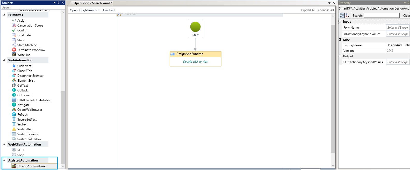
The Design Wizard will be displayed. Click on the Design rectangular box to enable the Main window.
Figure 2

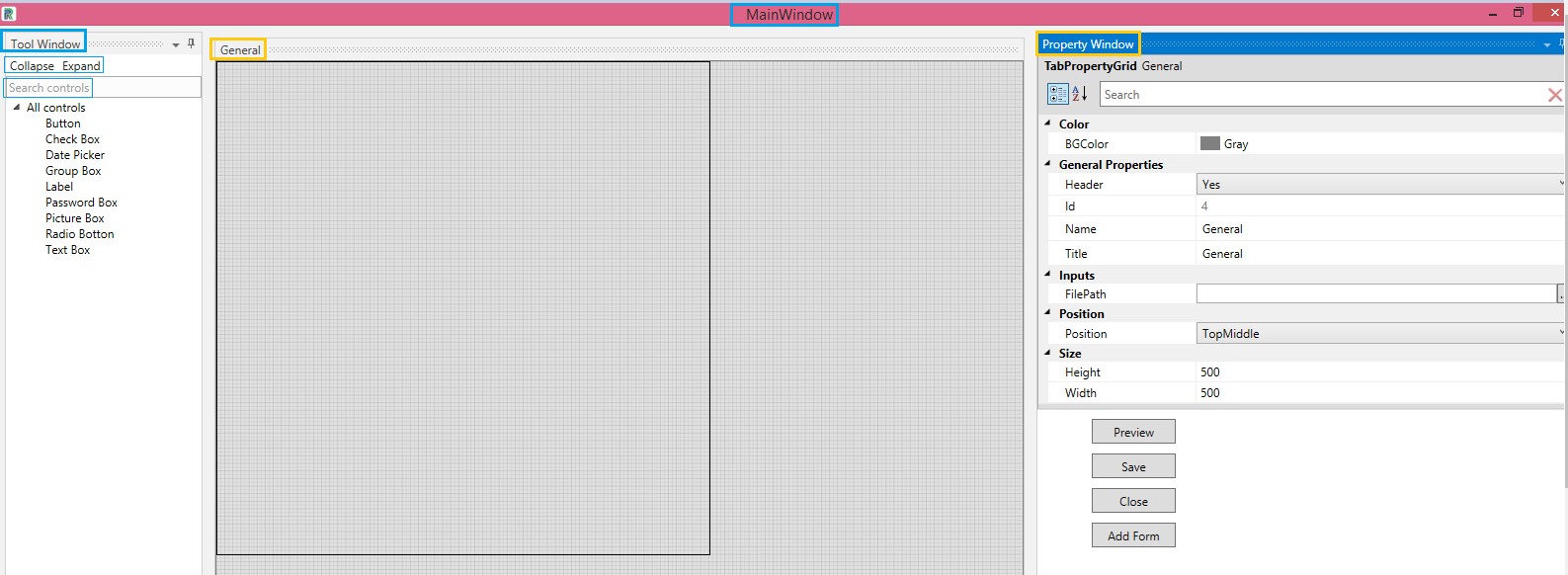
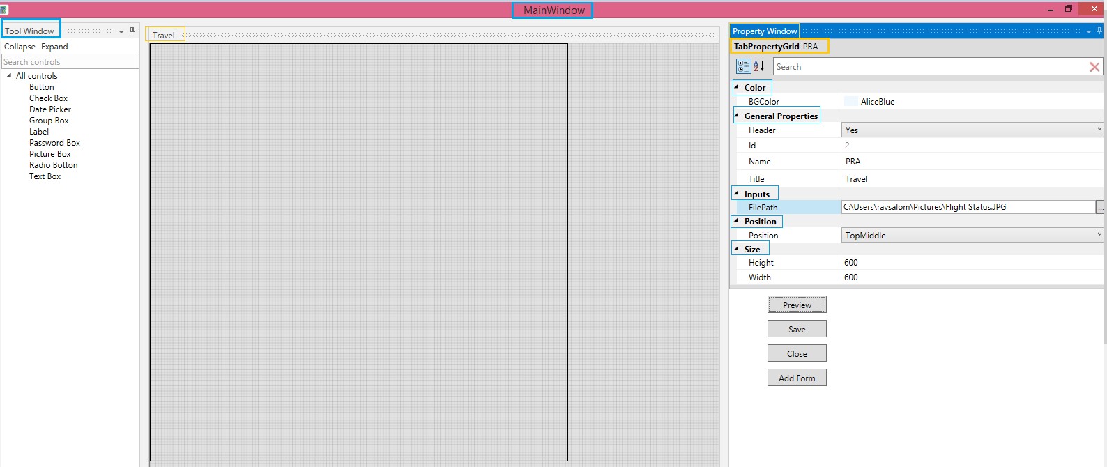
Main Window
The main window comprises the Tool Window on the left, Property Window on the right and an empty form with a default design form named General. Background color of forms are chosen from the choices provided in the Color field. One can go with the same name or rename the form by using the option called Title. Similarly, Provide a Name for the form. Each form should have unique names and titles. Duplicate names for forms is disallowed just as duplicate names in controls are disallowed. Name and Title help easy identification, but is not mandatory. File Path is used to load pictures or icons. Using the choices in the Position field, the controls can be placed to the right, left ,top or bottom and thus placed to give the form a neat look. Similarly, there are options to define the margin of the form.
The black square that is seen is the margin ,which is the default window size and the design form will be of the same width and height if the size option is not required. One can resize the form to fit individual requirements, using the Height and Width options provided under the Size field.
The controls are found under the Tool Window and can be hidden or made viewable by using the Collapse or Expand options. Currently, there are nine controls to begin with. Search Control allows the user to filter search and select the required control, promptly. There is another Search field under the Property Grid for quick search and retrieval of fields in the Property Window.
Options such as Preview ,Save, Close and Add Form can be availed as well.
Figure 3
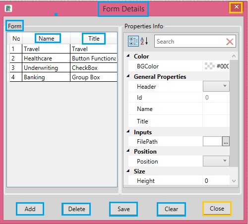
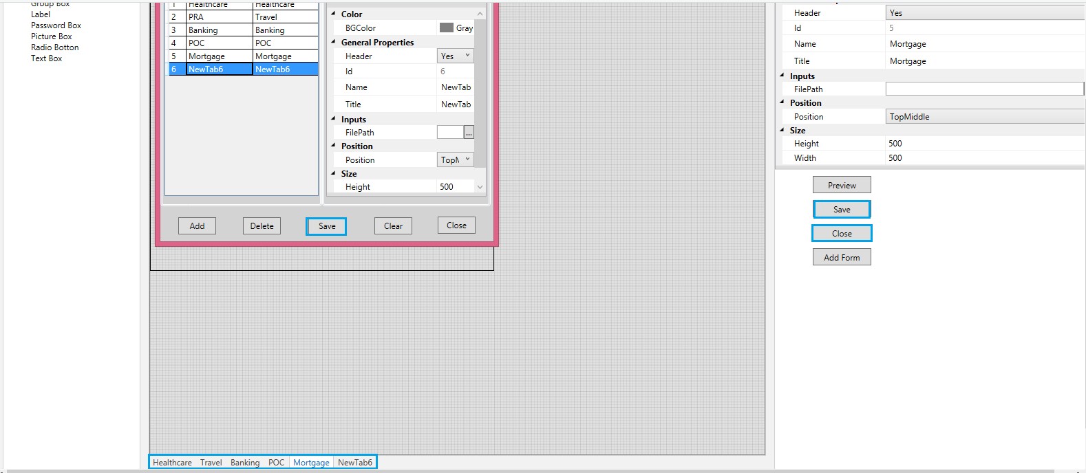
Add Form displays the Form Details window.
In the Form Details, similar options are available, and this enables easy creation and editing of multiple forms.
The Add option in the main window is used to add forms. If you add forms and do not make changes, it is sufficient to use the Save option available in the Form Details window. Select the form and click on Delete button to delete .If one wants to clear the unsaved modifications and retrieve the earlier version of the values, use the Clear button. Close button is used to close the Form Details window.
Figure 4
Points to note while using controls
- Each control should have different names. Duplicates will not be invoked.
- Once user edits or enters values in the Property Window of the respective control, they need to click out of the field( focus out) or click on Tab, to make the controls viewable in the main window. However, to save the entire form along with all the created controls, it is required to use the Save option that is available in the Main Window. One will get a reiteration stating that the XML file has been saved successfully.
- Form name, type, etc., will be auto populated ,if the form is already created. Name the control or go with the auto populated one.
- Spacing is allowed in creating the TitleÔÇÖs name and in Display Text. However, while creating a name for controls, please do not use space, special characters or numeric.
- Title will be displayed at the bottom of the Main Window, whereas, the control's name will be listed as a dropdown in the Design Wizard of SmartDesigner, when the entire form with individual controls are saved.
- One can use as many controls in forms within the margin. See to it that controls are placed inside the margin. So, selection of size and position of controls to fit the form, within the defined margin is important.
- One can easily drag and drop controls to place them as per requirements, within the margin. Manual adjustments can be done to place controls in the main window, but for precision, options in the Position field( Left and Top Margin) are used.
- Deletion of controls is performed in the main window by clicking on the control and pressing the delete key in the key board. Likewise, while deleting values in individual fields, clear the values using Backspace before typing the new value.
- Only after closing the Main Window, can one minimize the Designer.
Let us start
The first step is to create a form in which the controls will be manipulated. Once values are keyed in appropriate fields and mouse is clicked out or by clicking on Tab in the keyboard, the input values along with the controls will be auto populated in the main window. To see how the actual form will look with the chosen fonts, colors, and controls ,that is, the actual way the form will be displayed during runtime- preview the form. Ensure the form is saved.
How to create a form?
What follows is an example of the first step, namely, creation of forms. After the form is created, the controls can be designed in the form. After every step, one can preview to see the way the form is shaping up.
Double click on the Design Wizard to enable the main window.
In the Tab Property Grid, all requirements are selected as follows:
Color
Select the background color for the form. The background color of the form can be changed using the BG Color option under the Color field.
General Properties
If one wants a Header for the former, click Yes.
Provide a Name and a Title for the form.
Inputs
If you want to place an image in the form, copy and paste the file path, where the image is saved, in the File Path, under Inputs field. Image formats such as .jpg, jpeg and .png will be supported.
Position
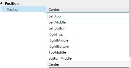
To place the header in a preferred position, choose the options available in the Position field. They are as follows:
Figure 5
Size
Customize the form Size as per requirements. Both Height and Width are customizable. Accordingly, the margin will be created for a form. All controls should be placed within this margin.
Figure 6
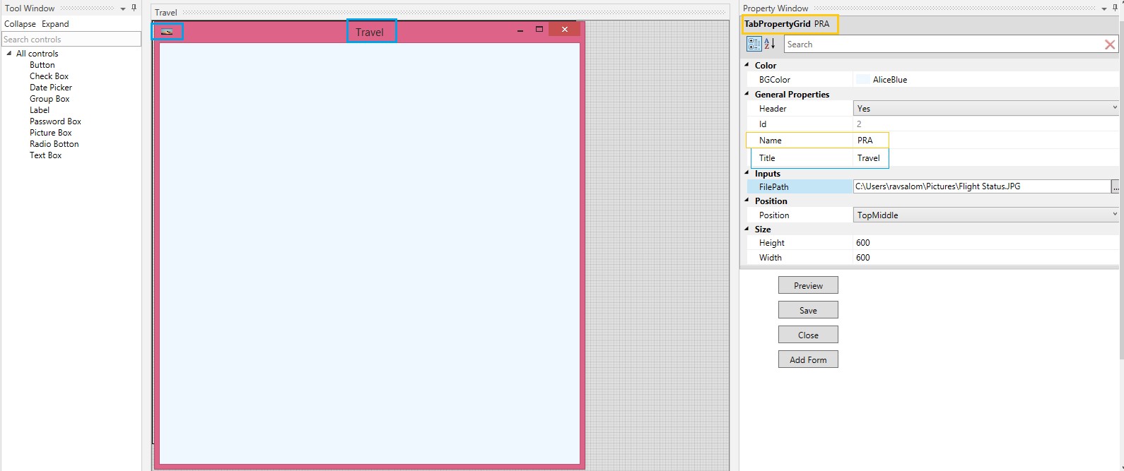
The Form is thus created, with the specified Title and the given image. It can be previewed. Save.
The Name will be reflected in the Tab Property Grid on the top right. The Title will get displayed on the form itself.
The controls will be designed to fit the height and width defined for the form.
Figure 7
Functionality of Controls
Let us proceed to understand the functionality of the various controls.
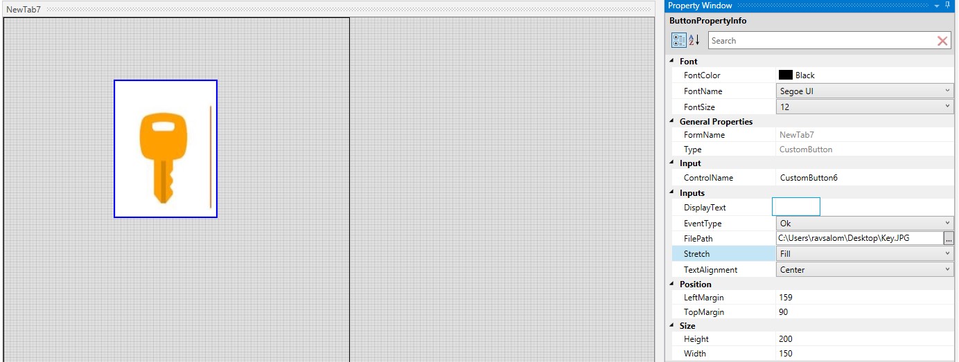
Drag and drop any one of the controls onto the Main Window. The following example starts with the first control in the Tool Window,namely,Button.
1.Button
Button enables both text and image.
In the following example, the button is chosen to be dragged and dropped. Proceed to fill in the requirements in the respective fields.
Font
Select the Font Color, Font Name and Font Size from the respective dropdowns.
General Properties
The form name remains the default name although the size of the form has been modified. One can provide a new Name.
Tab index is a feature that helps the user move from one control to another, by clicking the tab.(WIP)
Type of the control is auto populated as Custom Button, since the selected control is button.
Input
Provide a Control Name. In the following example, the auto populated control name is chosen.
Inputs
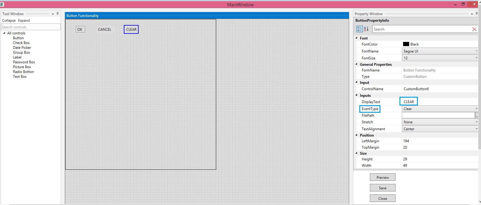
Type the value in the Display Text. This will be displayed inside the button.
Event Types are as follows:
Ok
Cancel
Clear
Select the type from the Event Type field .Type the values (Ok, Cancel ,Clear) in the Display Text. The same can be called during runtime and the same actions will be performed.
Position
Left Margin- Increasing the count will move the control to the right side .Decreasing the count will move it to the Left side.
Top Margin -Increasing the count will bring the control down and decreasing the count will move the control up.
Note :Numbers in Position can be selected from the drop-downs or typed. Use Backspace to clear and type the values. Do not copy the selection and hit delete in the keyboard.
Figure 8
File Path
As mentioned earlier, buttons can be used to depict images along with text or used to display only images.
Provide the name of the path where the image is saved, so the image gets displayed, inside the button.
One can increase or decrease the size of the image using the options provided in the field named Stretch. Refer the ensuing screen shots.
Figure 9

Stretch in Button
The images can be positioned or aligned using the options provided in the field, named Stretch. The options are explained below.
Figure 10

Figure 11
Fill

Figure 12
Uniform

Figure 13
Uniform to Fill
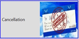
Figure 14
None

Text Alignment in Button
Text alignment options are used to align the text to the Left ,Right ,Center and Justify.
Figure 15
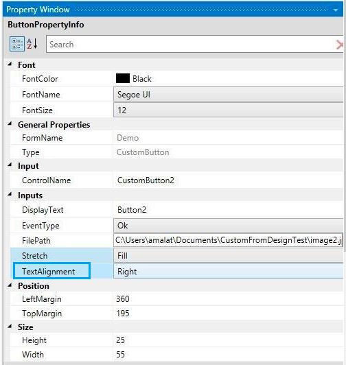
Figure 16
Left

Figure 17
Right
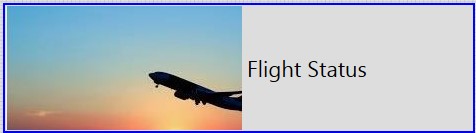
Button can be used to depict only images as well. If no value is given in the Display Text box and only image is chosen ,button will be displayed as an image.
Figure 18
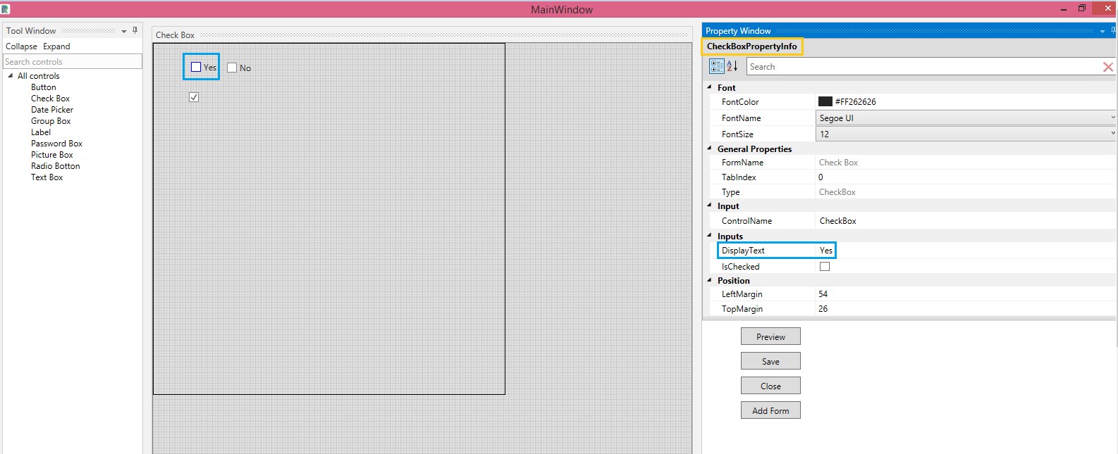
2.Check Box
Drag and drop a Check Box onto the Main Window.
Key in and select appropriate values in all fields in the Check Box Property Info window.
Whatever one wants displayed next to the Check Box is required to be typed in the Display Text field. Save.
Figure 19
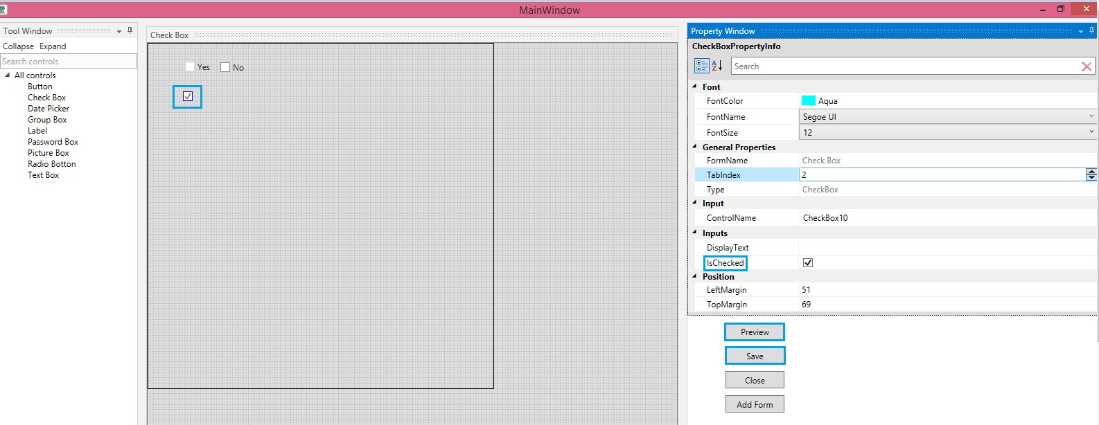
Check the IsChecked field to enable a tick box in the Check box. As before, preview before saving.
Figure 20
3.Date Picker
Date picker is used to pick dates to indicate important dates, such as, validity period,date of registry,Date of Birth,etc.
Drag and drop the date pickers alongside the labels with the appropriate values,typed as text.More than one date picker can be used,if required.
Click on the date picker and select the date in the value field. Click out or focus out. They will be populated in the main window.
Figure 21
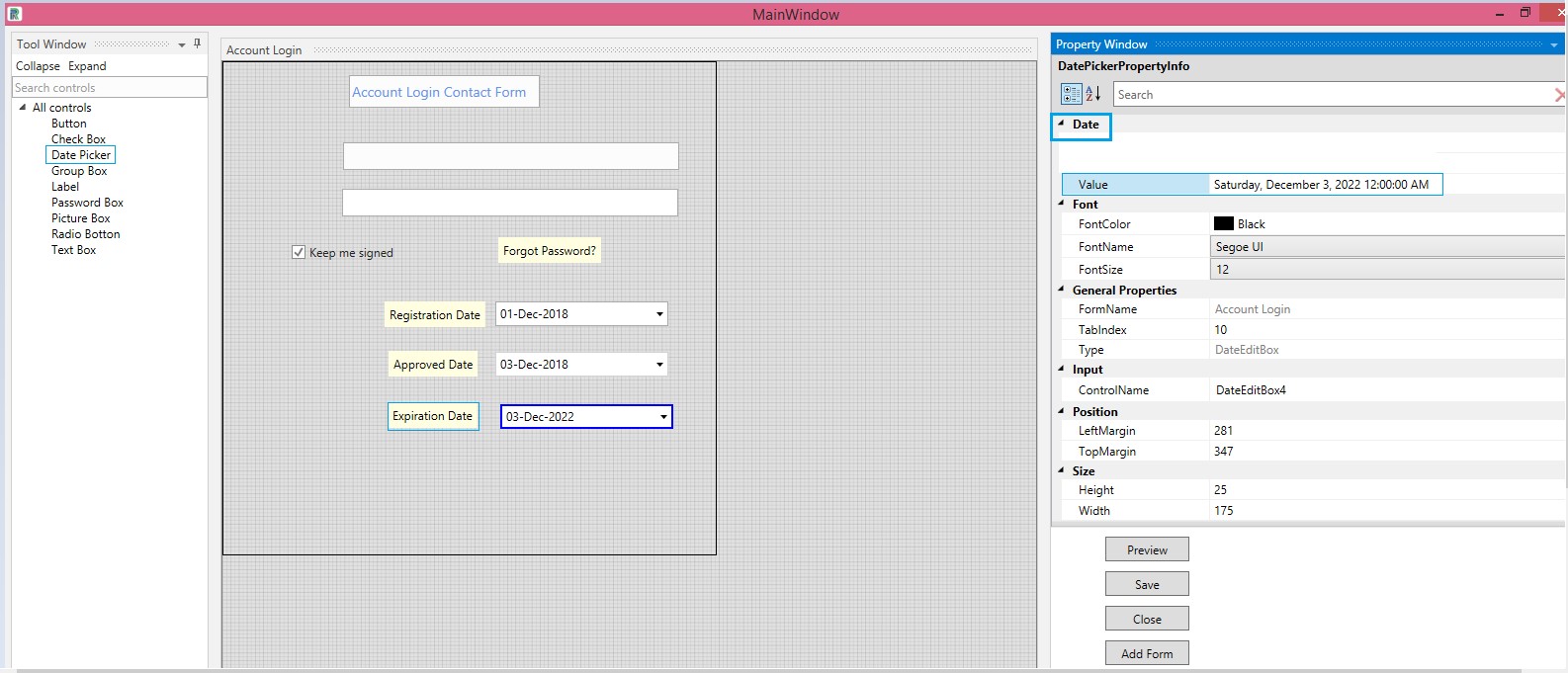
As each fieldÔÇÖs value is entered and mouse clicks out or focuses out after entry,the values get displayed in the main window.Also,after entering the values, if one clicks on Tab,the values are populated in the main window.
Figure 22

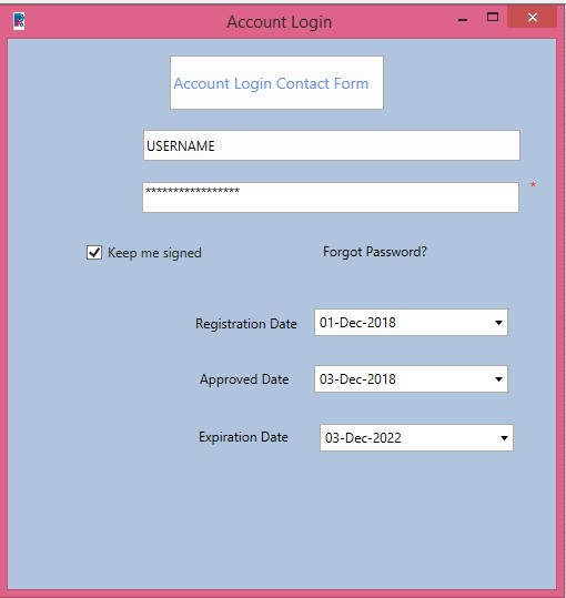
To view the other settings ,such as,form's name,logo,background color,etc., preview the form.
Figure 23
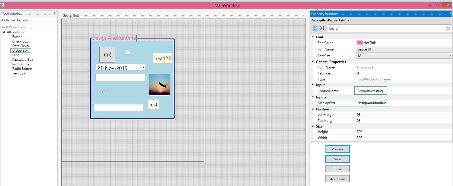
4.Group Box
Group Box facilitates grouping of data to be invoked during runtime. Thus,large amount of data is available for the user to make their task easier and enhance performance,resulting in overall process efficiency.
Drag and drop a Group Box onto the main window.
Select the Font Color, Name and Size.
Values pertaining to Form Name and Type are auto populated.
Provide a Control Name for the control.
Provide the Display Text ,to be displayed as defined.
Position the group box and define the Size of the same.
Save.
Note:Group Box can accommodate multiple controls inside it. However, one Group Box cannot be placed in another Group Box. Preview is possible before saving.
Figure 24
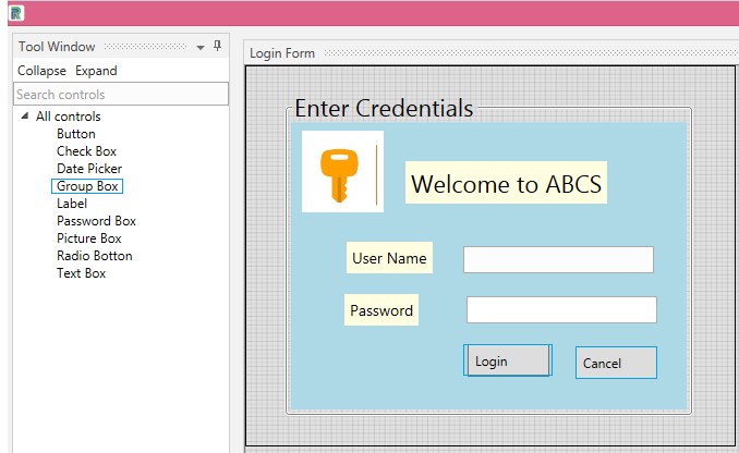
The following illustration displays how a simple login form can be created using the Labels, Text Box and Picture Box controls. All of this can be grouped using the Group Box control.
Create a form. Drag and drop a Group Box control. Place a Picture Box and insert a picture. Use a Label or a Text Box to give a header. Drop two more labels and provide the name and password values . Create Ok and Clear buttons.
Display Text for Ok = Login
Display Text for Clear = Cancel.
Save.
Figure 25
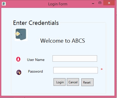
Another form created with a password box, text box, picture box and labels is placed inside a group box. OK, Cancel and Clear values are given as input for Login, Cancel and Reset for the buttons.Refer Figure 26.
Figure 26

A preview of the above form is displayed in the following image.
Note: Picture box can be used to insert icons, images, logos, etc. Password box will be displayed as mandatory ,by default.
Figure 27
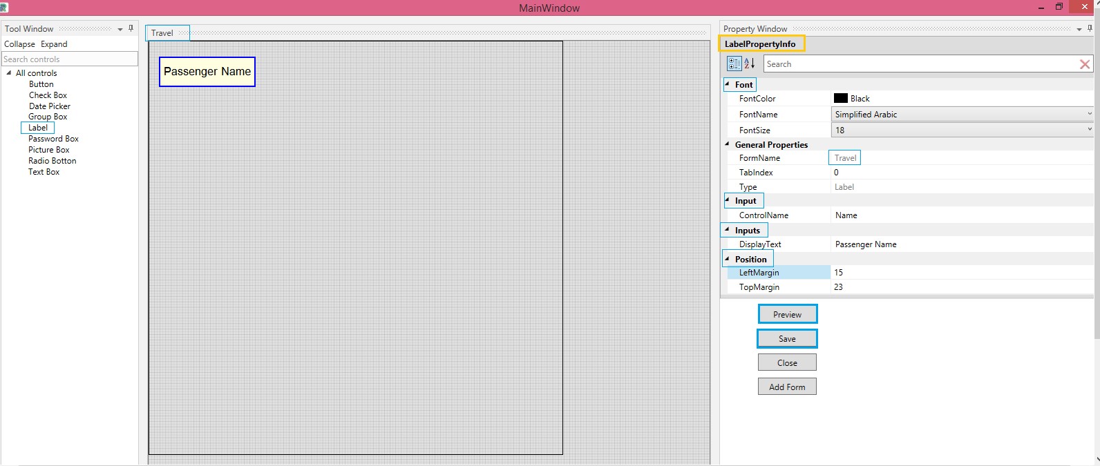
5.Label
In the following example, the Label is dragged and dropped. Proceed to fill in the requirements in the respective fields that are in the Property Window.
Font
Select the Font Color, Font Name and Font Size from the respective dropdowns.
General Properties
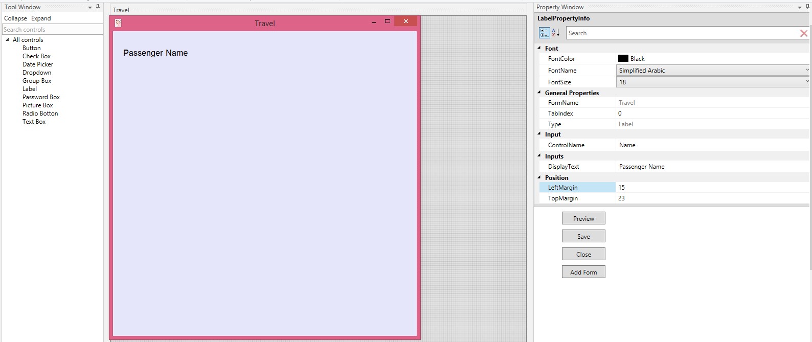
The Form Name remains the default name although the size of the form has been modified. One can provide a new name. Here, it is given as Travel.
Tab Index is a feature that helps the user move from one control to another, by clicking the tab.(WIP)
Type of the control is auto populated as Label, since the selected control is label.
Input
Provide a Control Name.
Inputs
Type the value in the Display Text.
Position
Left Margin- Increasing the count will move the control to the right side .Decreasing the count will move it to the left side.
Top Margin -Increasing the count will bring the control down and decreasing the count will move the control up.
Note :Numbers in Position can be selected from the drop-downs or typed.
Use Backspace to clear and type the values. Do not copy the selection and hit Delete in the keyboard. Save the designed control.
Figure 28
The created form, using the label can be previewed, as shown in the following image.
Figure 29
6.Password Box
The control called Password Box is dragged and dropped in the form. There is no specific field to tag this control as mandatory. By default Password Box is marked as mandatory and will be viewed as such, at the time when it is invoked.
Proceed to fill all details in the Password Box Property Info grid. The default Password Character is provided and will be displayed as previewed.
The inputs given for the password must comprise a minimum of eight characters, containing one uppercase, one lowercase, a special character and one integer.
In the second Password Box, one can see another character. It is done by deleting the default character and providing a character of oneÔÇÖs choice.
Figure 30
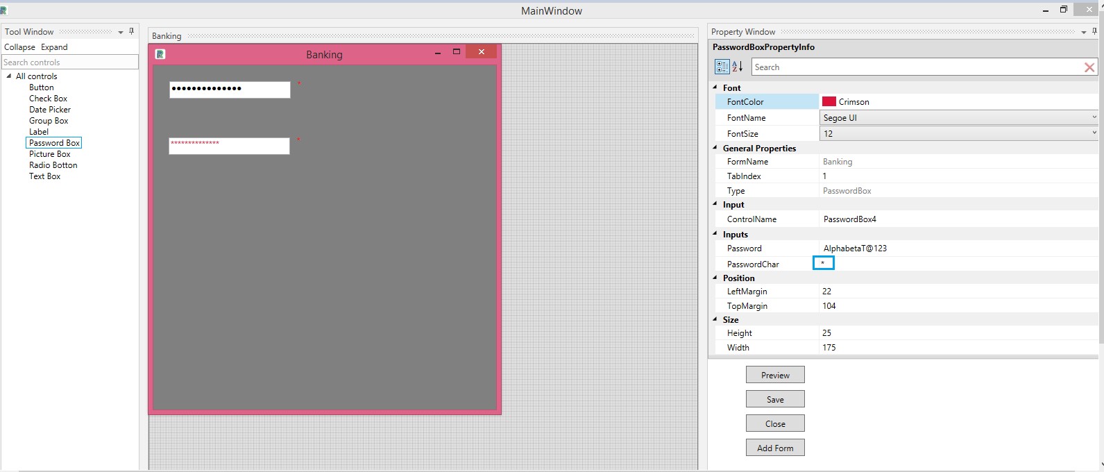
One can choose the password character as preferred. Save.
Figure 31

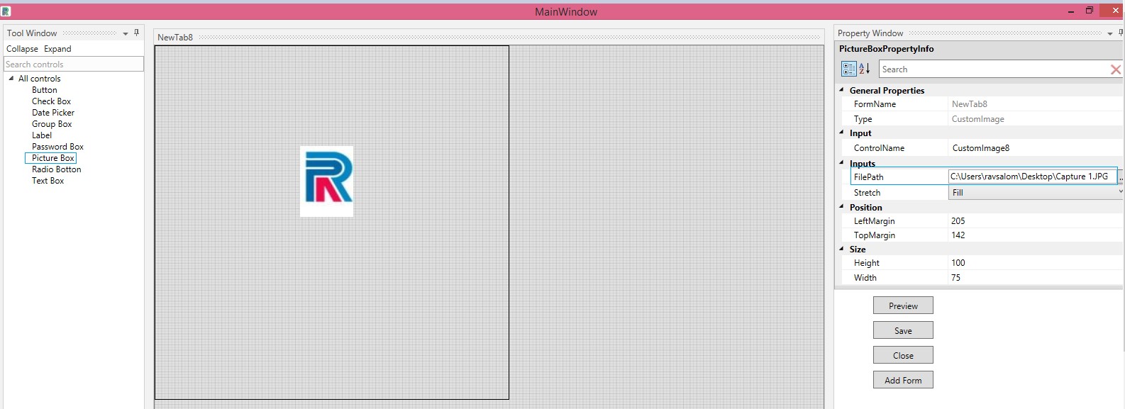
7.Picture Box
Drag and Drop a Picture Box onto the Main Window.
Fill in the appropriate details in the pertaining fields in the Picture Box Property Info Grid.
Type in or copy and paste the file path ,where the picture is saved. Formats supported are as follows:
.jpg, .jpeg, .png
Place the picture using the options available in the stretch dropdown.
Set the Height and Width for the Picture Box. Save
The picture is saved to the form and is positioned as defined.
Note: Picture Boxes are useful to insert logos or icons.
Figure 32
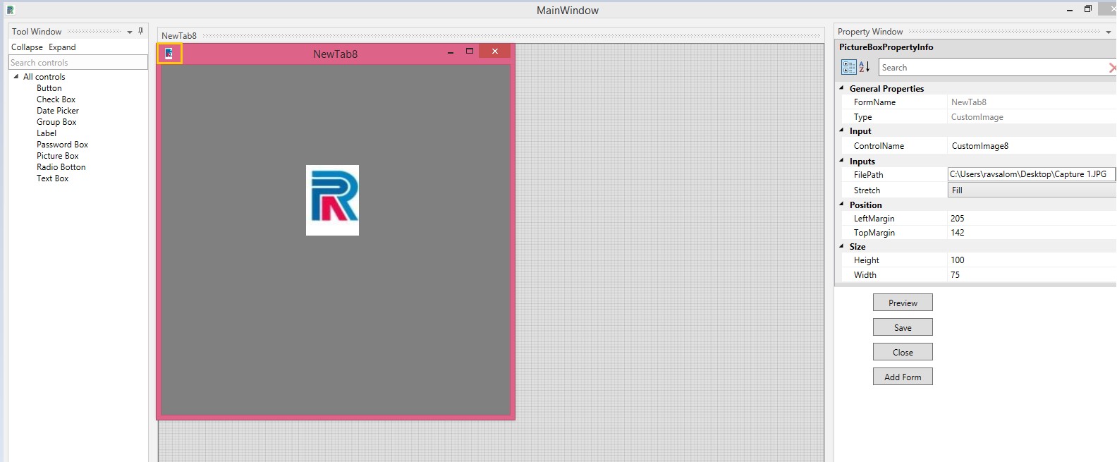
In the following example, the picture is set as a logo.
Figure 33
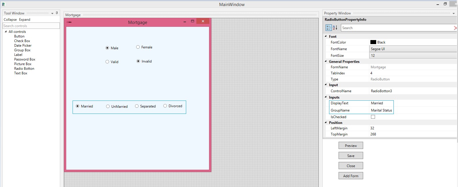
8.Radio Button
Drag and drop a Radio Button.
One can assign values to the radio buttons by keying in the appropriate text in the Display Text field. Select the Font Color, Font Name, and Font Size. Form name, type, etc. Will be auto populated ,if the form is already created. Name the control or go with the auto populated one.
Further, a single or various radio buttons can be grouped as one by providing a group name .Selection is possible for all radio buttons, present under one group name. For instance, male or female can be grouped as gender.
User can select either one ,by providing a Group Name. More than one group can be formed with different group names. Under one group,various buttons can be grouped.For instance, Under Marital Status, one can have as many radio buttons as required.
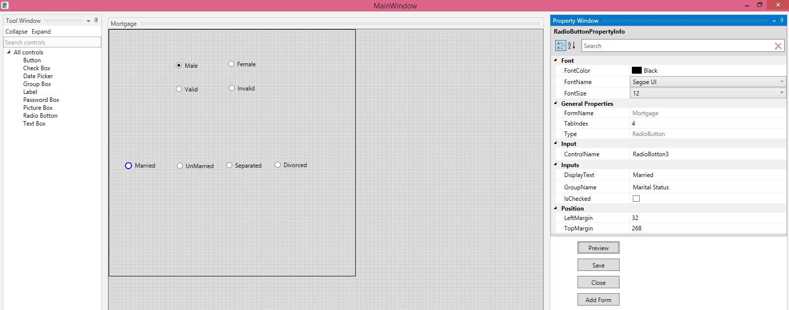
Note: to check functionalities in radio button and check box ,use the preview window . Actions cannot be performed in the main window.
Refer Figure 34.
Figure 34
Thus, as seen in the above example, three different groups are formed using the radio buttons and will be populated as such.Refer Figure 35.
Figure 35
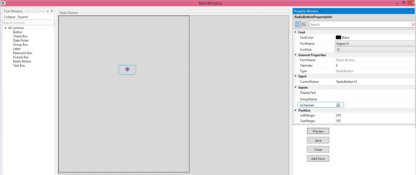
One can create a radio button that is already checked by checking the IsChecked box.
Figure 36
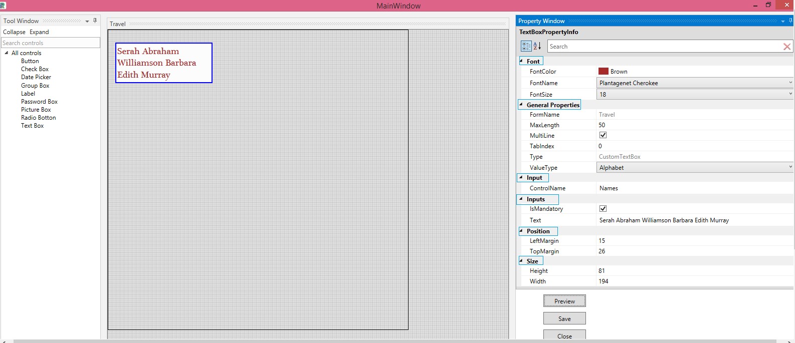
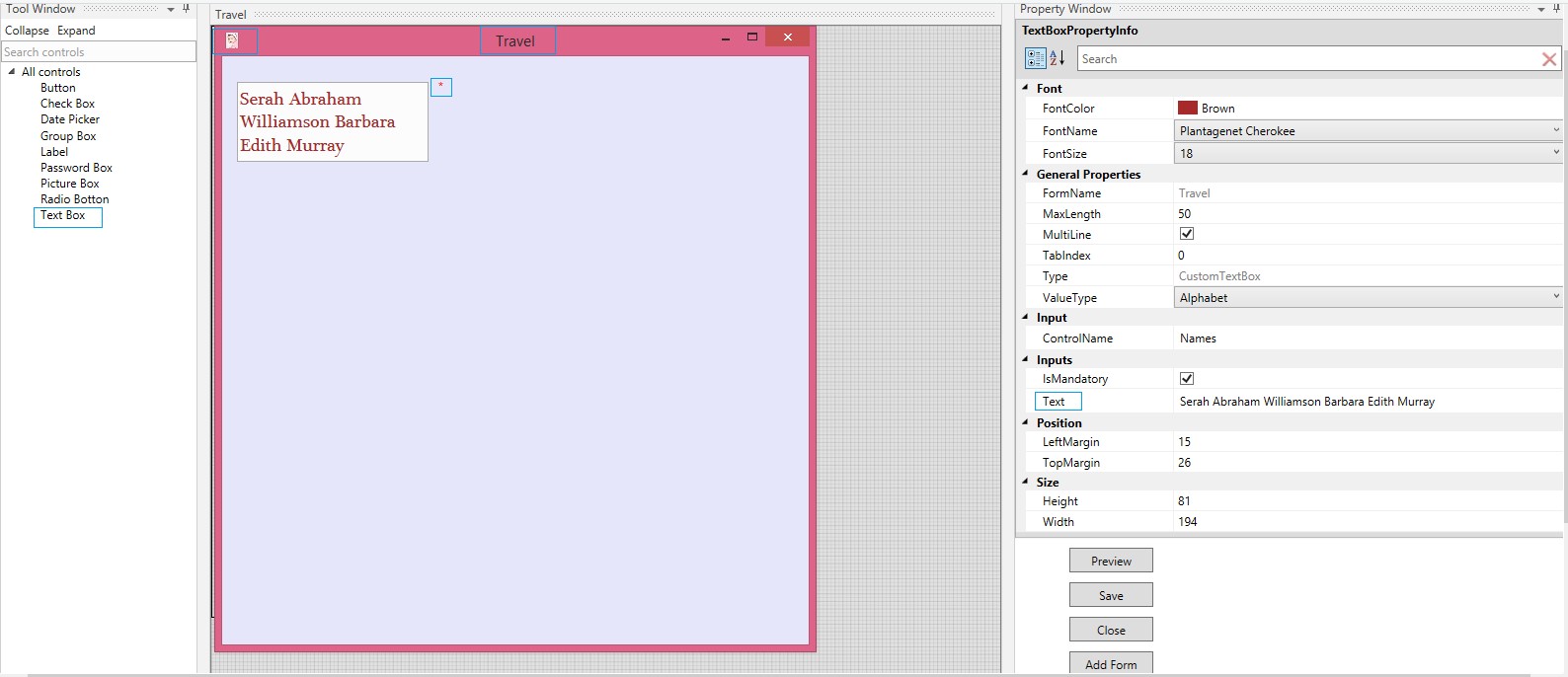
9.Text Box
The Text Box control is used for lengthy content, descriptions, or for any other purpose that require typing numerous words. The maximum length of character can be defined by the user, based on requirements. Multiline options splits the text into multiple lines. The options are many, for it supports various input values, without complexity or setting variables. By merely selecting the options from the dropdowns and typing the required values in the respective field ,the values can be called for use.
Drag and drop the Text Box control onto the Main Window.
Font
Select the Color ,Name and Size of the form from the respective dropdowns.
General Properties
Form Name is auto populated.
Select the Maximum Length of characters that is to be keyed in the Text Box.
If one wants the text to be split into multiple lines ,check the MultiLine option.
Type of control will be auto populated.
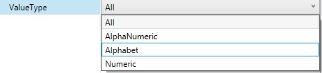
Select the Value Type from the following list available in the drop-down:Figure 37.
Figure 37
Input
Provide a name for the control.
Inputs
When the Is Mandatory box is checked, the control will be displayed with a red asterisk. Refer the following image.
Key in the values in Text field.
Position and Size can be set according to requirements.
Figure 38
Form has been created , using the Text Box control and it can be previewed. Save.
Figure 39
Other Options
Float- Enables the window to be dragged to any place on the screen and one can also maximize the floating window.
Dock- Will dock the window to its original frame.
Auto hide- Hides the window.
Figure 40

The formsÔÇÖ titles will be displayed at the bottom. Save the forms before closing. Options to save in Form details can be used for seamless saving of multiple forms. Click on each form and save, delete or clear. Click on Close or choose the x mark to close the form details grid.
Figure 41
The created forms are added to the Design Wizard.
Note: The control name is accepted as the form name and is displayed, as such, in the wizard.
Figure 42
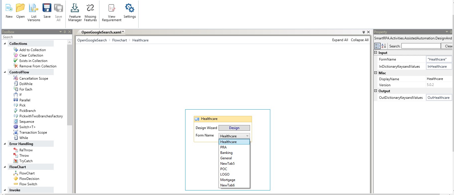
One can select the required form and execute.
Figure 43

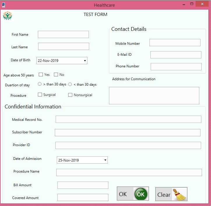
A Sample Form
After creating a form, proceed to use the Picture box to provide a logo. Drag and drop a label to provide the header. Once again use labels to create identification of the patient, as First Name, Last Name, etc. Drag and drop text boxes ,check boxes, radio buttons, Date picker ,etc. to design the form as per requirements. Group box is used to contain specific details as displayed in the following image. Buttons are used to submit and clear forms. Buttons can be presented as only images or only text or both image and text. Thus all controls ,except for password box are used to create the following form. Refer figure 44, to view an example of a form with passwords.
Forms are thus created ,using the controls available in the tool box and can be customized according to individual needs.
Figure 44

One can preview the form before saving.
Figure 45