Date Picker:
The Date picker control allows the user to select the list of date and time in a drop-down list or a grid box. The maximum value, minimum value and default value can be customized in the properties section. The date picker can be displayed in two ways: drop-down list and grid box of dates.
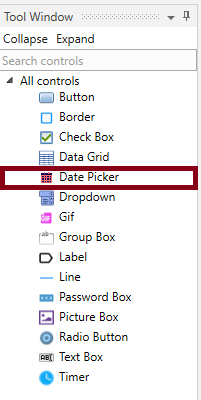
• Select Date picker control from the tool window section to the form.
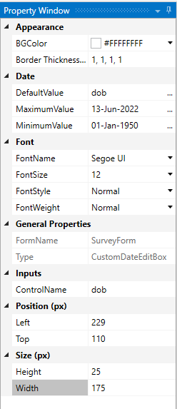
• Go to the properties section, the properties are explained in the following.
Technical Reference:
|
|
S. No |
Description |
|
1 |
BGcolor- The user can customize any background color for the data table. |
|
|
2 |
Border thickness – The thickness between the rows and columns can be adjusted here. |
|
|
3 |
Default Value- Enter a default value from the three dots in the corner and give a variable name. |
|
|
4 |
Maximum Value- The Maximum value of the dates to be selected can be entered here. |
|
|
5 |
Minimum value- The Minimum value of the dates to be selected can be entered here. |
|
|
6 |
FontColor- The font color can be customized here respectively. |
|
|
7 |
FontName- The font name can be customized here respectively. |
|
|
8 |
FontSize- The font size can be customized here respectively. |
|
|
9 |
FontStyle- The font style can be customized here respectively. |
|
|
10 |
FontWeight- The font weight can be customized here respectively. |
|
|
11 |
FormName- The Form Name can be defined here, or it can also be defined in the Form Properties. |
|
|
12 |
Type- The Type of the form will be displayed here. |
|
|
13 |
ControlName- The name of the respective control will be displayed here. |
|
|
14 |
Left- The left or right position of the Data Grid can be adjusted here. |
|
|
15 |
Top- The Top of bottom position can be aligned here. |
|
|
16 |
Height- The height of the Data table can be aligned here. |
|
|
17 |
Width- The Width of the Data table can be aligned here. |
• After customizing the Date picker, Select Preview option from the top of the form builder.
• Select Save and close it.
• Create a workflow for it and execute the Workflow to view the Form.