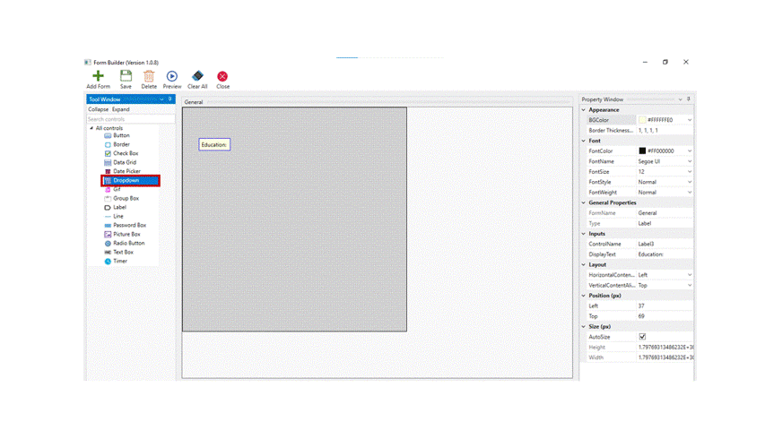
The tool window in the form builder has 15 controls as mentioned below.
|
|
|
|
|
|
|
|
|
|
|
|
|
|
|
|
|
|
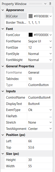
Button
The button control is used to insert a button to a form.
Technical Reference
|
|
APPEARANCE |
BGColor: Choose the background color from the color wheel to be displayed for the timer box. This is not a mandatory field. |
|
BorderThickness(px): Specify the border thickness value in pixels. The order of the border will be (left, top, right, bottom). This is not a mandatory field. |
||
|
FONT |
FontColor: Choose the font color from the color wheel for the text/ value to display. This is not a mandatory field. |
|
|
FontName: You can choose the font name from the drop-down for the text/ value to display. This is not a mandatory field. |
||
|
FontSize: Specify the font size for the text/value to display. This is not a mandatory field. |
||
|
FontStyle: Choose the font style from the drop – down, · Normal · Italic · Oblique This is not a mandatory field. |
||
|
FontWeight: The thickness/ weight of the font can be selected from the drop-down. This is not a mandatory field. |
||
|
GENERAL PROPERTIES |
FormName: Autofills to whichever form the control is dropped into. |
|
|
TabIndex: Specifies the position to which the cursor has to move when the tab on the keyboard is used. This is not a mandatory field. |
||
|
Type: This is auto populated once the button control is selected. |
||
|
INPUTS |
ControlName: Default name given to the control used. |
|
|
DisplayText: Specifies the text on the button which can be customized. This is a mandatory field to execute the workflow. |
||
|
EventType: Specifies the action the bot has to perform when the button is clicked. This is a mandatory field to execute the workflow. |
||
|
FilePath: Specify the file path of an image if required to be displayed on the button. This is a mandatory field to execute the workflow. |
||
|
Stretch: |
||
|
TextAlignment: Choose to align the text to the left,center or right. This is a mandatory field to execute the workflow. |
||
|
POSITION (px) |
Left : Increasing the count will move the control to the right side. Decreasing the count will move it to the Left side. |
|
|
Top: Increasing the count will bring the control down and decreasing the count will move the control up. This is a mandatory field to execute the workflow. |
||
|
SIZE (px) |
Height: You can increase or decrease the height of the box. This is a mandatory field to execute the workflow. |
|
|
Width: You can increase or decrease the width of the box. This is a mandatory field to execute the workflow. |
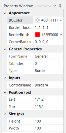
Border

The border control is used to add border to a picture box or to table or even to the forms.
Technical Reference
|
|
APPEARANCE |
BGColor: Choose the background color to be displayed inside the box. This is not a mandatory field to execute the workflow. |
|
BorderThickness(px): Specify the border thickness value in pixels. The order of the border will be (left, top, right, bottom). This is not a mandatory field to execute the workflow |
||
|
BorderBrush: Specify the colour of the border. This is a mandatory field to execute the workflow |
||
|
CornerRadius: Specify how sharp the corner should be. By default it is 0, 0, 0, 0. If the corners has to be blunt increase the number accordingly. This is a mandatory field to execute the workflow |
||
|
GENERAL PROPERTIES |
FormName: Autofills to whichever form the control is dropped into. |
|
|
TabIndex: Specifies the position to which the cursor has to move when the tab on the keyboard is used.
|
||
|
Type: This is auto populated once the border control is selected. |
||
|
INPUTS |
ControlName: Default name given to the control used. |
|
|
POSITION (px) |
Left: Increasing the count will move the control to the right side. Decreasing the count will move it to the Left side. This is a mandatory field to execute the workflow |
|
|
Top: Increasing the count will bring the control down and decreasing the count will move the control up. This is a mandatory field to execute the workflow |
||
|
SIZE (px) |
Height: You can increase or decrease the height of the box. This is a mandatory field to execute the workflow |
|
|
Width: You can increase or decrease the width of the box. This is a mandatory field to execute the workflow |
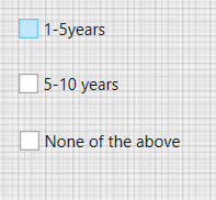
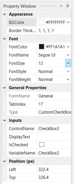
Checkbox
Checkboxes are used when there are lists of options and the user may select any
number of choices, including zero, one, or several.
Technical Reference
|
|
APPEARANCE |
BGColor: Choose the background color to be displayed inside the box. This is a mandatory field to execute the workflow |
|
BorderThickness(px): Specify the border thickness value in pixels. The order of the border will be (left, top, right, bottom). This is a mandatory field to execute the workflow |
||
|
FONT |
FontColor: Specify the colour of the font to be used outside the box. This is not a mandatory field to execute the workflow |
|
|
FontName: Specify the font style to be used outside the box. This is not a mandatory field to execute the workflow |
||
|
FontSize: Specify the font size to be used outside the box. This is not a mandatory field to execute the workflow |
||
|
FontStyle: Choose the style from the drop down to normal, Italic or oblique. This is not a mandatory field to execute the workflow |
||
|
FontWeight: Choose the font weight,to be light, normal or thick. This is not a mandatory field to execute the workflow |
||
|
GENERAL PROPERTIES |
FormName: Autofills to whichever form the control is dropped into. |
|
|
TabIndex: Specifies the position to which the cursor has to move when the tab on the keyboard is used. This is a mandatory field to execute the workflow |
||
|
Type: This is auto populated once the checkbox control is selected. |
||
|
INPUTS |
ControlName: Default name given to the control used. |
|
|
DisplayText: Specifies the text related to the checkbox which can be customized. This is a mandatory field to execute the workflow |
||
|
IsChecked: Check this box if the box has to be checked by default. This is a mandatory field to execute the workflow |
||
|
VariableName: Declare a variable here to return the value of the checkbox. This is a mandatory field to execute the workflow |
||
|
POSITION |
Left: Increasing the count will move the control to the right side. Decreasing the count will move it to the Left side. This is a mandatory field to execute the workflow |
|
|
Top: Increasing the count will bring the control down and decreasing the count will move the control up. This is a mandatory field to execute the workflow |
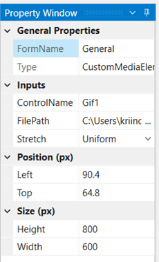
GIF
Gifs are used when we want to bring an existing gif into the form.
Technical Reference
|
|
GENERAL PROPERTIES |
FormName: Autofills to whichever form the control is dropped into. |
|
Type: This is auto populated once the checkbox control is selected. |
||
|
INPUTS |
ControlName: Default name given to the control used. |
|
|
FilePath: Specify the file path in which the existing GIF is stored. This is a mandatory field to execute the workflow |
||
|
Stretch: Defines how the image has to be displayed. This is a mandatory field to execute the workflow. |
||
|
POSITION (px) |
Left: Increasing the count will move the control to the right side. Decreasing the count will move it to the Left side. This is a mandatory field to execute the workflow |
|
|
Top: Increasing the count will bring the control down and decreasing the count will move the control up. This is a mandatory field to execute the workflow |
||
|
SIZE (px) |
Height: Specify the height of the Gif screen. This is a mandatory field to execute the workflow |
|
|
Width: Specify the width of the Gif Screen. This is a mandatory field to execute the workflow. |
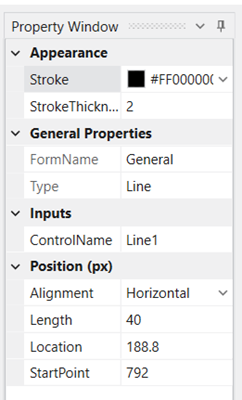
Line

Lines can be used to separate, organize, emphasize, or provide a framework for the page.
Technical Reference
|
|
APPEARANCE |
Stroke: Specify the colour of the line. This is a mandatory field to execute the workflow |
|
StrokeThickness: Specify the thickness of the stroke. Increase or decrease the number for the same. This is a mandatory field to execute the workflow |
||
|
GENERAL PROPERTIES |
FormName: Autofills to whichever form the control is dropped into. |
|
|
Type: This is auto populated once the Line control is selected. |
||
|
INPUTS |
ControlName: Default name given to the control used. |
|
|
POSITION (px) |
Alignment: Choose from the drop down for the line to be horizontal or vertical. This is a mandatory field to execute the workflow |
|
|
Length: Specify the length of the line required. This is a mandatory field to execute the workflow |
||
|
Location: Specify where exactly the line has to be placed. This is a mandatory field to execute the workflow |
||
|
StartPoint: Specify from where the line has to start. This is a mandatory field to execute the workflow. |
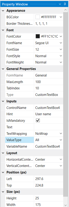
TextBox
Text boxes are used to get input from the user or to display text. The TextBox control
is generally used for editable text.
Technical Reference
|
|
APPEARANCE |
BGColor: Choose the background color to be displayed inside the button. This is not a mandatory field to execute the workflow |
|
BorderThickness(px): Specify the border thickness value in pixels. The order of the border will be (left, top, right, bottom). This is a mandatory field to execute the workflow |
||
|
FONT |
FontColor: Specify the colour of the font to be used inside the box. This is a mandatory field to execute the workflow. |
|
|
FontName: Specify the font style to be used inside the box. This is a mandatory field to execute the workflow |
||
|
FontSize: Specify the font size to be used inside the box This is a mandatory field to execute the workflow |
||
|
FontStyle: Choose the style from the drop down to normal, Italic or oblique. |
||
|
FontWeight: Choose the font weight,to be light, normal or thick. |
||
|
GENERAL PROPERTIES |
FormName: Autofills to whichever form the control is dropped into. |
|
|
MaxLength: Set the maximum number of characters that can be entered in the textbox. |
||
|
TabIndex: Specifies the position to which the cursor has to move when the tab on the keyboard is used.
|
||
|
Type: This is auto populated once the checkbox control is selected. |
||
|
INPUTS |
ControlName: Default name given to the control used. |
|
|
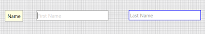
Hint: Editable text inside the box which gives a hint of what has to entered into the box. |
||
|
IsMandatory: Check this box if the details to be entered by the user is mandatory. This is denoted by an asterisk sign on top |
||
|
Text: The text that the user has to enter when prompted. |
||
|
TextWrapping: Specify if the text entered has to be wrapped or not. |
||
|
ValueType: Specify if alphabets or alphanumeric or only numeric should be entered. |
||
|
VariableName: Declare a variable here to return the value of the textbox. |
||
|
LAYOUT |
HorizontalContent: Specify how the given entry has to be taken. |
|
|
VerticalContent: Specify how the given entry has to be taken. |
||
|
POSITION (px) |
Left: Increasing the count will move the control to the right side. Decreasing the count will move it to the Left side. |
|
|
Top: Increasing the count will bring the control down and decreasing the count will move the control up. |
||
|
SIZE (px) |
Height: Specify the height of the box |
|
|
Width: Specify the width of the box |
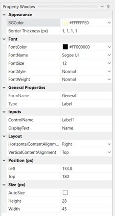
Labels
Form labels are read by a screen reader when a form field receives focus.
Labels are there to connect an explanatory text with a form element.
Technical Reference
|
|
APPEARANCE |
BGColor: Choose the background color to be displayed inside the label.
|
|
BorderThickness(px): Specify the border thickness value in pixels. The order of the border will be (left, top, right, bottom).
|
||
|
FONT |
FontColor: Specify the colour of the font to be used inside the box. |
|
|
FontName: Specify the font style to be used inside the box. |
||
|
FontSize: Specify the font size to be used inside the box |
||
|
FontStyle: Choose the style from the drop down to normal, Italic or oblique. |
||
|
FontWeight: Choose the font weight,to be light, normal or thick. |
||
|
GENERAL PROPERTIES |
FormName: Autofills to whichever form the control is dropped into. |
|
|
Type: This is auto populated once the checkbox control is selected. |
||
|
INPUTS |
ControlName: Default name given to the control used. |
|
|
DisplayText: Specify the text to be entered into the label box |
||
|
LAYOUT |
HorizontalContentAlignment: Choose from the drop down on how the horizontal text should be aligned. |
|
|
VerticalContentAlignment: Choose from the drop down on how the vertical text should be aligned. |
||
|
POSITION (px) |
Left: Increasing the count will move the control to the right side. Decreasing the count will move it to the Left side. |
|
|
Top: Increasing the count will bring the control down and decreasing the count will move the control up. |
||
|
SIZE (px) |
AutoSize: Check this box, for the label box to get an automatic size based on the text entered. |
|
|
Height: Specify the height of the box |
||
|
Width: Specify the width of the box |
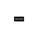
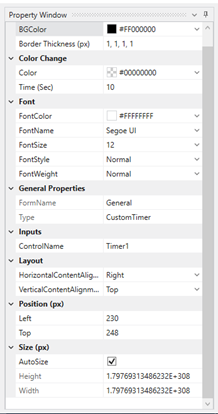
Timer
This control can be used when you want to add timer to the forms.
Technical Reference
|
|
APPEARANCE |
BGColor: Choose the background color from the color wheel to be displayed for the timer box. |
|
BorderThickness(px): Specify the border thickness value in pixels. The order of the border will be (left, top, right, bottom). |
||
|
COLOR CHANGE |
Color: Choose the color to display for the next timer box when the time ends. |
|
|
Time (sec): Specify the time value in seconds to add in the form. |
||
|
FONT |
FontColor: Choose the font color from the color wheel for the text/ value to display. |
|
|
FontName: You can choose the font name from the drop-down for the text/ value to display. |
||
|
FontSize: Specify the font size for the text/value to display. |
||
|
FontStyle: Choose the font style from the drop – down, · Normal · Italic · Oblique |
||
|
FontWeight: The thickness/ weight of the font can be selected from the drop-down. |
||
|
GENERAL PROPERTIES |
FormName: The name of the form will be displayed here. |
|
|
Type: The type of the control will be displayed here. |
||
|
INPUT |
ControlName: It displays the default name. |
|
|
LAYOUT |
HorizontalContentAlignment: Choose the horizontal alignment from the drop-down for the content while displaying. |
|
|
VerticalContentAlignment: Choose the vertical alignment from the drop-down for the content while displaying. |
||
|
POSITION |
Left: Increasing the count will move the control to the right side. Decreasing the count will move it to the Left side. |
|
|
Top: Increasing the count will bring the control down and decreasing the count will move the control up. |
||
|
SIZE(px) |
Autosize: Choose this option to automatically detect and fill the size of the control. |
|
|
Height: You can increase or decrease the height of the box. |
||
|
Width: You can increase or decrease the width of the box. |
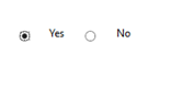
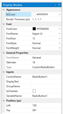
Radio Button
This control is used to add radio button to the forms. These forms can be used as
either one option. If an option is selected, the circle will be filled. If the option is not
selected, the circle will be empty. When one circle is selected, the others are
deselected, so that only one option may be selected at any time.
Technical Reference
|
|
APPEARANCE |
BGColor: Choose the background color from the color wheel to be displayed for the timer box. |
|
BorderThickness(px): Specify the border thickness value in pixels. The order of the border will be (left, top, right, bottom). |
||
|
FONT |
FontColor: Choose the font color from the color wheel for the text/ value to display. |
|
|
FontName: You can choose the font name from the drop-down for the text/ value to display. |
||
|
FontSize: Specify the font size for the text/value to display. |
||
|
FontStyle: Choose the font style from the drop – down, · Normal · Italic · Oblique |
||
|
FontWeight: The thickness/ weight of the font can be selected from the drop-down. |
||
|
GENERAL PROPERTIES |
FormName: The name of the form will be displayed here. |
|
|
TabIndex: Tab index specifies the position to which the cursor has to move when the tab on the keyboard is used. |
||
|
Type: The type of the control will be displayed here. |
||
|
INPUTS |
ControlName: It displays the default name. |
|
|
DisplayText: Specify the text here to display in the form. |
||
|
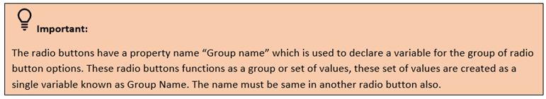
GroupName: Create a variable name here for the set of options of the radio button. |
||
|
IsChecked: This option can be checked when you want to check that button in default. |
||
|
VariableName: Create a variable name for the radio button. |
||
|
POSITION |
Left : Increasing the count will move the control to the right side. Decreasing the count will move it to the Left side. |
|
|
Top: Increasing the count will bring the control down and decreasing the count will move the control up. |
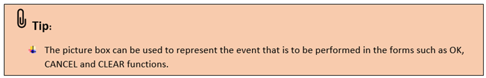
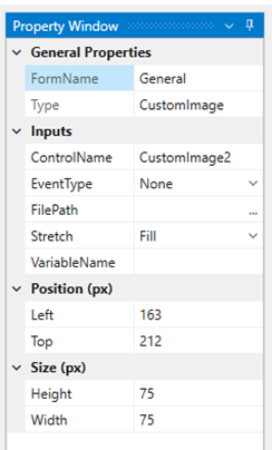
PictureBox
This control is used when you want to add a picture to the form. The picture box
is used to represent something, or to add to display an image.
Technical Reference
|
|
GENERAL PROPERTIES |
FormName: The name of the form will be displayed here. |
|
Type: The type of the control will be displayed here. |
||
|
INPUTS |
ControlName: It displays the default name. |
|
|
EventType: Choose the event that the picture needs to perform from the drop-down. · OK · Cancel · Clear · None |
||
|
FilePath: Choose the file path from the local by selecting the three dots in the box. |
||
|
Stretch: Choose the stretch options from the drop-down to, · Fill the image according to the size of the box, · Align the image uniformly to the box, · Align the image uniformly to fill the box. |
||
|
VariableName: Create a variable name to define the picture in the workflow. |
||
|
POSITION |
Left : Increasing the count will move the control to the right side. Decreasing the count will move it to the Left side. |
|
|
Top: Increasing the count will bring the control down and decreasing the count will move the control up. |
||
|
SIZE |
Height: You can increase or decrease the height of the box. |
|
|
Width: You can increase or decrease the width of the box. |
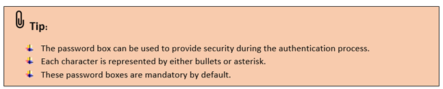
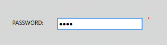
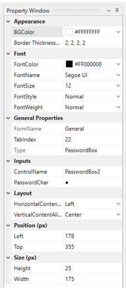
Password Box
This control is used when you want to give password option to the forms and
to get password details from the user. The control option does not display what
the user types in the box.
Technical Reference
|
|
APPEARANCE |
BGColor: Choose the background color from the color wheel to be displayed for the timer box. |
|
BorderThickness(px): Specify the border thickness value in pixels. The order of the border will be (left, top, right, bottom). |
||
|
FONT |
FontColor: Choose the font color from the color wheel for the text/ value to display. |
|
|
FontName: You can choose the font name from the drop-down for the text/ value to display. |
||
|
FontSize: Specify the font size for the text/value to display. |
||
|
FontStyle: Choose the font style from the drop – down, · Normal · Italic · Oblique |
||
|
FontWeight: The thickness/ weight of the font can be selected from the drop-down. |
||
|
GENERAL PROPERTIES |
FormName: The name of the form will be displayed here. |
|
|
TabIndex: Tab index specifies the position to which the cursor has to move when the tab on the keyboard is used. |
||
|
Type: The type of the control will be displayed here. |
||
|
INPUTS |
ControlName: It displays the default name. |
|
|
PasswordChar: Specify the password characters that needs to be represented during the runtime. The default will be bullet. |
||
|
LAYOUT |
HorizontalContentAlignment: Choose the horizontal alignment from the drop-down for the content while displaying. |
|
|
VerticalContentAlignment: Choose the vertical alignment from the drop-down for the content while displaying. |
||
|
POSITION (px) |
Left : Increasing the count will move the control to the right side. Decreasing the count will move it to the Left side. |
|
|
Top: Increasing the count will bring the control down and decreasing the count will move the control up. |
||
|
SIZE(px) |
Height: You can increase or decrease the height of the box. |
|
|
Width: You can increase or decrease the width of the box. |
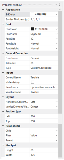
Drop-down
This control is used when you want to add the values in a drop-down.
Creation of Drop-down and its data
1. Drag and drop the drop-down control to the form.
2. A drop-down customizing window will appear on the form.
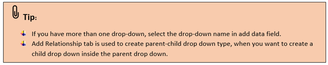
3. There are 3 tabs – Add Drop down, Add Data, Add Relationship.
4. Select the Add Drop-down tab and create drop-down name as
“Education” and select the add (+) button.
5. Go to the next tab, Add Data, this tab allows to add data to the drop down.
6. Select the Dropdown name from the box
7. Add items in the Items column and select add (+) button.
8. Once adding, select ok.
9. The values will be added to the field automatically.
Technical Reference
|
|
APPEARANCE |
BGColor: Choose the background color from the color wheel to be displayed for the timer box. |
|
BorderThickness(px): Specify the border thickness value in pixels. The order of the border will be (left, top, right, bottom). |
||
|
FONT |
FontColor: Choose the font color from the color wheel for the text/ value to display. |
|
|
FontName: You can choose the font name from the drop-down for the text/ value to display. |
||
|
FontSize: Specify the font size for the text/value to display. |
||
|
FontStyle: Choose the font style from the drop – down, · Normal · Italic · Oblique |
||
|
FontWeight: The thickness/ weight of the font can be selected from the drop-down. |
||
|
GENERAL PROPERTIES |
FormName: The name of the form will be displayed here. |
|
|
TabIndex: Tab index specifies the position to which the cursor has to move when the tab on the keyboard is used. |
||
|
Type: The type of the control will be displayed here. |
||
|
INPUTS |
ControlName: It displays the drop -down name. |
|
|
IsMandatory: You can check this box to make this drop-down a mandatory option for the user. |
||
|
ItemSource: This property gets the data auto- filled from the drop-down customizing window. |
||
|
VariableName: The variable name gets auto filled from drop-down name. |
||
|
LAYOUT |
HorizontalContentAlignment: Choose the horizontal alignment from the drop-down for the content while displaying. |
|
|
VerticalContentAlignment: Choose the vertical alignment from the drop-down for the content while displaying. |
||
|
POSITION(px) |
Left : Increasing the count will move the control to the right side. Decreasing the count will move it to the Left side. |
|
|
Top: Increasing the count will bring the control down and decreasing the count will move the control up. |
||
|
RELATIONSHIP |
Child: This field gets auto filled when the child drop- down is created. |
|
|
Filter: Choose the filter type either by Key or value from the drop-down |
||
|
Parent: You can the choose the drop-down name which needs to be created as parent. |
||
|
SIZE(px) |
Height: You can increase or decrease the height of the box. |
|
|
Width: You can increase or decrease the width of the box. |
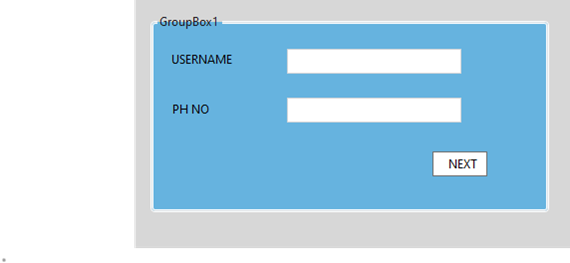
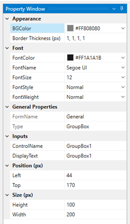
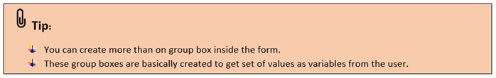
GroupBox
This control can be used to group related controls (such as option buttons,
check boxes, or closely related contents) into one visual unit.
Group boxes are rectangular objects with optional labels. Use a group box to
visually organize related items on a form. For example, in a customer order
application, group the name, address, and account number of a customer.
Or in an order form, group a list of available items.
Technical Reference
|
|
APPEARANCE |
BGColor: Choose the background color from the color wheel to be displayed for the timer box. |
|
BorderThickness(px): Specify the border thickness value in pixels. The order of the border will be (left, top, right, bottom). |
||
|
FONT |
FontColor: Choose the font color from the color wheel for the text/ value to display. |
|
|
FontName: You can choose the font name from the drop-down for the text/ value to display. |
||
|
FontSize: Specify the font size for the text/value to display. |
||
|
FontStyle: Choose the font style from the drop – down, · Normal · Italic · Oblique |
||
|
FontWeight: The thickness/ weight of the font can be selected from the drop-down. |
||
|
GENERAL PROPERTIES |
FormName: The name of the form will be displayed here. |
|
|
Type: The type of the control will be displayed here. |
||
|
INPUTS |
ControlName: It displays the default name |
|
|
DisplayText: Specify the text here to display in the form. |
||
|
POSITION(px) |
Left : Increasing the count will move the control to the right side. Decreasing the count will move it to the Left side. |
|
|
Top: Increasing the count will bring the control down and decreasing the count will move the control up. |
||
|
SIZE(px) |
Height: You can increase or decrease the height of the box. |
|
|
Width: You can increase or decrease the width of the box. |
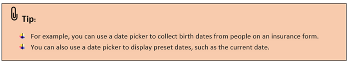
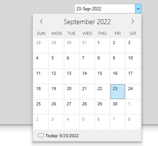
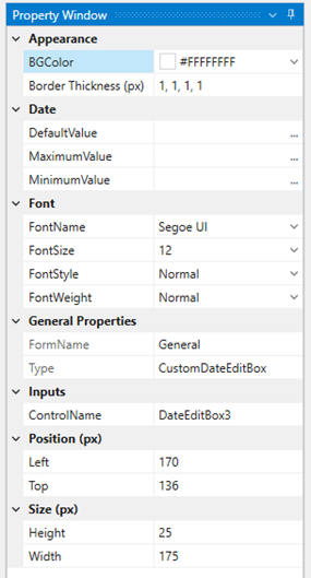
Datepicker
This control allows the users to enter dates from the calendar pop-up.
Technical Reference
|
|
APPEARANCE |
BGColor: Choose the background color from the color wheel to be displayed for the timer box. |
|
BorderThickness(px): Specify the border thickness value in pixels. The order of the border will be (left, top, right, bottom). |
||
|
DATE |
DefaultValue: Specify the default value either from drop-down, Variable – You need to create a variable here to assign in the workflow. Datepicker – You can select this option to select the date from the calendar. |
|
|
MinimumValue: Specify the minimum value either from drop-down, Variable – You need to create a variable here to assign in the workflow. Datepicker – You can select this option to select the date from the calendar. |
||
|
MaximumValue: Specify the maximum value either from drop-down, Variable – You need to create a variable here to assign in the workflow. Datepicker – You can select this option to select the date from the calendar. |
||
|
FONT |
FontColor: Choose the font color from the color wheel for the text/ value to display. |
|
|
FontName: You can choose the font name from the drop-down for the text/ value to display. |
||
|
FontSize: Specify the font size for the text/value to display. |
||
|
FontStyle: Choose the font style from the drop – down, · Normal · Italic · Oblique |
||
|
FontWeight: The thickness/ weight of the font can be selected from the drop-down. |
||
|
GENERAL PROPERTIES |
FormName: The name of the form will be displayed here. |
|
|
Type: The type of the control will be displayed here. |
||
|
INPUT |
ControlName: It displays the default name |
|
|
POSITION(px) |
Left : Increasing the count will move the control to the right side. Decreasing the count will move it to the Left side. |
|
|
Top: Increasing the count will bring the control down and decreasing the count will move the control up. |
||
|
SIZE(px) |
Height: You can increase or decrease the height of the box. |
|
|
Width: You can increase or decrease the width of the box. |
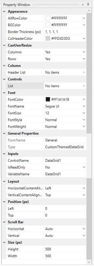
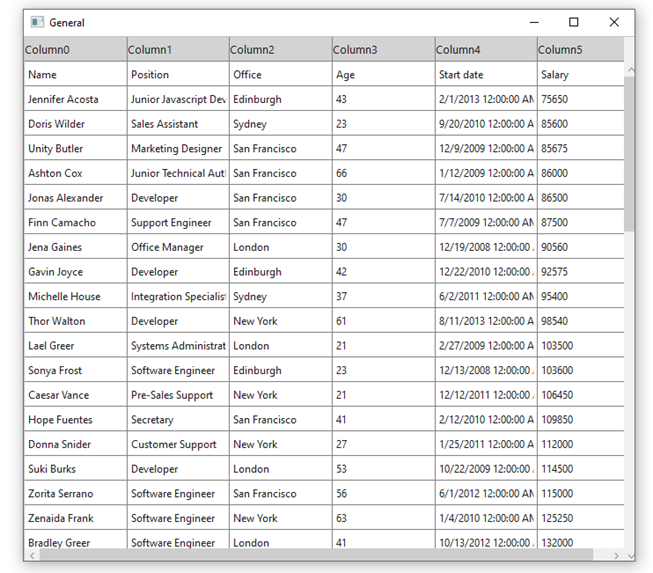
Datagrid
This control is used to display data in a series of rows and columns.
DataGrid is used to display data in scrollable grid. It requires data
source to populate data in the grid.
Technical Reference
|
|
APPEARANCE |
AltRowColor: You can choose the color from the color wheel to set colors in alternative rows. |
|
BGcolor: Choose the background color from the color wheel to be displayed for the timer box. |
||
|
BorderThickness(px): Specify the border thickness value in pixels. The order of the border will be (left, top, right, bottom). |
||
|
ColHeaderColor: You can set the colors for column headers from the color wheel. |
||
|
CAN USER RESIZE? |
Columns: You can set the columns resizable for the user here from the drop -down. Select either yes or no. |
|
|
Rows: You can set the rows resizable for the user here from the drop -down. Select either yes or no |
||
|
COLUMNS |
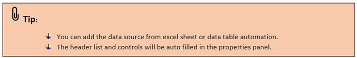
HeaderList: If you are entering data inputs directly, mention the header list. |
|
|
CONTROLS |
List: If you are entering data inputs directly, mention the list items. |
|
|
FONT |
FontColor: Choose the font color from the color wheel for the text/ value to display. |
|
|
FontName: You can choose the font name from the drop-down for the text/ value to display. |
||
|
FontSize: Specify the font size for the text/value to display. |
||
|
FontStyle: Choose the font style from the drop – down, · Normal · Italic · Oblique |
||
|
FontWeight: The thickness/ weight of the font can be selected from the drop-down. |
||
|
GENERAL PROPERTIES |
FormName: The name of the form will be displayed here. |
|
|
Type: The type of the control will be displayed here. |
||
|
INPUTS |
ControlName: It displays the default name |
|
|
IsReadable: You can set the table to only read mode here from the drop-down. |
||
|
VariableName: A default variable name will be available here; you can customize it accordingly. |
||
|
LAYOUT |
HorizontalContentAlignment: Choose the horizontal alignment from the drop-down for the content while displaying. |
|
|
VerticalContentAlignment: Choose the vertical alignment from the drop-down for the content while displaying. |
||
|
POSITION(px) |
Left : Increasing the count will move the control to the right side. Decreasing the count will move it to the Left side. |
|
|
Top: Increasing the count will bring the control down and decreasing the count will move the control up. |
||
|
SCROLL BAR |
Horizontal: The scroll bar will be automatically created horizontally if it is set as Auto. The other options are , Auto, Disabled, Hidden, Visible. |
|
|
Vertical: The scroll bar will be automatically created vertically if it is set as Auto. The other options are , Auto, Disabled, Hidden, Visible. |
||
|
SIZE(px) |
Height: You can increase or decrease the height of the box. |
|
|
Width: You can increase or decrease the width of the box. |