
Simplifying human and robot collaboration. Design professional looking forms
for assisted automation using the Form Builder and customize with advanced
styling options to match your process and branding.
Purposes
1. Form builder facilitates the user to create customizable forms that will help
consolidate and enter values during execution of the robot and with the values,
decide the sequence of workflows that has to be executed. So, even before storing
data, if user can create the forms as per requirement, it would be easy for them to
collect or pass information seamlessly.
2. This is extremely helpful in validations, or quickly collecting missed out details, etc.
Additionally, the user will be able to group multiple forms in a workflow using simple
drag and drop activities.
3. The forms can be created swiftly and creatively, based on individual needs. It cannot
get simpler than this, because there is no necessity to create variables or get into
complex steps.
4. Due to the many font styles and sizes, various background and font colors, provision
for icons and headers, resizing and positioning, the forms can be customized as creatively
as possible.
How to open a form?
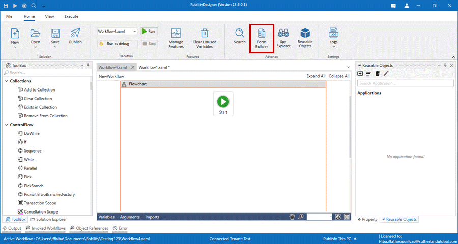
1. From your designer home menu, select the Form builder option.
2. If the form builder is not available in your designer, it will automatically start to install
when you select it.
3. The form dialog box appears on the screen.
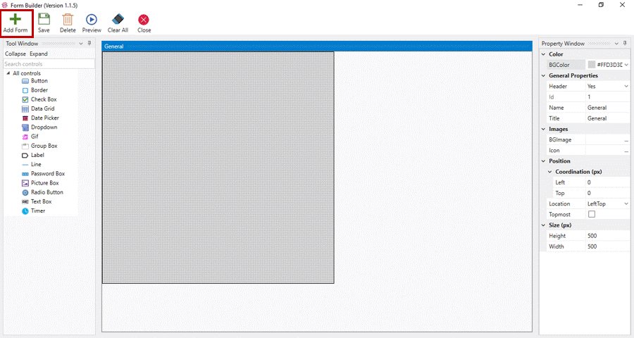
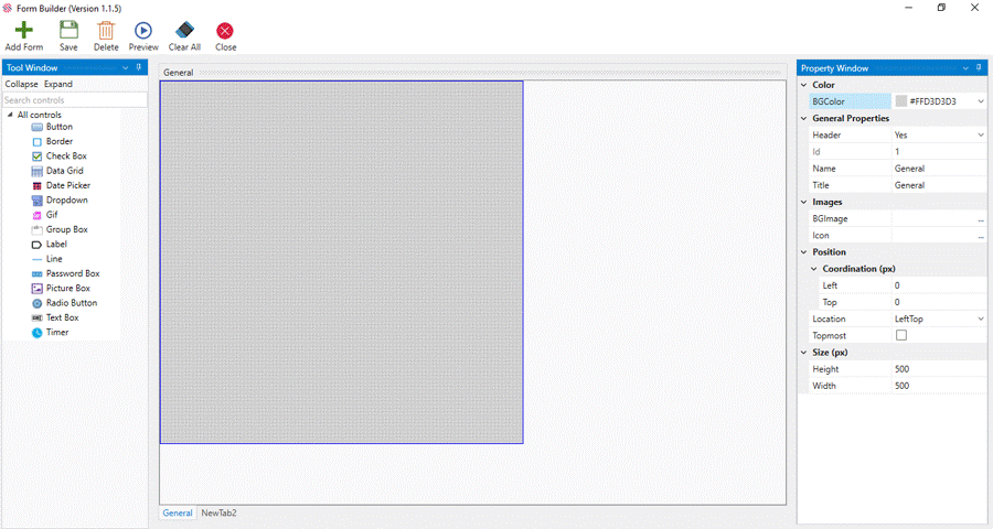
Main Window
The main window has the menu on the top, the tool window on the left, the property
window on the right and a default design form named General
Menu
The menu has options such as add form, save, delete, preview, clear all, close.
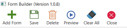
· Add Form- To create multiple forms, click on the Add Form menu, fill the Form Name,
Title and Add. The title will be displayed at the bottom, open the form and proceed.
· Save: After creating a form or a form with controls or while making changes, save
option is used
· Delete: Will delete the highlighted controls from the form. If the form is selected, it
deletes the form itself. However, it does not allow to delete the default form
· Preview: Allows you to take a sneak peek of the selected form before adding to the
activity.
· Clear all: Will clear all the controls in the selected form.
· Close: Will Close the whole form which is selected.
Property Window
· The property window has the properties for the default form available.
· Background Color of forms are chosen from the choices provided in the Color field.
· Each form should have unique names and titles.
· A background image and icon can be given to the form by clicking on the three dots
in the respective boxes.
· We can use the position box and choose from the options given to display the form
and also adjust the height and width of the form.
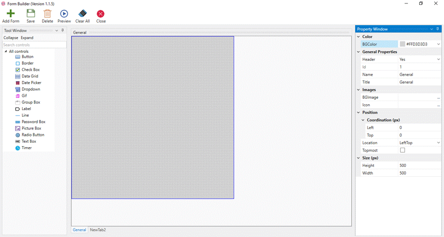
Tool Window
· The tool window allows us to add controls to the form.
· It has 15 options from which we can choose to build the form.
· This box can be hidden or made viewable by using the expand or
collapse option.
· The search box helps us to search for a specific control.
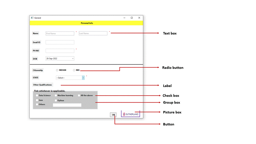
Sample Form
Here we have created a sample form with the following controls.
To know more about the form builder feature, click on the link below,
Sutherland Robility (sutherlandglobal.com)
Click here to learn about the controls in the Form Builder.