
Log
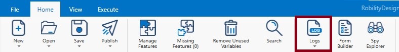
The Log menu provides accurate information of the robot execution for capturing and tracking errors as well as maintaining sophisticated audit trails. We have added workflow execution duration, removed character limitation on the Designer output console to make it more informative and user-friendly. Click on Log to access the activity's log details which is user specific and precise.
Based on the requirement of the project, the user defines the level of data that needs to be recorded during execution by using the Log Level option.
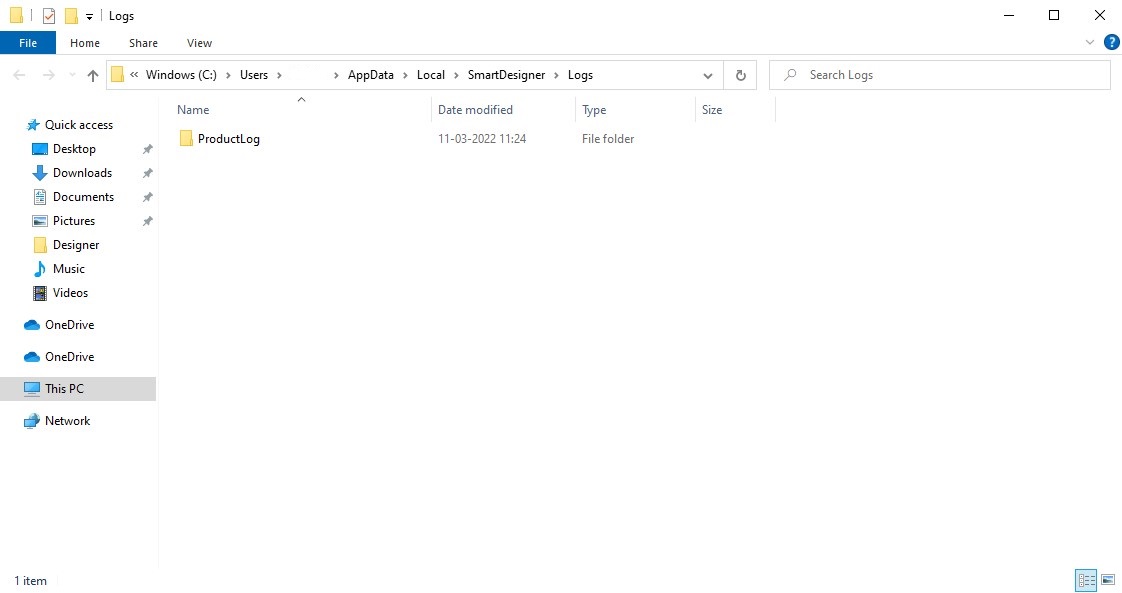
The open logs options redirects to the logs stored in the local path of the user’s system. If the user has the requirement, can view logs which have been stored in the system.
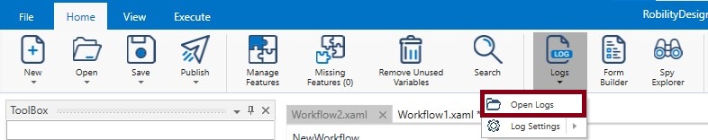
The Log Settings drop-down has the following options. The settings are set as per the level in which the user has the necessity.
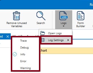
Info
This log level provides information pertaining to the start and end of the execution of the workflow. Errors if any, warnings if any, will be captured if the user selects the info log level.
Trace
Trace level allows the user to capture every single action or step executed by the robot, along with the step-by-step information. Info, Debug and the succeeding levels are traced when one chooses the trace level.
Debug
If the requirement is for the initiation and completion details of the activities, barring the system information, choose the Debug level. Information, Warning and the subsequent levels will be captured (if present) when one chooses the Debug level. Except for trace, all other log levels will be displayed.
Warning
The Warning level can be set in instances where the exception does not act as a barrier for processing but needs to be addressed.
Error
In certain runs, some part of the workflow will be executed, and some others may not, due to errors and in such instances the user could set Error to check where, why and how the mistake has occurred. Warning will also be captured.
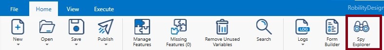
SPY Explorer
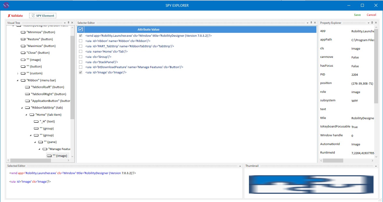
This feature helps the user to know the selected element’s attributes. Click on the spy explorer option. The window appears on the screen.
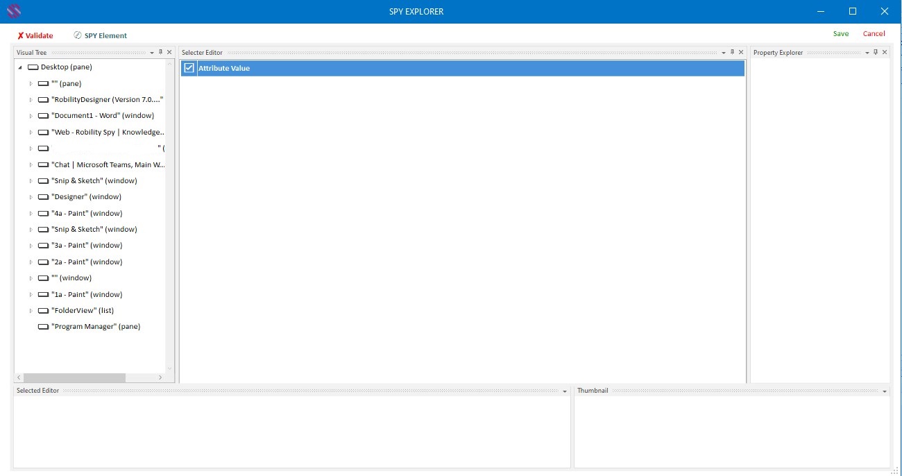
The visual tree panel displays the applications that are currently available in the user system.
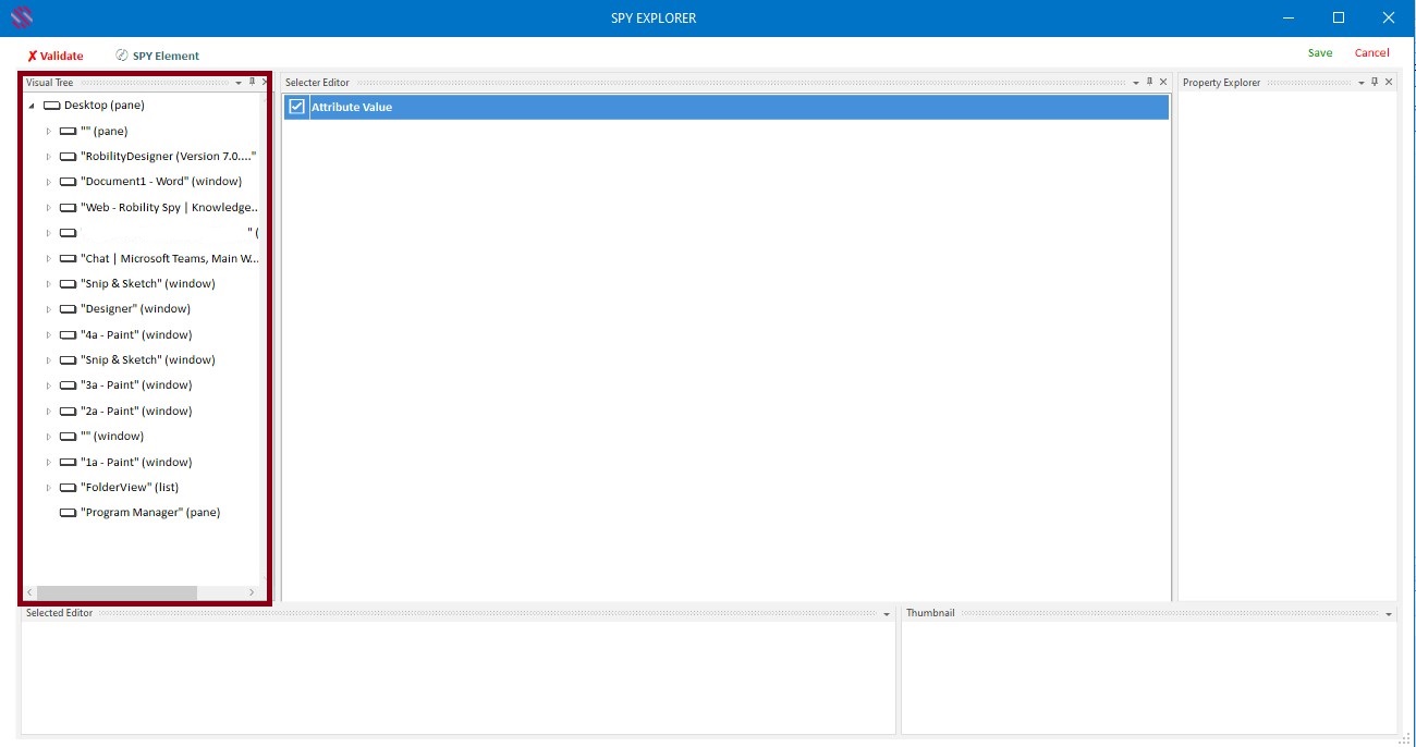
The Validate option above the visual tree panel helps to validate the element that has been spied using the Spy element option near to it.
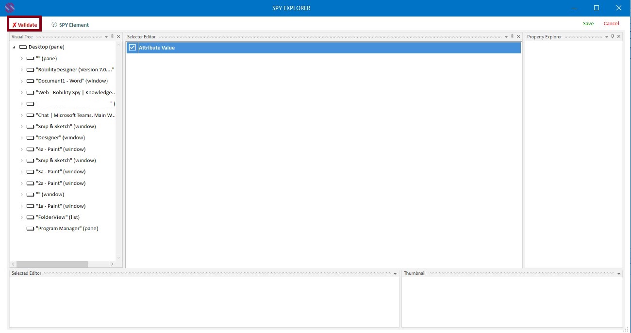
The SPY element option enables to allow the user to manually select the element. Click on the spy element option then select the element. The attributes of the selected element will be displayed in the selector editor panel. Another window appears while the user moving the cursor to select an element, to enlarge the selecting element.
Once the element is selected, its attributes will be displayed in the selector editor panel.
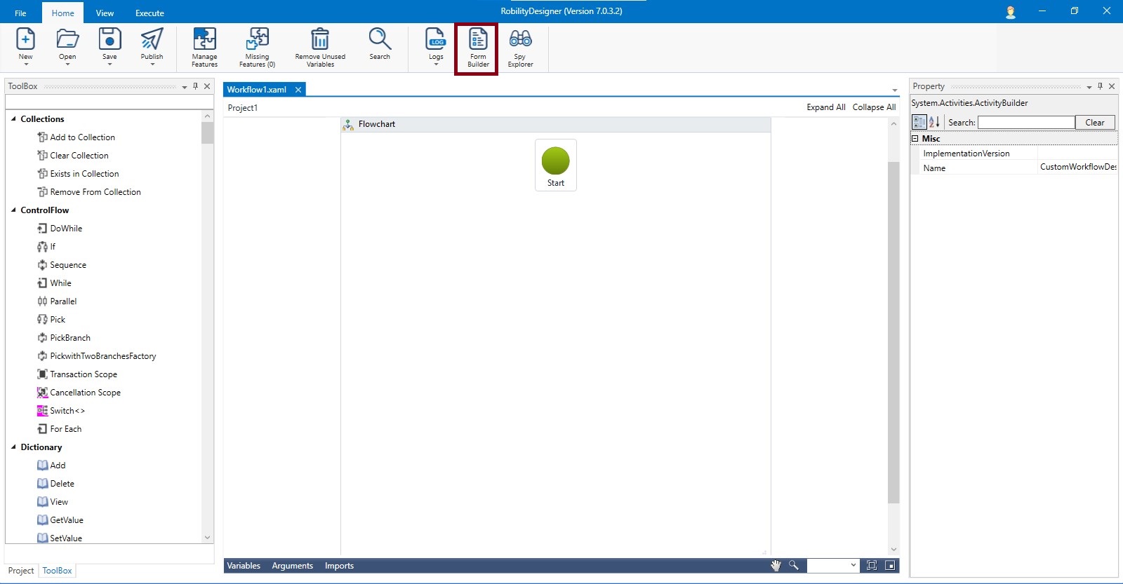
Form Builder
Simplifying human and robot collaboration. Design professional looking forms for assisted automation using the Form Builder and customize with advanced styling options to match your process and branding.
Important Note: To use the form builder make sure to install form builder activity, using feature manager.
Form builder facilitates the user to create customizable forms that will help consolidate and enter values during execution of the robot and with the values, decide the sequence of workflows that has to be executed. So, even before storing data, if user can create the forms as per requirement, it would be easy for them to collect or pass information seamlessly. This is extremely helpful in validations, or quickly collecting missed out details, etc. Additionally, the user will be able to group multiple forms in a workflow using simple drag and drop activities. The forms can be created swiftly and creatively, based on individual needs. It cannot get simpler than this, because there is no necessity to create variables or get into complex steps. Due to the many font styles and sizes, various background and font colors, provision for icons and headers, resizing and positioning, the forms can be customized as creatively as possible.
How to start?
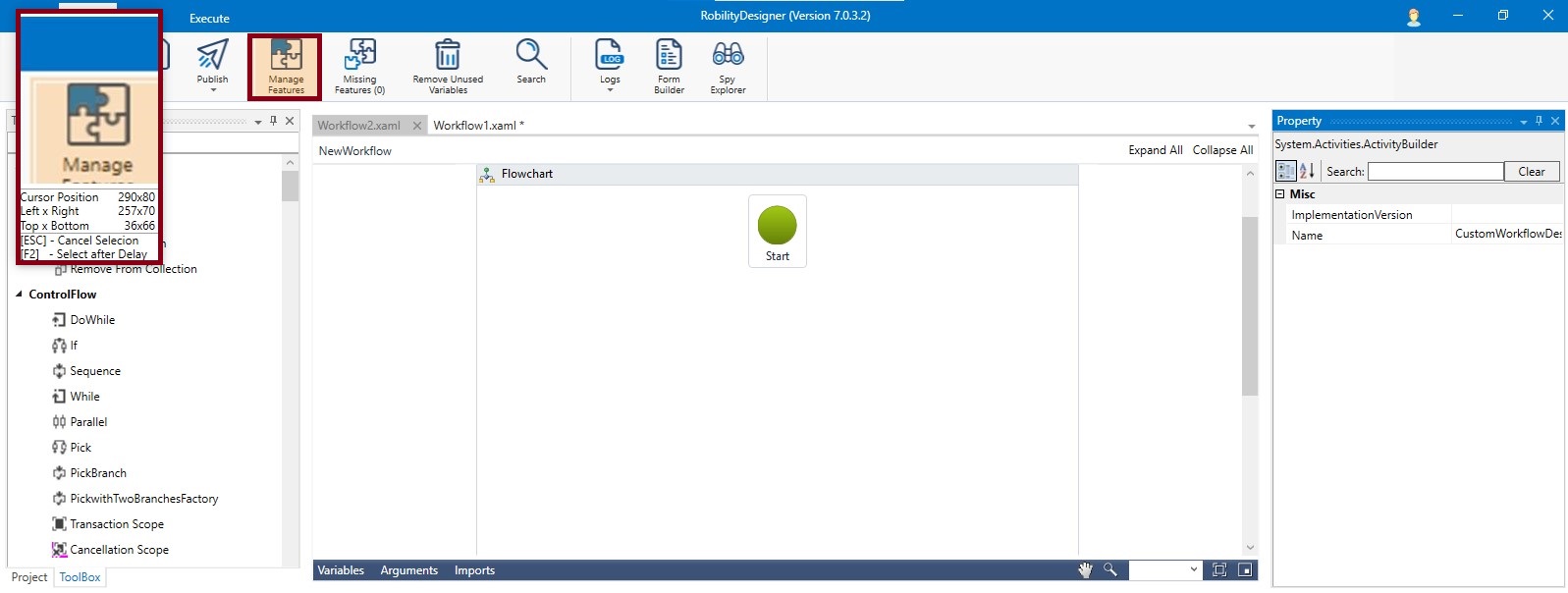
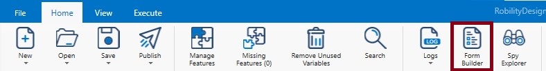
Download the Form Builder activity from Manage Features menu in the Smart Designer. Only if you download the Form Builder activity can you use the controls available in the Form Builder Menu. Click on the Form Builder that is available as a menu at the top middle in the Home Tab.
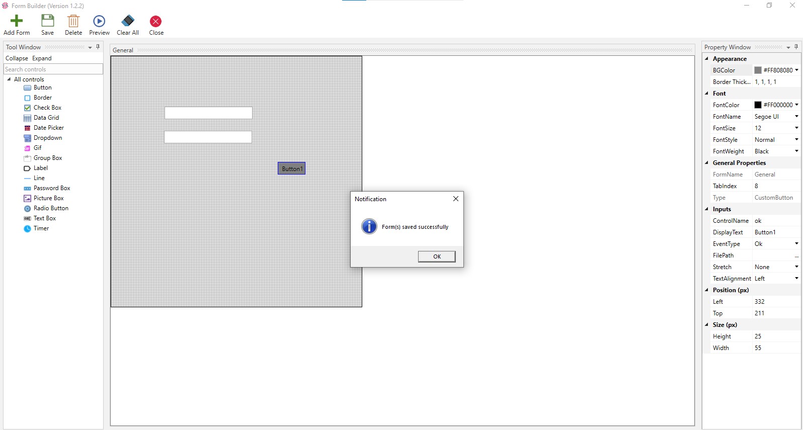
The General Form will be enabled. You can name it as desired and customize it using the options provided in the Property Window.
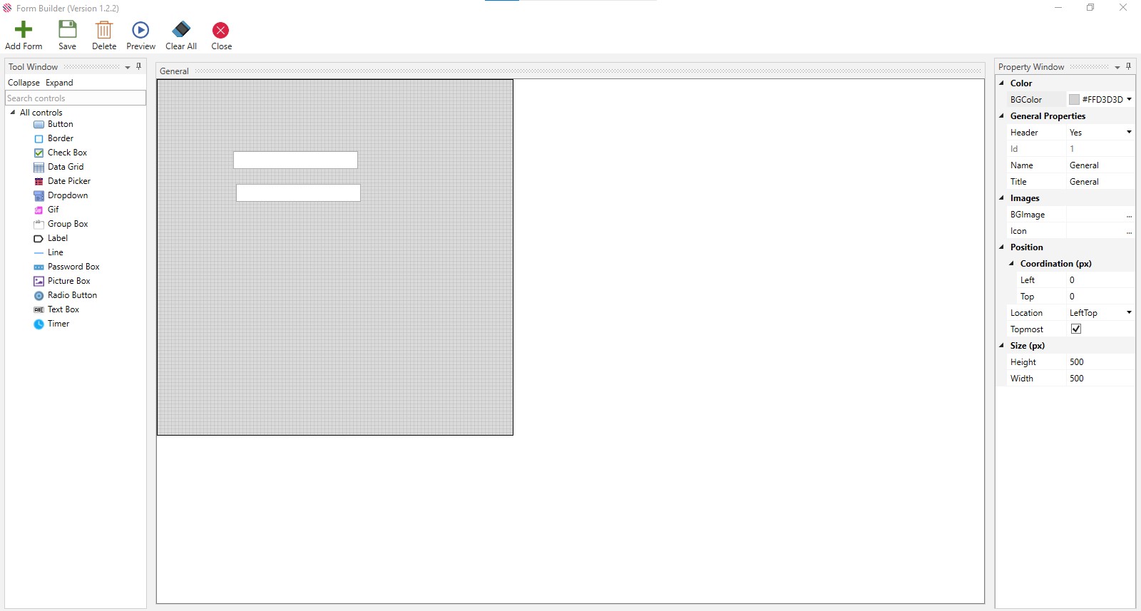
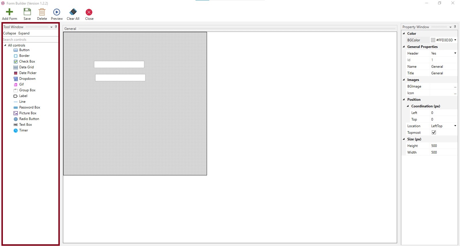
Main Window
The main tab comprises the Tool Window on the left, Property Window on the right and an empty form with a default design form named General.
Property Window
Several options are provided in the Property Window. Background Color of forms are chosen from the choices provided in the Color field. Each form should have unique names and titles. Duplicate names for forms are disallowed just as duplicate names in controls are disallowed. Name and Title help easy identification and is not mandatory. File Path is used to load pictures or icons.
Using the choices in the Position field, the form and controls can be placed to the right, left, top or bottom, etc.
The black outline that is seen is the margin, which is the default window size, and the design form will be of the same width and height if the size option is not required. One can resize the form to fit individual requirements, using the Height and Width options provided under the Size field. Ensure all controls are created within the boundary of the form to avoid errors.
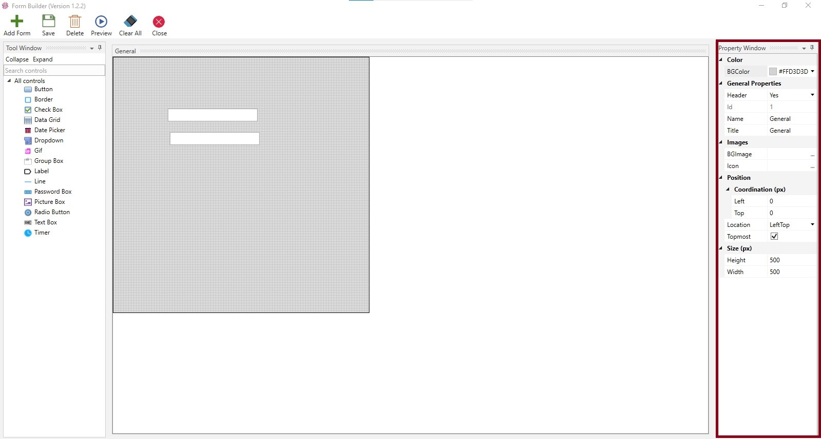
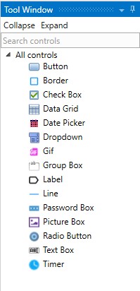
Tool Window
The form can be created using the controls provided in the Tool Window.
The controls are found under the Tool Window and can be hidden or made viewable by using the Collapse or Expand options. Currently, there are fifteen controls to begin with. Search Controls allows the user to filter search and select the required control, promptly.
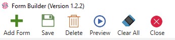
Menu
Menu comprises options such as Add Form, Save, Delete, Preview, and Close, which can be used to perform these actions. Clear All options will clear all the controls in the form.
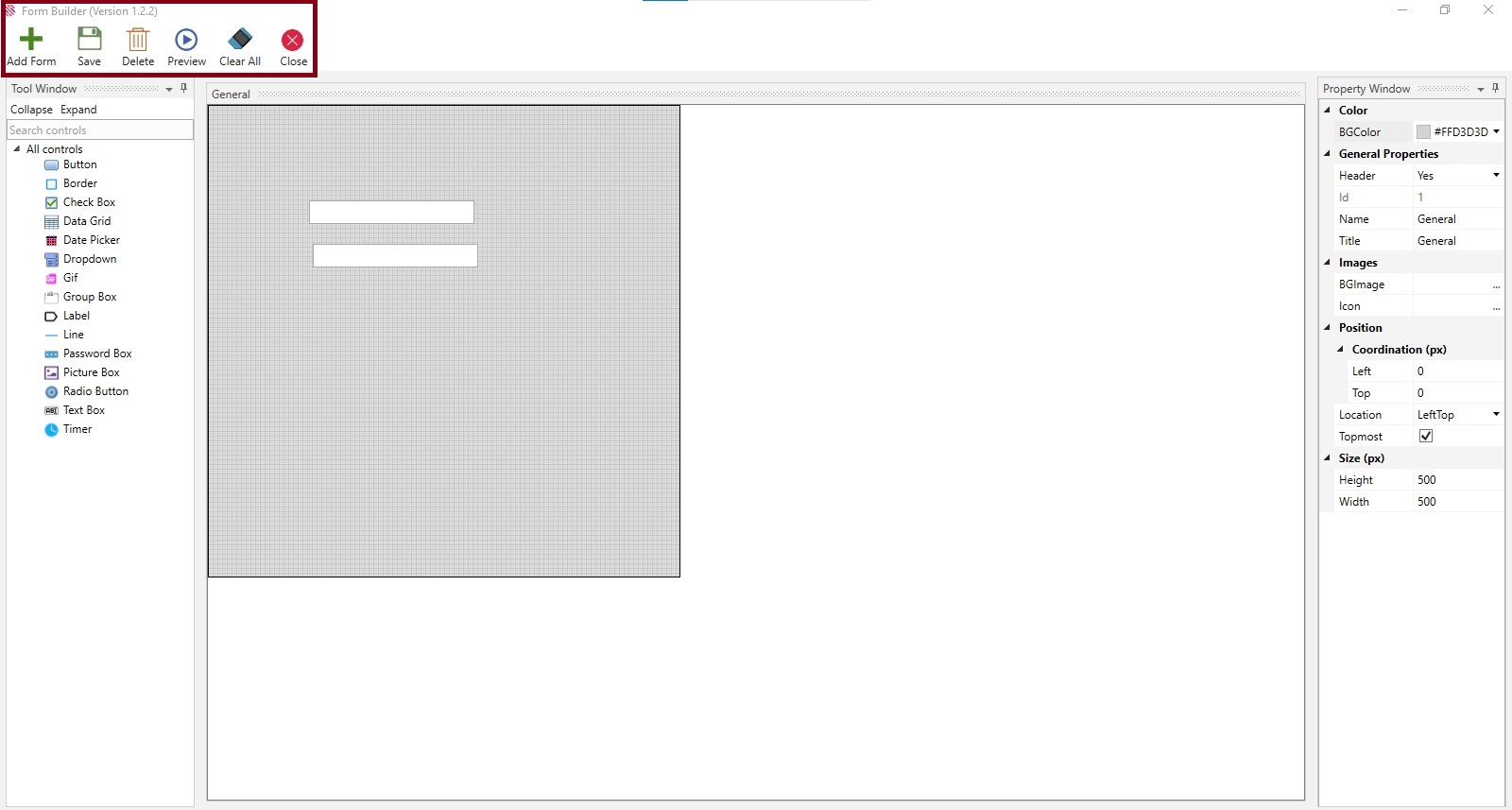
Add Form - To facilitate creating multiple forms, simultaneously. Click on the Add Form menu, fill the Form Name, Title and Add. The title will be displayed at the bottom, open the form and proceed.
The form will be created and displayed.
- Save - After creating form or form with controls or while making changes, save option is used
- Delete - if controls are chosen they will be deleted, no controls are chosen, and multiple forms are opened it will delete the selected form. If only one form is opened it will not allow you to delete it without alerting
- Preview - You can Take a sneak peek of the created form
- Clear All - Will clear all controls in the form
- Close - Will close the form or form with controls.
What are the controls that are available to design the form?
The user can use the following controls to design the form.
What follows is an example of creating a form using the Button control.
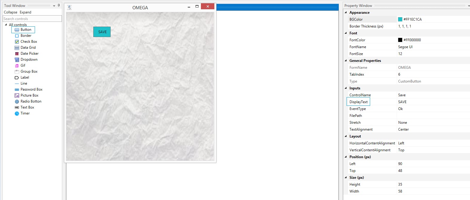
Click on the Form Builder to enable the General Form. Select a background, give it a name and place an icon in the form. Drag and drop a Button control on the form.
Appearance
Select the Background Color (BG Color) and Border Thickness (px.)
Font
Select the Font Color, Font Name and Font Size from the respective dropdowns.
General Properties
Provide a Form Name.
Tab index is a feature that helps the user move from one control to another, by clicking the tab in the keyboard. Provide the number as per requirements.
Type of the control is auto populated as Custom Button, since the selected control is button.
Inputs
Provide a Control Name.
Type the value in the Display Text. This will be displayed inside the button. The same can be called during runtime and the same action will be performed.
Select the type from the Event Type field.
Event Types are as follows:
- Ok
- Cancel
- Clear
Select Stretch options, such as:
- Fill
- Uniform
- Uniform to Fill
Select Text Alignment as Left, Centre or Right as you want your text in the Button to be placed.
Layout
Select Horizontal or Vertical content alignment as per requirement. This will be explained in detail in the Text Box control section.
Position(px)
Left: Increasing the count will move the control to the right side. Decreasing the count will move it to the Left side.
Top: Increasing the count will bring the control down and decreasing the count will move the control up.
Note: Numbers in Position can be selected from the dropdowns or typed.
Size(px)
Increase or decrease height and width as per requirements.
After filing all details, preview. The button is created in the form as per specifications. Save your work after creating the control.
Choosing the Form
Click on the Form Builder menu on the top right to access the General Form.
After creating customized forms with the use of the provided controls , save the form.
Proceed to drag and drop a Form Invoker from Form Builder Automation package under the Toolbox section. The created forms will be displayed in the dropdown to proceed further. Set it as the start node. Double-click to view.
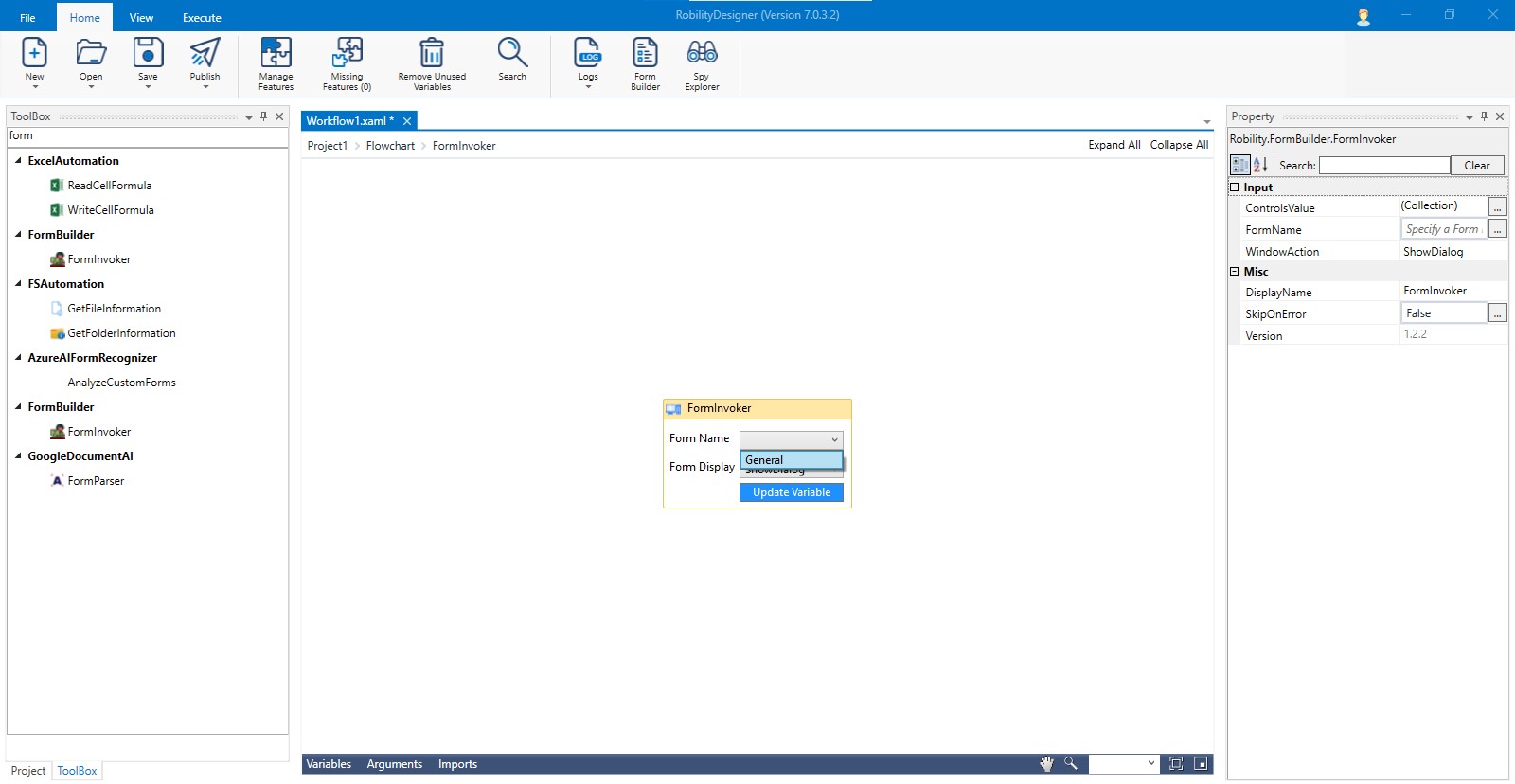
The saved forms will be displayed.
Choose the one as per requirement and execute.
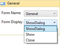
There are options in the Form Display, such as Show, which will open and show multiple forms at a time .It will allow users go to the next step without closing the current form during runtime. Show Dialogue will display the form and will not allow users to proceed without closing the current form. Close option will close the form.
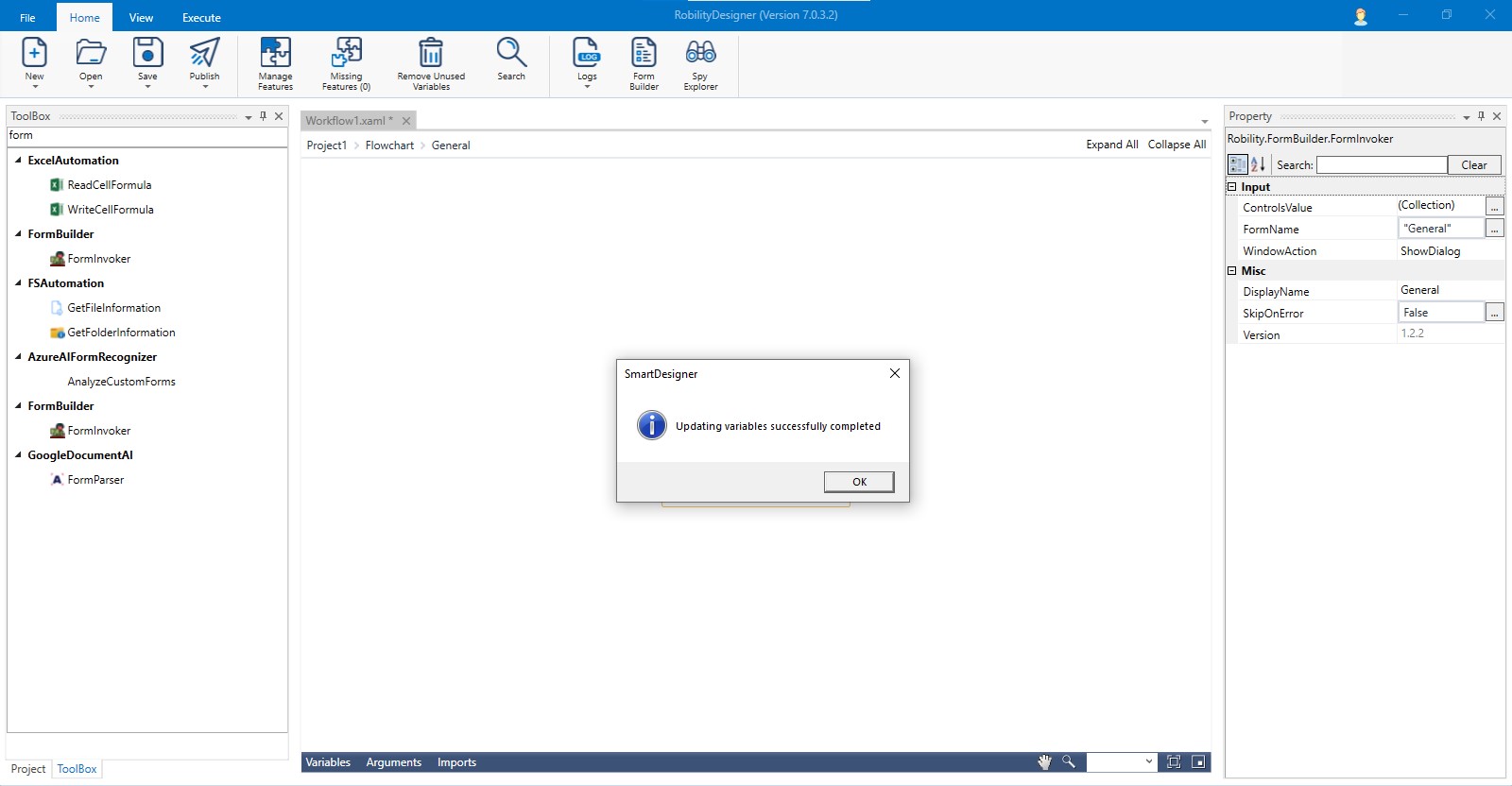
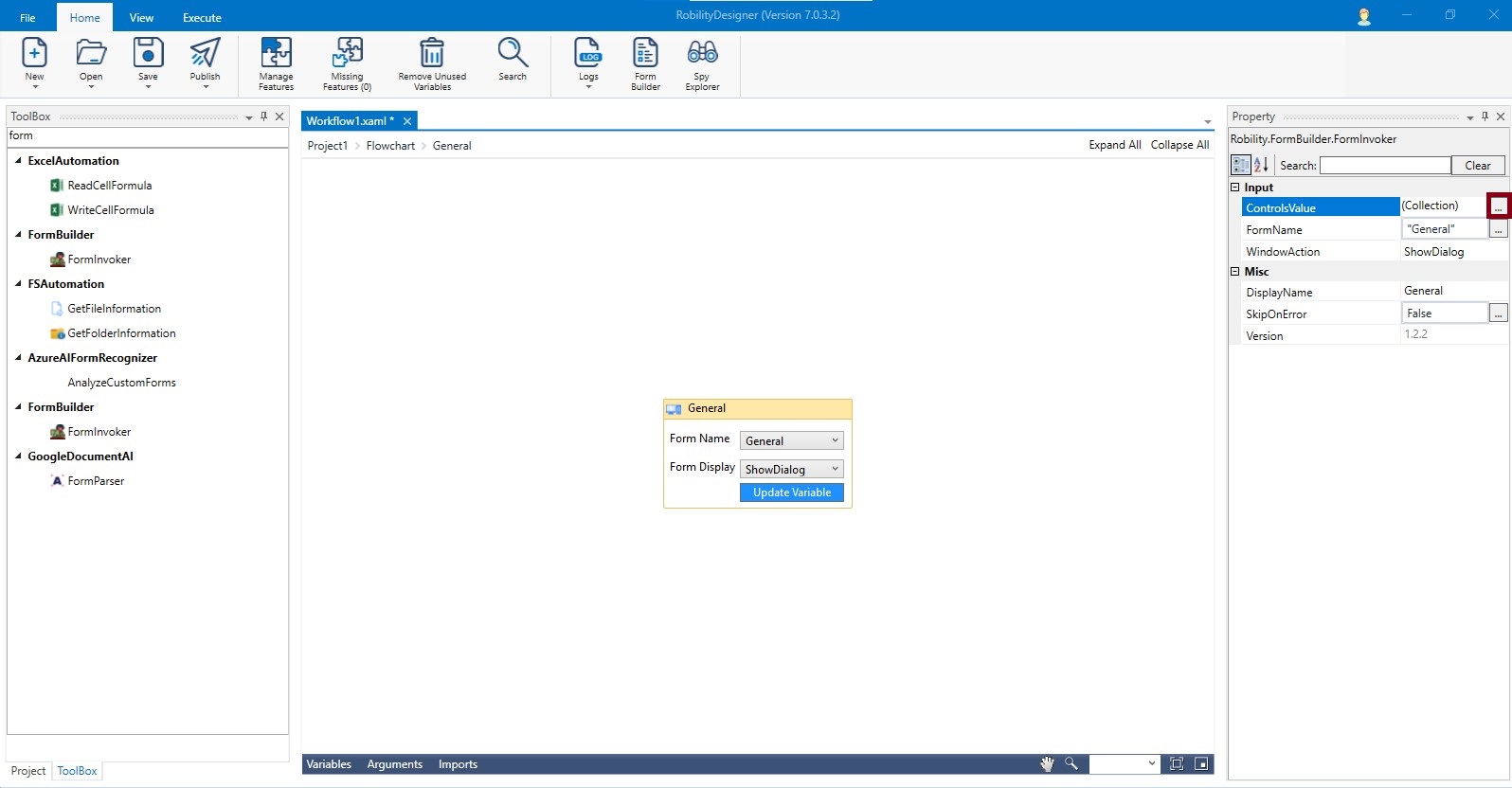
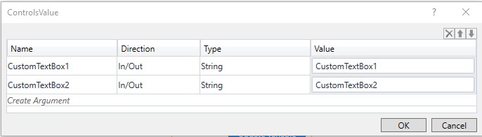
Click on Update Variables and all the created variables will be mapped against the respective controls.
They will be displayed in the Controls Value Window as well. Click on the ellipsis beside the Control Value field to enable the window.
At last the user can run the workflow to preview the message.